You already know that managing a product is challenging. There’s a lot of competition when it comes to winning the market share. Although product analytics is important, it’s not uncommon to focus on the wrong data.
You’re probably also aware of how useful cohort analysis is regarding product management. And you’re right — cohorts are critical for getting a well-rounded picture of your product’s performance.
Cohorts are also a powerful tool as they give you:
- Plenty of control over the digital product you’re working on
- Influence on how to align teams around your product, making it an acquisition, conversion, and retention flywheel
- A lot of space to analyze user retention indicators to help you gain users and ROI faster, and foster healthier product ARR growth
Throughout this article, you’ll receive practical examples of cohort analysis across various verticals. In addition, you’ll have the opportunity to read about what the cohort analysis experts think about this behavioral analytics technique.
But first, let’s see how cohort analysis fits into this product-led growth methodology that’s on the rise as of late.
Cohort analysis: a part of the product-led growth flywheel
Companies turn to product-led growth (PLG) as it naturally drives user acquisition, expansion, conversion, and retention.
According to the PLG collective, this methodology is gaining in popularity mainly because tech-savvy users:
- Refuse to use a product that falls short of their expectations
- Are (often) more likely to make purchases through apps rather than salespeople
- Have high demands and expect outstanding customer experience
As a product manager, you understand that problems with customer churn and retention are often associated with product friction, inadequate pricing packages, or a lack of seamless integration.
At the same time, making informed decisions about products is tricky. It’s easy to find yourself weighed down under piles of product data or overly focused on vanity metrics like daily active users (DAU).
That’s why cohorts are so indispensable.
What is cohort analysis?
Cohorts are simply groups of users who share common characteristics.
A cohort analysis, being a part of behavioral analytics, is a powerful technique that allows you to spot trends and similarities between “buckets” of users. These user groups share common patterns of behavior or perform the same actions.
By analyzing your cohort reports, you can:
- Make better product decisions
- Increase user retention
- Increase product revenue
Check out what Michiel Vermeulen — a cohort and product-led growth expert — has to say:
It’s because every time you put a cut in each of those steps your users make in their journey, you make the data set smaller and more controllable. It’s like you freeze groups of users in time.
Cohorts also help you make more influence. So the smaller the parts that you chop, the better.
If you look at users that convert and those users that start to pay your business money, every chop you make, you get better control. Let’s say your business has 100 new users. They may convert. But, so what?
If you build a cohort and you aggregate, let’s say, 100 users — they came from this campaign on this channel. They started at this moment and they’re now here. This gives you more control over what you can analyze. For example, you can dig deeper into:
The time to value (how much time it takes for your free users to turn into paying clients) Product offering analysis? Do we have the right amount of free and behind-the-paywall features? How is our product performing over a specific period of time?
So, cohorts give you the feasibility to improve your product in a product-led growth framework. Cohorts are actually the only way to make a big influence on a product and have better control over that product.

Why cohort analysis is so powerful: Product manager benefits
Cohorts help product managers perform detailed analyses (tied to feature adoption in SaaS as well as big picture analysis regarding user retention) across verticals.
If you’re responsible to hit a certain KPI in your role, then there’s no doubt cohorts can help you do it better, faster, and smarter.

Cohort analysis benefits in product management:
A long-term overview of your product’s health. Say your product has been on the market for five years. Cohorts tell you if the number of paid accounts increased over time.
The ability to differentiate between segments of users. For example, you can compare the customer lifetime value of one package vs. another.
Gives you insights into feature adoption. For example, what percent of users use features like “Create custom report” or “Create a new task list.”?
A clear picture of your product’s retention rate. For example, customer retention cohorts will tell you whether your user base consists of retained customers or new customers.
You may seek to answer questions like “What’s our growth strategy to make our product more sticky so we can increase the number of customers?”
Information regarding groups of users (acquisition cohorts) during a specific campaign. For example, you can check how many users come to the product on a regular basis and use a certain feature. You can also check how many users from a selected cohort upgraded to a higher plan.
Measure feature launch goals. For example, when you launch the feature “Multiple dashboards,” you can monitor the percent of users that actually used the feature over X period of time.”
In addition to the benefits of cohort analysis, there is something more that makes them a powerful addition to your analytics stack.
Cohort analysis reports are the sweet spot between viewing:
- The whole user base. Looking at all users at once doesn’t give you much insight. That’s because the view is too broad. Sometimes, the only thing your users have in common is that they’re using your product.
- Every single user in particular. This is another trap. That’s because a detailed user-level view doesn’t tell you much about user behavior patterns. There’s also a scaling problem. If your product only has 10 users, it’s fine to analyze each user’s journey. But if you plan on scaling up, it’s not possible to analyze hundreds of thousands of users
With these benefits in mind, let’s see your options when it comes to building cohorts.
Cohorts are based on events. This means that you almost have unlimited options for measuring what’s important to you. That’s because an event can be:
- Clicking the “Upgrade to paid plan” button
- Clicking the “Create a custom report” button
- A visit to a “My drive” space
- Clicking the “Play button” in a video
- Filling the text box
- Downloading a segmented report in.xlsx format (Excel format)
- Clicking on a “Choose organic users” segment
Often, analytics tools give you the option to add custom events (either involving no-code or API). It’s up to you to choose which events are important in your product management mission so you can build cohorts based on what really matters in your product.
How to do cohort analysis, including a dashboard login example
Let’s take a look at a monthly cohort analysis example. It’s based on the event “dashboard login for free users.” We selected a monthly view as this form of data visualization highlights clear trends.
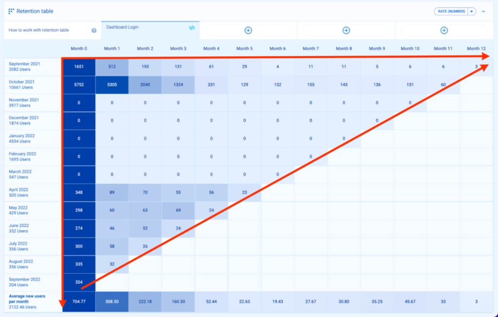
How to read cohort analysis? Analyze the grid from 3 different standpoints — horizontally, vertically, and diagonally.
Column-orientation analysis (from top to bottom)
How one cohort compares to another.
Each row represents a group of people. Let’s take a closer look at how to interpret these examples:
From top to bottom, you can see that cohort size varies. Each month, there was a different number of users:
- In October 2021, 10 661 users that were first seen by Smartlook in October 2021 and completed the event at least once between October 2021 and September 2022
- In March 2022, 547 users that were first seen in Smartlook in March 2022 and completed the event at least once between March 2022 and September 2022
Row-orientation analysis (from left to right)
Progress of behavior over a specific period of time (month over month in this example)
Each column represents a week since the day the group was created.
Here, you can easily see what’s the progress over time of the event you’re analyzing. Let’s use the dashboard login for website users that have a free account as an example.
- Row 1, September 2021. In month 0 (September 2021), 1,651 out of 2,082 users that were first seen in September 2021 completed “Dashboard login for free web users” in September 2021.
- Row 1, September 2021. In month 7 (April 2022), 11 out of 2,082 users that were first seen in September 2021 completed “Dashboard login for free web users” in April 2022.
As a result, you can see what happens with the values of the event you’re checking. In this case, it’s visible that from month 0 (the month of acquisition), there was a decline until Month 6.
Later, there was an increase from Months 7 and 8 onwards. Want to know why there was an increase in the number of web users with free accounts? What caused the trend to change?
So you converted 100 users. In the last 90 days. You’ve churned 6 – this % tells you how good you’re.
However, every time that you measure it (and you can measure it at any given time taking 90 days) tells you something about progress.
How have you been able to deal with the number of product leads? How can you improve it? How can you influence it?
And a real product growth process is never about: Hey, now churn is 6%, and let’s make it 5%. No. If you do this process continuously well, you’re having a bigger, sustainable change.
Diagonal orientation analysis (across)
This is every web user with a free account dashboard login in September 2022. Spot trends in behavior during a specific month.
This view lets you see trends and behaviors by month. Say you work for an e-commerce company that sells Christmas trees. In this case, you’ll want to pay attention to recurring users in November and December as that’s your high season.
Analytics tools vary in terms of tracking and data scopes.
For example, Google Analytics Universal offers user-, session-, hit-, and product-level data scopes. In Google Analytics 4, at the moment, there is only user- and hit-level.
“Hit,” in Google products, is just another way to name “event-level.”
With Smartlook, you can have 3 different data scopes.
For example, below, you can see: “Active since,” “Dimensions,” “User ID,” “Location,” and “IP.” You can see every new session this particular user started as well as the duration and number of events per session.
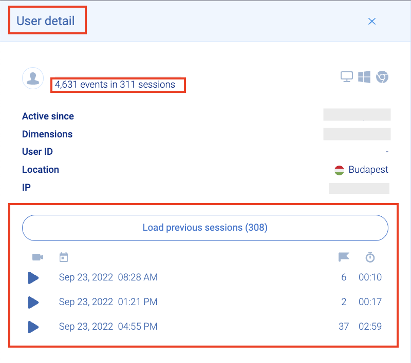 When it comes to session recordings, the situation is from a different perspective. Here, you can see user details and total events per session from a session-level view.
It helps you understand what users really do and where they click. In reality, this gives you the why behind user actions in your product.

Above, you can see that each user has their own set of unique events during a number of sessions.
For example, say a user from Gubin performed 73 events during a 7-minute and 34-second session and a user from Oakhurst performed 113 events during a 6-minute and 32-second session.
This gives you a multidimensional view of analytics data. It’s up to you to decide which data scope in behavioral analytics is the most important to you.
4 practical use cases of how to benefit from cohorts based on retention tables
Various online resources will tell you that “your product has to provide users with value.” Despite this being a popular statement, it’s subjective. It’s impossible to measure objectively — just try asking 15 users what this value is all about and you’ll receive 15 different answers.
That’s why we’ve turned to an article by Mark Roberge, former Chief Revenue Officer of HubSpot’s sales department. Mark thinks you need to use event indicators that are objective — meaning they leave no room for interpretation.
We support this approach and use a set of solid indicators across our product team.
So for us, it is very important to look at the cohorts of users who filter recordings, use events to see particular actions, regularly check funnels and then also watch the recordings of these actions. This is where we closely watch engagement and retention for these cohorts.

Before we dive into cohorts from various verticals, let’s take a look at what objective indicators look like (based on Roberge’s approach):
- “Upgraded from free to paid plan” event instead of “Customer sees value” event
- “Logging in at least 1 time per month” event instead of “Mentions the product during meetings”
- “10% reduction in processing time” event instead of “Bought our product”
- “Adopted 3 features within our tool” event instead of “Offering a versatile and lightweight tool”
- “User created 5 heatmaps” event instead of “User loves our tool as they use all features”
- “Time to value is 5 days” event meaning user created 1 dashboard, 1 custom report, and 3 heatmaps within a 5-day period instead of “Providing fast time to value and an ‘AHA’ moment”
If you want to build your first cohorts, keep in mind that Smartlook offers retention tables built on events. Try a full-featured, 30-day trial: no credit card required.
- Cohort analysis in SaaS on the example of a cloud drive
Say you have a cloud drive product and you’d like to build and use cohort analysis regarding your SaaS product. The subscription packages look like this:
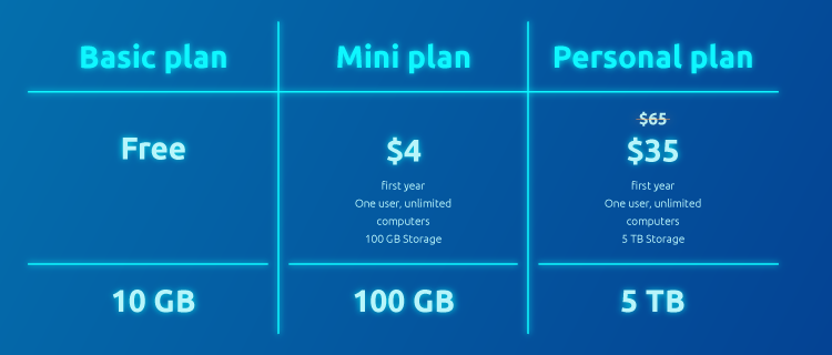
As a product manager, you really want to nail down the one user retention indicator that’s connected with the key product feature — file upload. Let’s say the objective measurement is: “50% of free users upload at least 1 file to their cloud storage within 10 days of usage.”
You can track this leading indicator (in this case, it’s about a key feature of the cloud product being an event called “upload a file”). Let’s see what your cohort analysis for this SaaS product looks like:
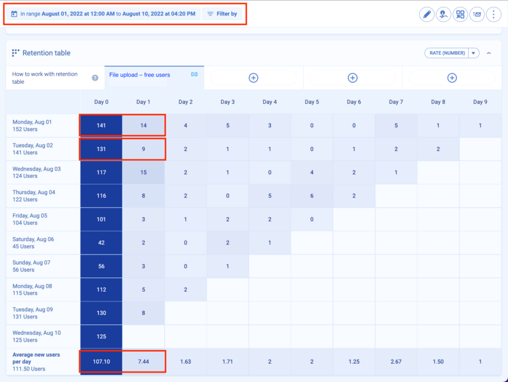
Event: File upload free users
Range: From Aug 1, 2022 until Aug 10, 2022(daily cohort)
Segmentation by custom property: none
Rate: %
How to analyze product cohort data?
Horizontally:
- 141 out of 152 users first seen on Monday, August 01 performed an event: upload a file on Monday, August 01, 2022. (100% on day 0)
- 14 out of 152 users first seen on Monday, August 01, performed an event: upload a file on Tuesday, August 02, 2022 (10% on day 1), etc.
Vertically:
- 131 out of 141 users first seen on Tuesday, August 02, performed an event: upload a file on Tuesday, August 02, 2022. (100%)
- 9 out of 141 users first seen on Tuesday, August 02, performed an event: upload a file on Wednesday, August 03, 2022 (7%), etc.
On average: 107.01 users performed this event 0 days after they were first seen (out of 111.50 users). That’s 96%.
You can assume you’re on track thanks to your user retention indicator because, on day 0, 96% of free users uploaded 1 file to drive. What’s worrisome is that the trend of this event is drastically decreasing.
Conclusion: Users on day 0 uploaded a file but they stopped doing it over the next few days. There might be a couple of reasons to accept/reject:
- Users faced an error that turned them off. As a result, fewer users continued to perform this event in later days
- Users had problems uploading the file because they didn’t know how to do it (friction in the product)
- A poor upload design process turned users off
- Users didn’t see any benefit in uploading the files because they couldn’t share them afterward
To improve your results in the following days, try finding the cause of this decreasing trend. Check user session recordings and verify the right cohort of users and potential causes of friction.
Check whether the problem lies in a lack of education, FAQ, a poor onboarding process, or friction during the first day of product usage.
- Product cohort analysis on the example of private clinic healthcare
Let’s say you have a private healthcare clinic and your users (patients) can buy different healthcare packages through your app. They can choose from Free, Professional, Extended, or Full-scale subscriptions. Each package differs in terms of the scope of health services patients receive.

As a product manager, you’d like to check if “40% of Professional package users booked at least 1 stomatologist visit within 3 months since month 0.”
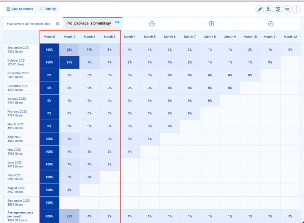
Conclusion: Month 0, 895 out of 1266 users with the Professional package booked a stomatology visit.
- Month 1, 177 users out of 895 users = 20%
- Month 2, 121 users out of 895 users = 14%
- Month 3, 71 out of 895 users = 8%
This means that the first cohort of users (Sept 2021) isn’t achieving the goal of “40% of Professional package users booked at least 1 stomatologist visit within 3 months since month 0.”
Also, when looking at April 2021, May 2021, or June 2021 cohorts, the numbers don’t look promising and the goal isn’t achieved. With this data at your fingertips, you can come up with potential solutions that push Professional package holders to book stomatologist visits.
But maybe there’s a problem with this application’s user path that stops users from booking a visit? For example, unintuitive UI, an error, or maybe users are unaware that they are able to book a stomatologist visit in-app? Maybe the option is hidden so users skip it?
- Fintech cohort analysis with the example of an online payment app
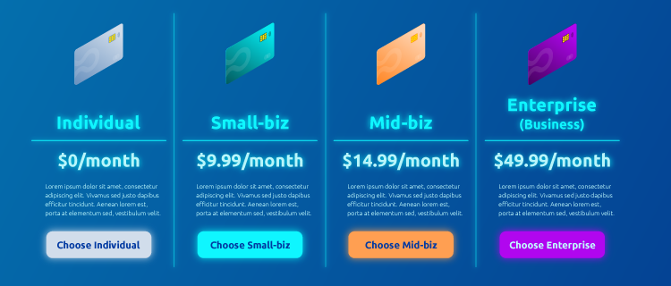
Fast forward to a growing market called fintech. Let’s say you’re managing a popular mobile financial application that targets both:
- Individual users (individual accounts)
- 3 types of businesses (small, medium, and large)
We’re sure you’re aware that product, marketing, and sales are all aligned with one another. You know that a company simply has to adjust its messaging to each audience to be successful.
But let’s say that this time, you want to know the user retention rate by comparing 2 important user groups: mid-size businesses and enterprise customers.
You’d like to check this because you know that your marketing team was working hard over the past 3 months on a series of campaigns targeting enterprise businesses, and you’d like to see if those campaigns brought quality leads. What’s more, you’d like to compare different cohorts in terms of user engagement.
You’re checking the event “dashboard login” to see if they log into their accounts and keep coming back to the app. Your goal is to have “dashboard login for enterprise customers over the last 3 months on the level of 40%.” Let’s check the cohorts.
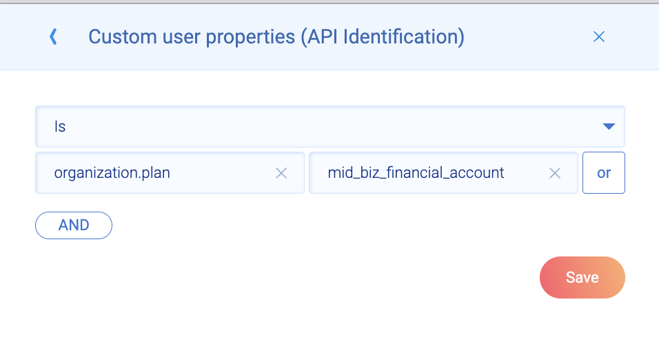
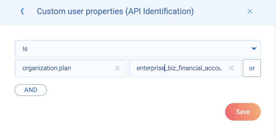
Mid-business cohort
Let’s first filter by custom user property. Here, you’re filtering by “organization.plan,” which is mid_biz_financial_account. This is because you only want data related to those users who have a mid_biz account.
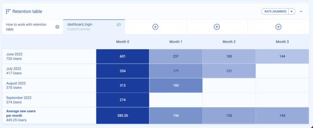
Now, let’s look at the cohort itself. It’s a 90-day cohort of the event dashboard_login for users who hold a business account as they’re mid-sized companies.
Now, let’s build another cohort. This time, there will only be enterprise accounts.
It’s a 90-day cohort of the event dashboard_login for users who hold an enterprise business account.
Segmented cohort comparison:
Based on both cohorts, you can see that:
- On average, you have 442.25 users in the mid-biz cohort
- On average, you have 194.25 users in the enterprise-biz cohort
In the same 90-day period, it means your business is getting more users tied to mid-biz accounts than enterprise ones.
Maybe it’s good to check the source of leads for both groups. And to check the quality of leads and cost per acquisition.
Later, you can also bucket both mid-biz and enterprise users in a 12-month cohort to see if they’re still logging into your product — in other words, to check if they’re active.

Comparison of % between mid-biz and enterprise-biz cohorts:
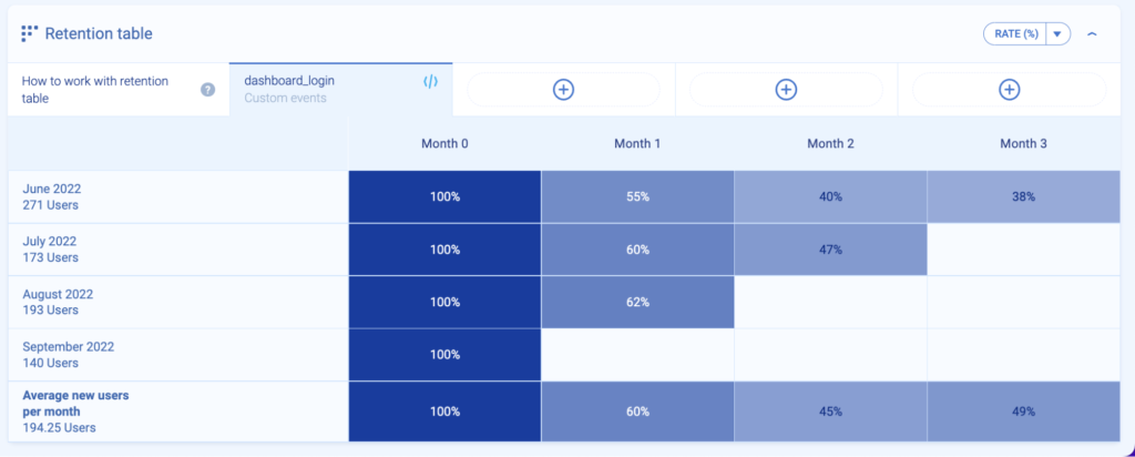
Remember your event indicator called dashboard login for enterprise customers over the last 3 months on the level of 40%? Here, there are some interesting findings.
It looks like most user groups in your enterprise cohort are achieving this goal. Let’s take a look at the details:
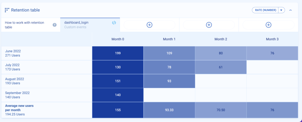
- June 2022 group, month 0: out of 271 users, 199 users logged into their dashboard (100%)
- June 2022 group, month 1, 109 users out of 199 users logged in (55%)
- June 2022 group, month 2, 80 users out of 199 users logged in (38% – this is below your goal)
What about other months’ cohorts? The data looks solid, considering that both July 2022 and August 2022 user cohorts continue to be above 40% (your goal).
This means that the campaigns done by your marketing team succeeded. The users acquired by those targeted campaigns are actively using your financial app. It’s also a good idea to check the average revenue per account (ARPA) for this type of client.
The final takeaway? When looking at the dashboard logins of mid-biz users acquired in the same period of time based on cohorts with % — it looks like mid-biz users are less likely to come back to your product.
You really need to understand the use case for this type of cohort, including the actions that users perform and how essential the app is in their daily lives.
Is it because non-marketing activities were used to acquire those businesses, or does the problem stem from something else?
- Advanced cohort analysis using the example of an online travel agency
With the example of an online travel agency, we’ll go deeper into how segmentation and cohort analysis works. Although cohorts are groups of users, that doesn’t mean you can’t segment those groups of users even further.
To understand product cohort analysis for leisure and travel companies, we’ll pinpoint the ideal customer profile (ICP). Let’s say your ICP is a big family that books trips for 9 travelers in one blow.
It’s your ICP because the average lifetime value for such a user is 50% higher than any other user — e.g., solo travelers, small families, or business travelers.
Let’s see how the filtering looks on your agency UI:
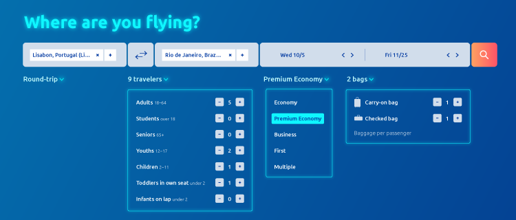
You can add custom user properties (API identification), the same way we did with the fintech example. But this time, we’ll use the following filters:
- A round trip
- 9 travelers (5 adults, 2 youths, 1 child, 1 toddler in own seat)
- Premium Economy
- Carry-on bag + checked bag (1+1) for each passenger
As a product manager, you’d like to know if those big families with those exact traits (filters) finalize their trip purchases. There is potential for a big spend for this cohort, but you should also focus on the frequency of purchases and the cohort size.
Your event indicator will be “After purchase page view is 70% in 90-day cohort” — you want to be sure that they saw this page, meaning they finalized their purchase.
The cohort with the following filters looks as follows:
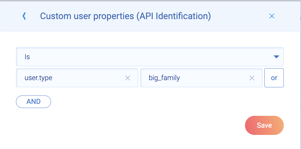
Event: After purchase page view
Range: June 2022 to August 2022 (90-day cohort)
Segmentation by custom property: big_family
Rate: % and numbers
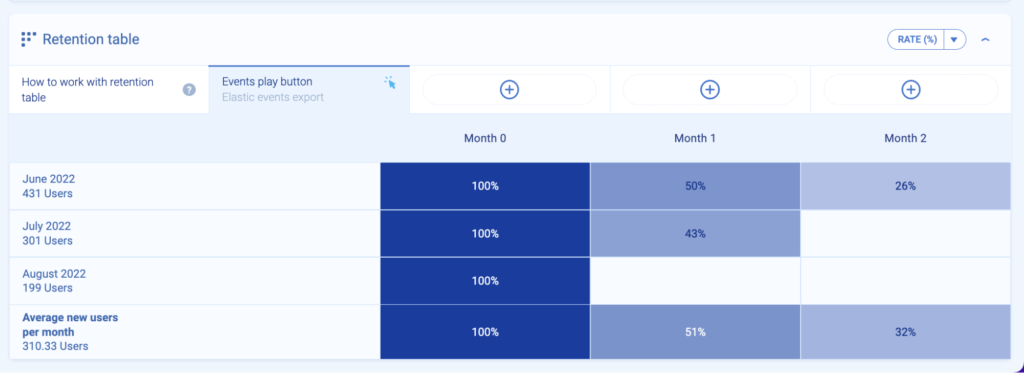
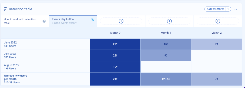
Let’s also take into account that the marketing department made a last-minute before-holiday campaign targeted at your ICP — big families.
Was the goal of “After purchase page view is 70% in 90-day cohort” achieved? No, it wasn’t.
- In June cohort 2022: in month 0, out of 431 users seen, 299 landed on the after-purchase page (100%)
- In June cohort 2022: in month 1, out of 299 users seen in month 0, 150 landed on the after purchase page (50%)
- In June cohort 2022, in month 2, out of 299 users seen in month 0, 78 landed on the after purchase page (26%)
Conclusion: In the second cohort (July 2022), users also didn’t reach 70% in the 90-day cohort. It may mean that the marketing campaign, despite offering discounts, didn’t encourage big families to book vacation trips with your online travel agency.
Understanding the root of the problem is crucial.
Maybe there was an issue with your website that was causing friction? Your ICPs have big families. They don’t have time to tolerate such errors.
Maybe you didn’t take into account the seasonality of this cohort? For example, you see that, on average, families take two vacations from April to September, and you set this up as your goal.
You also see that one cohort received a last-minute offer, and their performance is much higher than the first cohort. So, you compare the revenue for both cohorts and you see that the discounted one brought slightly more revenue than the first one. In this case, it makes sense to also apply the discount to the first cohort.
Or maybe your ICP chose to book a couple of vacation trips either:
- In advance — so it would be better to run marketing campaigns in February 2022, March 2022, or April 2022 at the latest
- Directly — via the flight provider because the prices were better, or there was less friction on their websites
You never know until you dig deeper. Here, this cohort provides just one “view” to show you that something contributed to your failure to reach this particular product goal.
It’s time to create a couple of hypotheses and dig deeper into how your ICP behaves online, including what’s important to them.
Instead, look from a wider perspective. Look from the beginning. For example: you see that churn is often going up during those 90 days in cohort analysis.
You can see that your users are all coming from the campaign you did at the beginning a couple of weeks ago.
If those leads come but don’t do what they’re supposed to do (buy your product, convert, etc.), those leads from those campaigns are not valuable so you should change something in those marketing campaigns instead.
Use cohorts to create products your users will love
Cohort analyses are obligatory in your role as PM. Cohorts provide you with a visual chart of how a vast population of users interacts with a product to achieve an outcome.
With such a chopped view, you’ll be able to perform meaningful experiments, make informed product decisions, and satisfy demanding users faster.
Schedule a free demo to see retention tables in action.