Heatmaps are a great way to get an overview of a typical user’s behavior on your website. However, many people make 3 big mistakes when analyzing them:
- Drawing misleading conclusions by not waiting for enough data. A heatmap must gather at least 1,000 views before you can make accurate conclusions based on it.
- Evaluating individual heatmaps on their own. A single heatmap doesn’t tell you much, since the hotspots (areas where users click, scroll, or move their mouse) are typically where you’d expect them to be. That’s why the value of heatmaps comes from comparing how the hotspots change after design updates.
- Making large changes based on heatmaps alone. While heatmaps can often show you where users are having trouble on your website, it’s not always obvious why they aren’t converting. That’s why it’s best to combine heatmaps with other analytics tools (like session recordings) before redesigning your website or mobile app.
In this guide, we’ll show you how to get the most out of the 3 types of heatmaps — click maps, scroll maps, and move maps — while avoiding these mistakes.
We’ll also show you how our tool, Smartlook, can help you see what users are doing on your website or mobile app and uncover why they’re doing it.
Smartlook captures every user interaction on your website or mobile app and lets you create heatmaps, define events, build funnels, and watch session recordings. You can try Smartlook today by signing up for a free account — no credit card required.
How to get UX insights from the three different types of heatmaps
In the context of website analytics, the term heatmap encompasses 3 different heatmapping tools (or types of heatmaps) — click maps (left in the screenshot below), move maps (middle), and scroll maps (right).
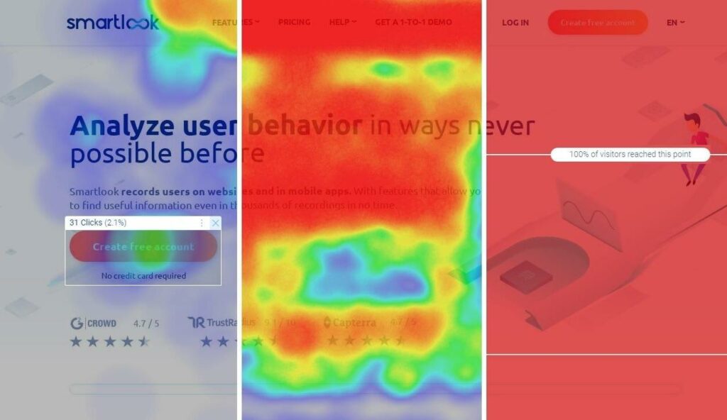
Heatmap software collects numerical data about users’ clicks, movements, and scrolls and visualizes these datasets, so you can see the aggregate of these interactions at a glance. The data visualization typically uses a hot-to-cold color scheme, going from bright red (for the most popular parts on a page) to blue or gray (for the least popular ones).
Regardless of the type, there are a few best practices that can help you get reliable insights when analyzing heatmaps:
- Make sure the heatmap has collected at least 1,000 views. Smartlook lets you create a heatmap with zero views, but we recommend waiting until it’s gathered at least 1,000 views before making any conclusions about user behavior. In general, the more views a heatmap collects, the more accurately it will reflect the user experience.
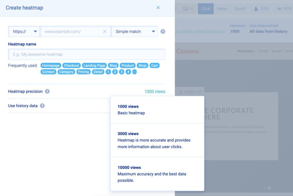
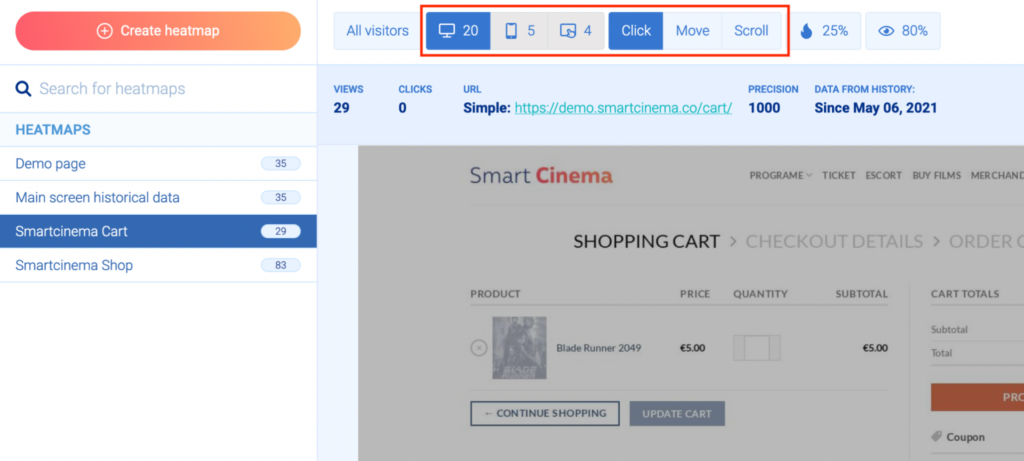
- Analyze both desktop and mobile traffic before making changes. Desktop and mobile screens are radically different, which affects what users see and click. For example, important elements like headlines and call-to-action buttons (CTAs) might catch the attention of most desktop users, while being barely noticed by mobile visitors, due to their positioning on a smaller screen. In Smartlook, you can switch between mobile, desktop, and tablet users via the buttons above the heatmap.
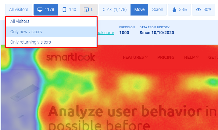
- Compare the behavior of new visitors versus returning visitors. New visitors behave differently than those who already know your website and are coming back to find something specific. Understanding these differences is important for improving the journey for each segment of visitors.
Now, let’s see how the different types of heatmaps work and how to extract the most value from them.
Click maps: See where and how often users click
Click maps show you where users click (on desktop) or tap (on mobile).
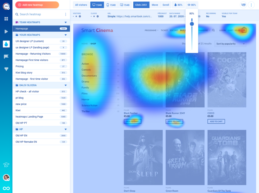
The screenshot above shows a desktop click map with a few colored regions where users click. The red center marks the area where most clicks were concentrated.
Additionally, with Smartlook, you can select an area and see the actual number of clicks recorded (i.e., the raw data points) and what percent of the total clicks on the webpage they represent.
Click maps are valuable for finding where users click and how often they interact with important CTAs.
For example, one of our clients (Sewio) used click maps to learn that crucial buttons on their homepage weren’t being clicked. Based on their findings, they made a hypothesis and reworked the page to make the buttons more visible. The result was a 276% click-through rate (CTR) increase for their “Go to store” button.
Lastly, quickly repeated clicks in a specific area or on elements that aren’t clickable (i.e., rage clicks) may indicate confusion or frustration. Smartlook tracks rage clicks by default, as we’ll see in the events section of this guide.
Move maps: Track where users move their cursor
Move maps show where users move their cursors while navigating a page.
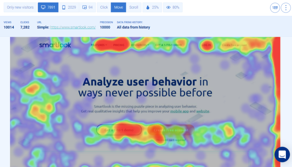
Similar to click maps, move maps also display clusters of activity, with the red hotspots indicating a high concentration of mouse movements.
Tracking mouse movements can help you find usability issues, like areas that distract or confuse visitors. For example, hectic cursor activity around some parts of a page may indicate that users don’t know where to click or are getting distracted by elements on the page.
Also, there have been studies correlating mouse movements and eye-gaze. That’s why move maps are often used as a cost-effective substitute for eye-tracking software to determine which elements on a page attract users’ attention.
Scroll maps: Find the average fold and which sections are being ignored
This final type of heatmap shows what percentage of visitors reach each part of your page.
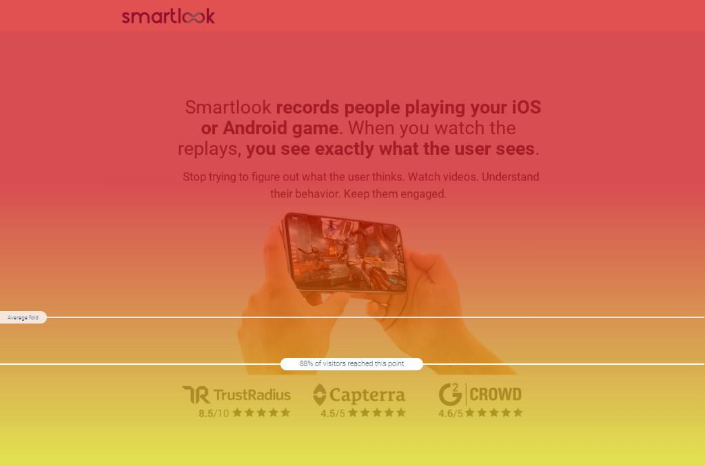
All scroll maps start with a bright red area at the top (where all users land) and turn yellow, green, blue, and gray as users drop off down the page.
Scroll maps can help you quickly find a page’s average fold and determine whether its elements are placed correctly. Here’s how:
- The average fold is the part of your page that most users see without scrolling. In other words, it’s the most valuable real estate on a page, since all users see it. As you can see in the heatmap example above, Smartlook shows the average fold by default, so you can quickly find what users see when landing on a page. This is really useful, especially if you’re designing pages on a larger screen than those used by your audience.
- Knowing where most users scroll to will help you make informed decisions about element positioning. If you have text or visual elements that you must show to everyone, it’s a good idea to place them above the average fold. Going back to our previous case study, Sewio’s scroll maps showed that most users weren’t scrolling enough to reach some of the most compelling page elements. This made them move the “Go to store” button and client success stories above the average fold, resulting in huge CTR boosts to both elements.
Lastly, scroll maps are also helpful for finding false bottoms. False bottoms are a design flaw that confuses people into thinking that a page ends before it does. Look out for sharp changes in color in your scroll maps (such as from yellow to blue instead of a gradual fade to green and then blue) as they may indicate a false bottom.
Use heatmaps to compare new and old versions of your page or app (even retroactively)
Comparing user behavior on different versions of the same page is a crucial use case for heatmaps.
Here’s why.
Most page redesigns are made based on a hypothesis, like “if we move our newsletter sign-up form closer to where users are already scrolling, we should see an increase in sign-ups.” By comparing heatmaps of the old page versus the new one, you can see if the changes in user behavior support or refute your hypothesis.
With Smartlook, you can even do this analysis retroactively. Our tool automatically collects every user interaction (including scrolls, clicks, and mouse movements), so when you create new heatmaps, they automatically get populated with historical data, as far back as your data retention plan goes.
Also, if you forgot to make a heatmap before a design change, you can generate it retroactively by changing the dates in Smartlook to the period before the design change.
How to overcome the limitations of heatmaps for website analysis
While heatmaps provide a useful overview of the typical user experience, they don’t tell you why users do what they do. In other words, you can’t put the interactions on a single page in the context of the entire user journey.
Since they don’t show you the why, heatmaps can only give you a guess, at best, as to how you can improve the user experience. That’s why it’s a good idea to use them only as a stepping-stone.
Before making large website changes, it’s essential to get a deeper understanding of your users’ behavior. You can do that by using session recordings, events, and funnels in addition to your heatmap data analysis.
See the entire user journey and every user interaction with session recordings
Session recordings (sometimes called session replays) let you see what individual users saw and did on your website.
Unlike heatmaps, session recordings remove the guesswork from your analysis. Instead of an overview of many users’ experiences, session recordings show you every interaction of one specific user. This means you get the full context, which helps you determine why users didn’t convert or where they struggled.
Smartlook captures session recordings automatically after our code snippet is added to your website or mobile app.
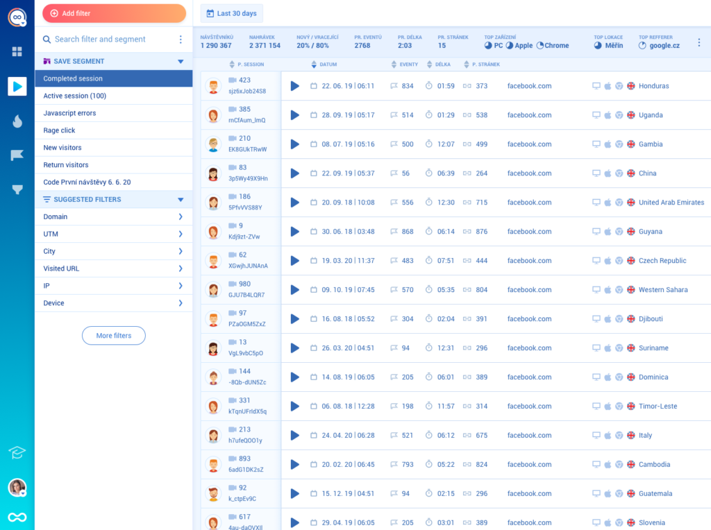
You can use over 30 filters to quickly find the recordings you want to watch, including things like session duration, country, device, new or returning visitor, and more.
Track business-critical user interactions with events
In web analytics, an “event” is a user interaction that can be tracked, like a visit to a specific URL or a click of a button.
Most analytics tools like Google Analytics require a developer to set up tracking on multiple page elements (buttons, form fields, etc.) before they start collecting user interaction data.
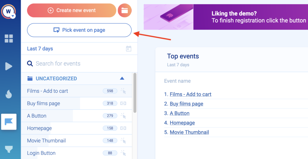
However, Smartlook automatically tracks all user interactions on your website or mobile app with a single code snippet. You can then decide which user interactions you want to analyze by defining standard events like URL visits, button clicks, or text input without any programming. There are 3 ways to define these events:
- Choose from a template of pre-selected standard events like URL visits, button clicks, typed text, and clicks on a CSS selector (allowing you to select any element on the page).
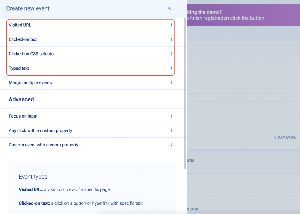
- Use our no-code event picker by clicking on the “Pick event on page” button.
- Define an event from a recording. While watching a session recording, you can pause and turn an important user action into an event, without leaving the recording.
You can also define custom events to track all other user interactions, outside of the standard events. However, a developer will be required since custom events are created via JavaScript.
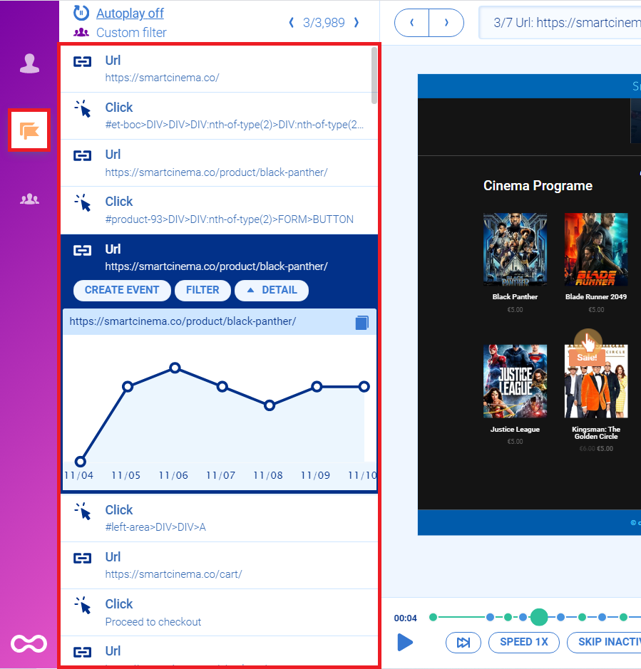
With Smartlook, you can use events to filter session recordings, so you can quickly find sessions that include a specific interaction (event). For example, you can watch sessions of all users who clicked on the “Pay now” button, as shown in the screenshot below.
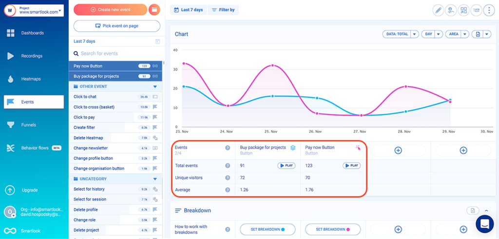
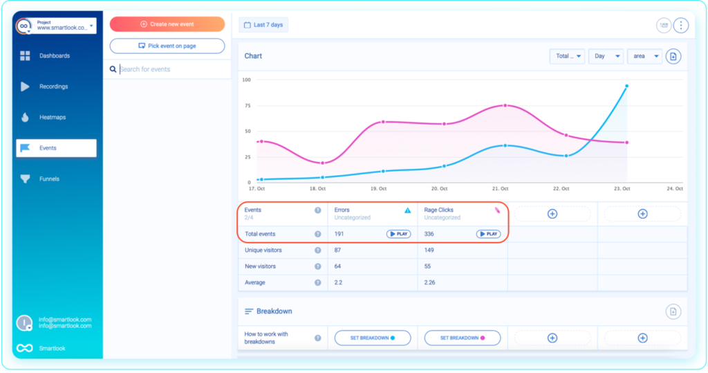
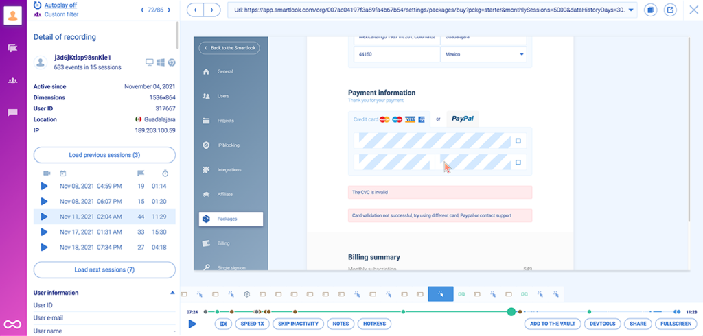
Combining events with session recordings is useful for finding errors, as well as broken or confusing UI elements. Smartlook automatically tracks rage clicks and JavaScript errors, so you can watch only the sessions of users who experienced these issues.
By watching the session recordings, you can see the exact error message that users saw, like in the screenshot below.
You can see how easy it is to define and analyze events with Smartlook’s live public demo (no registration or credit card required).
Inside the demo, open the “Events” tab, and you’ll be able to analyze a few pre-made events or define new ones by clicking on “Create new event.”
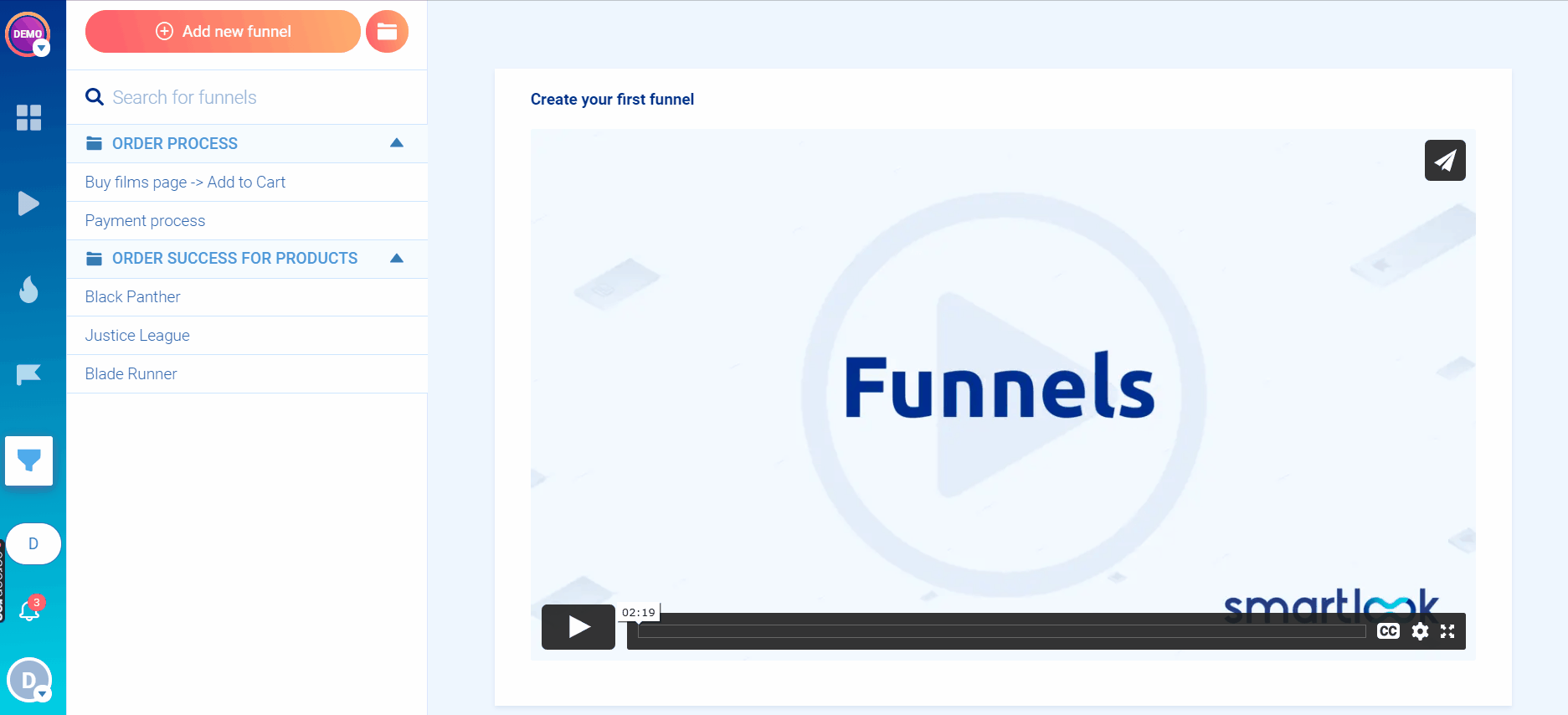
Understand the user journey and measure conversion rates with funnels
Funnels are sequences of steps that users take to complete a goal, like buying a product or signing up for a newsletter.
Building and analyzing funnels helps you understand the entire user journey, calculate important metrics like conversion or cart abandonment rates, and find ways to improve them.
In Smartlook, creating a funnel is as simple as placing 2 or more events in the order you believe your users follow. Once you do that, our funnel visualization tool instantly shows you the funnel, like in the GIF below.
For example, an e-commerce store can build the following funnel with standard events to track their checkout process, from the homepage, through adding an item to the cart, to clicking on “Pay Now” and getting a purchase confirmation:
- Event 1: A homepage visitor clicks on the shop (select the button with our no-code picker to define the event).
- Event 2: The visitor searches for an item (typed text).
- Event 3: The visitor clicks “Add to cart” (clicked on a CSS selector).
- Event 4: They click on the “Pay Now” button (clicked on text).
- Event 5: They land on the “Thank you” page (visited URL).
Again, you can experiment with the funnel analysis tool using Smartlook’s free public demo.
Bringing it all together: Combine session recordings with events and funnels to quickly find actionable insights
As we’ve said before, session recordings are a powerful tool for understanding your visitors’ experience.
However, finding the recordings that’ll answer your questions about user behavior can take a long time if you’re just watching sessions chronologically (which is what you have to do with many session replay tools).
That’s why Smartlook lets you filter sessions by events (as we already showed) and funnel steps. For example, the screenshot below shows a 3-step checkout funnel, with users dropping off between each step.
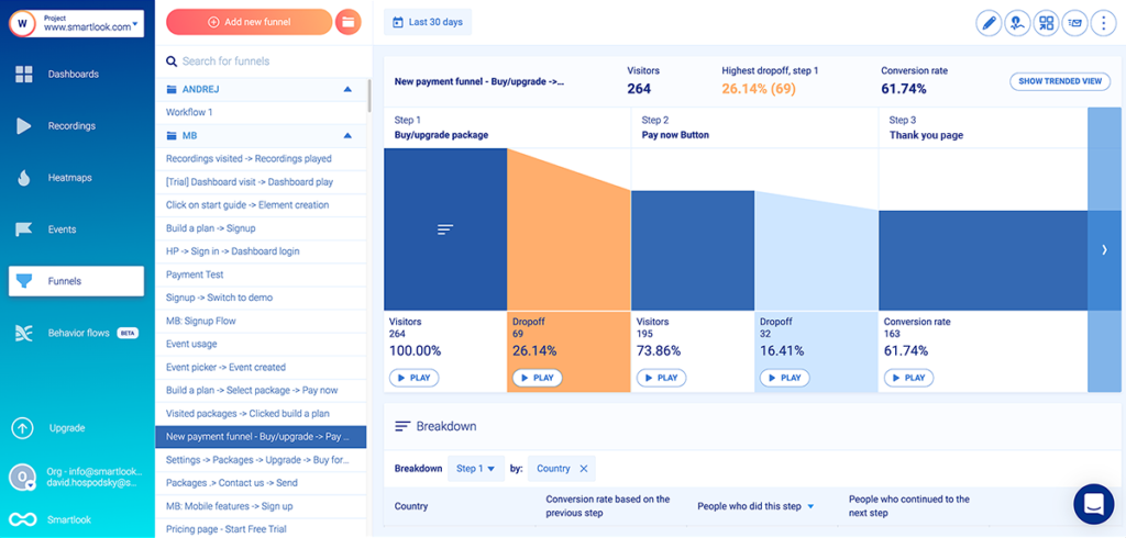
When you click the “Play” button under each step of the funnel, you go directly to the recordings of all users who dropped off at that stage. This saves you both time and effort, as you don’t have to sift through all other recordings.
AstroPay (one of our fintech clients) used a similar process to improve their user experience and sales funnels. First, they defined events and built a funnel for their cryptocurrency purchase process.
Then, they watched session recordings for the funnel stages with the highest drop-off rate (in this case, between Steps 1 and 2), which helped them find a huge opportunity for reducing friction. After optimizing the process based on their findings, they increased the funnels’ conversion rate by 56%.
Get Smartlook and track all user interactions on your website or mobile app automatically
If you want to start analyzing user behavior on your website or mobile app as soon as possible, sign up for a free Smartlook account. Once you install our code snippet, our tool automatically starts tracking all user interactions, which you can then use to create heatmaps, define events, build funnels, and watch session recordings.
Finally, if you want a more detailed presentation of Smartlook that’s tailored to your business, schedule a demo with our team.