


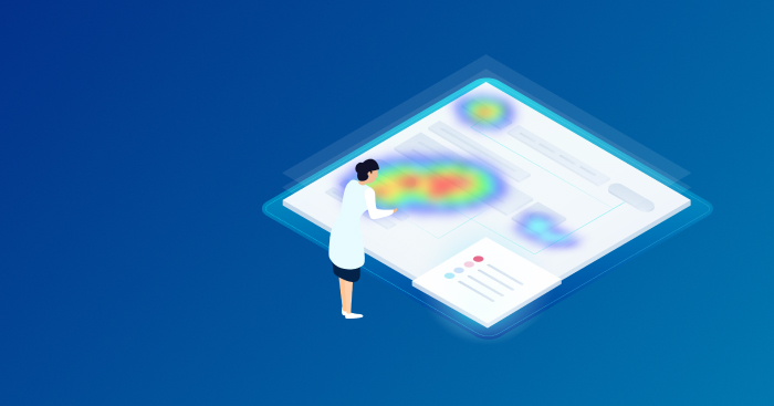
What are heatmaps and how to use them for website and mobile app analytics

A reliable heatmap tool is essential for web and mobile analytics, as well as UX research. They are simple, visual, and easy to use and provide an initial overview of how users engage with your app or website, often serving as a starting point for deeper analysis.
Imagine you’re firing up your heatmap software of choice — what insights can you expect to find?
The thing is — websites and mobile apps are very different, each with a distinct set of business needs informed by your industry and target audience. Are you planning on using heatmaps to optimize the customer journey and improve conversion rates? Or are you more focused on usability and user retention?
Regardless of how you plan to use them, it’s essential that you understand exactly how heatmaps can help your business.
Throughout this guide, you’ll learn everything there is to know about heat maps, including how they are used in web and mobile analytics, as well as typical use cases across various industries like e-commerce, mobile gaming, online banking, and SaaS. We’ll also discuss the inherent limitations of contemporary heatmap tools.
What is a heatmap?
Simply put, a heat map is a data visualization technique. Numerical data is represented by variations in color and hue, giving an obvious indication of what values are high or low relative to each other. Generally, a heatmap scale consists of colors ranging from red to blue, and is inspired by the way images are captured by the infrared camera — hence the word “heat.”
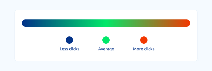
A heatmap gradient showing the meaning behind the color palette
Simple heatmaps are a colored version of a shaded matrix. The visual difference helps you understand the dataset better as you can immediately see which values are the highest and lowest. It also makes it easy to gauge averages.
An example of a simple heat map chart by Fusioncharts
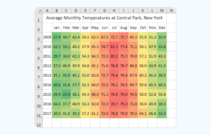
A very intuitive temperature heat map made in Excel
Spatial heatmaps go one step further, overlaying this information on a map or an image to give context to the data. Common examples include population distribution and density, mobile signal coverage, internet penetration, etc.
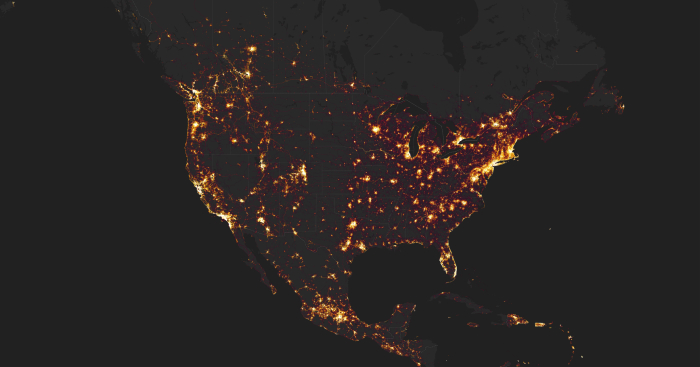
A heat map visualization of cycling activities in the Americas by Strava.com
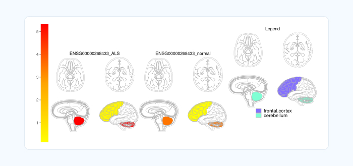
A scientific heatmap superimposed on anatomical images. Source: bioconductor.org
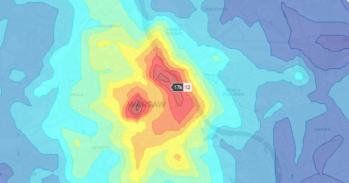
Heatmap of real estate prices in Warsaw. Source: towardsdatascience.com
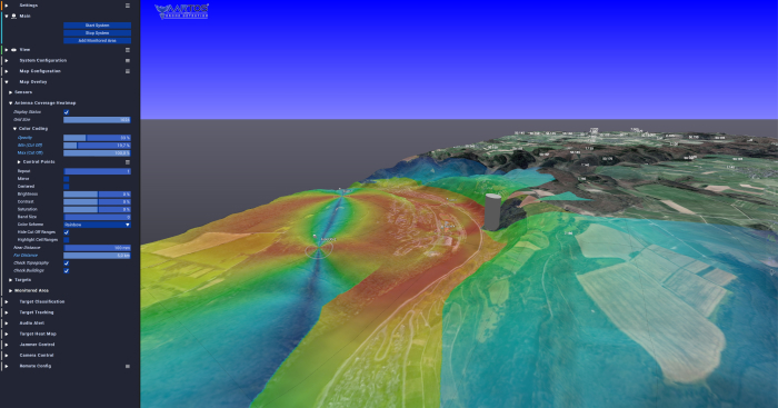
A heat map illustrating the coverage of a drone detection system. Source: Wikipedia
Website and mobile application heatmaps (like the ones we’re talking about in this guide) work exactly like that.
You have a visual representation of click, scrolling, or movement data superimposed over the interface. The hot areas indicate what attracts the majority of user attention, and the cold areas represent the areas that receive minimal interaction — if any at all.
Types of heatmaps for websites and apps
Depending on the interaction data you wish to visualize, there are 3 distinctive types of heatmaps that product owners, digital marketers, UX specialists, and testers can work with.
Scroll heatmaps
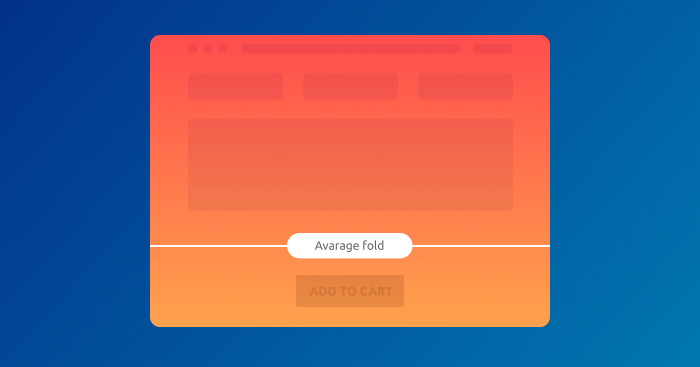
Scroll maps show the portion of users who scroll all the way to the bottom of a page. They also point out exactly where users begin to lose interest.
The key metric for scroll maps is average fold. This indicates the portion of the page that is seen by the majority of users. It’s a page that is displayed on the user’s device without any scrolling.
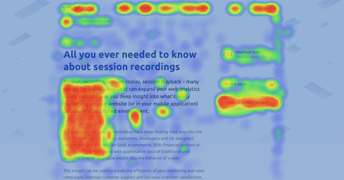
A part of a scroll map for our session recording guide
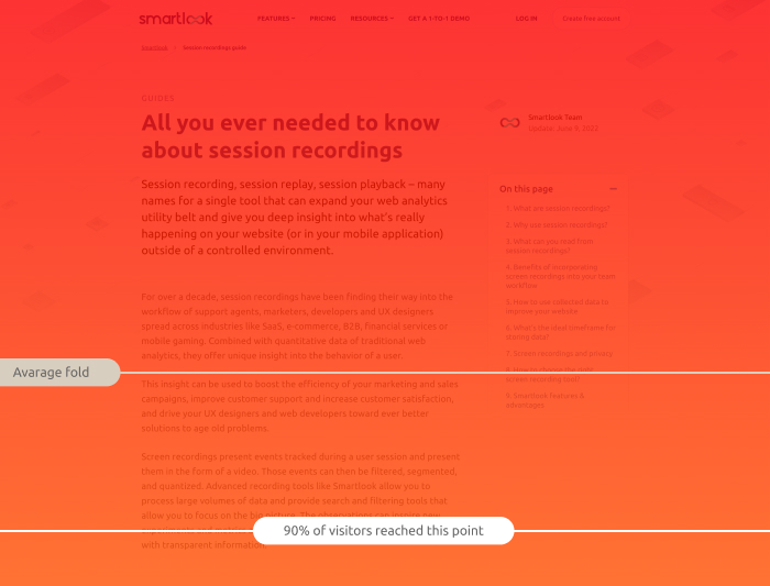
A part of a scroll map for our session recording guide
The rest of the scroll map shows you the percentage of users that scroll down to see the rest of the page.
As a rule of thumb, you should always keep your call-to-action elements above the average fold so that 100% of your visitors see them and have a chance to interact with them.
Scroll maps also come in handy for visualizing the scroll depth of blog posts, tutorials, interviews, and news pieces. It’s not uncommon to learn that a large banner is mistaken for the bottom of a page or that some of your posts are too extensive for the average reader to finish.
Move heatmaps
Move maps track every user’s cursor movement to give you an idea of how they navigate your interface.
Move heatmaps provide you with valuable insight into where users expect to find features and which elements they tend to interact with.
For mobile applications, heatmaps track long touches that are used to navigate the screen and move things around.
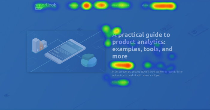
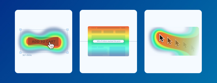
Click heatmaps
Click maps show exactly where users click (or tap if they are on a mobile device).
Clicks can tell you a lot: which options and features users typically interact with, which menu options they choose, and the portion of visitors that click on call-to-action buttons. Click maps can also show you what text or images users think should be interactive, even though they aren’t.
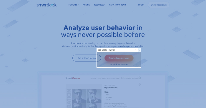
A click map of a Smartlook homepage
In general, heatmaps are an overview of a website or mobile application. They provide you with a quick aggregation of data regarding the engagement rate and overall usability of your website or app so you can ensure that everything is working as intended.
How to use heatmaps
Heatmaps work best as a first step in the analysis process.
They give you a general overview of user activity — what attracts their attention, where they click, and how they interact with design elements — in other words, a broad picture of webpage performance.
Try to start with an idea how an app or website is supposed to work. In UX design, this is often called a hypothesis-led approach.
Once you have your “ideal” user flow mapped out, you can compare it with the actual user data aggregated via heatmaps.
This way heatmaps serve as a valuable tool for testing hypotheses and running experiments to confirm or invalidate assumptions.
Typically, the main takeaway from heatmap analysis is understanding if people notice and click things that you want them to notice and click on.
User segmentation
Heatmap data is only useful in context. When aggregated without a particular expectation or objective, the data can be inactionable or even misleading. For example, users access websites from different devices. The experience varies on a 1080p laptop screen and on a 4K panel. This is especially critical with scroll maps as they track which portion of your user base saw a particular portion of a page. Bigger screens result in more false positives.
However, with a bit of definition, heatmaps can give you quick and actionable insights.
With help from filters, you can create heatmaps that only display the actions of a particular group of users.
When filtered by device, heatmaps are an excellent way to determine which version of your product needs improvement.
Finally, correct segmentation helps you understand how various user groups navigate your website.
For example, if you identify your customers through CRM integration (click here and here to learn about CRM integration with Smartlook), you can see what various groups of customers prioritize when interacting with your website or application.
Say you have a SaaS product with an assortment of plans, like Free, Enterprise, and Unlimited. In this case, it makes sense to separate customers to better address their needs. For example, Free tier customers may gravitate towards basic features, while Enterprise users, having more complex problems to solve, might interact with the interface in a totally different way.
A/B testing
Heatmaps are a great visualization tool for A/B testing as you can quickly see the difference in user behavior.
When compared side by side, heatmaps make it apparent when one option performs significantly better than the other — or when the variable has no effect on the performance whatsoever.
Move maps and click maps can help identify distracting or confusing elements, and scroll maps will show you if one variant appears more scroll worthy than another to your site’s visitors.
UI optimization
At first glance, it seems like a good thing when users have a lot of options. Everyone likes choice, right? But in practice, an overwhelming number of buttons, pop ups, menus, and settings can make a user feel paralyzed, unable to handle the flood of information.
Heatmaps can help you perform a quick triage of registration and sign up forms to determine which fields give your users pause, or determine which buttons in the menu rarely — if ever— get clicks.
If you have an interface for browsing physical or digital goods — like an e-shop page or an in-game purchases menu in a mobile game — a heatmap can show you if certain options perform better than expected.
You can experiment by moving things around to more visible positions to see if it positively impacts your conversion rate.
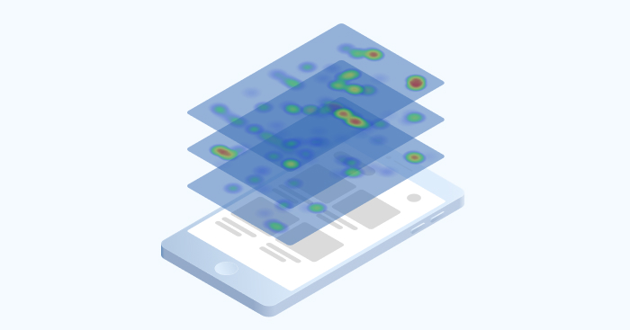
Mobile heatmaps
Mobile devices are increasingly becoming the standard for browsing the web. More than half of all internet traffic comes from mobile devices, while desktop lags behind.
As a result, developing an application for engaging with customers makes more business sense even for the companies that used to rely mostly on their website. Across many industries, the mobile experience is a top priority, and has been for many years.
Heatmaps help you see how users interact with microcopy and show if any elements attract unnecessary attention to give an overall idea of how smooth the navigation is.
Some UI elements distract users. Others don’t attract enough attention.
Heatmaps for mobile apps pose a much bigger technological challenge than website heatmaps. All websites are structured in the same way: you have html, you have some javascript — you have the same overall anatomy.
Apps for iOS and Android devices are a different kind of beast. They can be built using several different technologies which makes analytics implementation difficult and labor intensive.
While the rendering of native apps is similar to web, technologies such as SwiftUI and Jetpack Compose make it much easier for developers to build UI. Unfortunately, they make it difficult for heatmap tools to track user actions. Although there are many other technologies like React Native and Flutter, the underlying problem is the same — as application UI is built and rendered in many ways, analytics software has a difficult time understanding what it’s looking at.
Although infinite scrolling is a popular feature in social media apps, it’s limiting when it comes to heatmaps. As a page continuously changes over time, heatmaps become drastically less accurate.
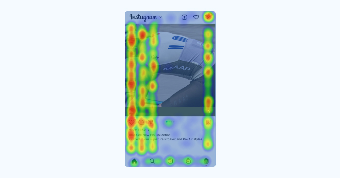
This is what a heatmap of an Instagram page would look like.
Pages where only part of the content is dynamic also pose a great challenge as distinguishing between the two is impossible for many heatmap solutions.
Unlike with PCs, interaction with mobile devices is much more physical, complete with quick taps and long presses, device orientation and zoom-ins, swipes, and rage taps. Heatmaps may give you an idea of where users tap, but context is essential to understand what exactly is happening.
Are users tapping on non-interactive elements expecting something to happen? Are they opening and closing the same menu repeatedly trying to find a way forward? Do they rapidly change back and forth from portrait to landscape mode to get a better position to interact with a button or menu?
When combined with gesture information, mobile heatmaps can help you make quick and effective UX decisions and steer your product toward perfection.
Read more: 5 practical ways to use mobile heatmaps
Data privacy and security
The time when user data was up for grabs on the internet is over (and for good reason). Today, not respecting your users’ privacy can have serious repercussions, including millions of dollars in fines and in some circumstances, civil and criminal liabilities. For this reason, all tracking and analysis practices must take user privacy into account.
Measures like the California Consumer Privacy Act (CCPA) impose certain restrictions on how consumer data is recorded, stored, and managed. Companies risk fines up to $7,500 per violation, meaning the more traffic — the greater the risk.
Companies that operate in Europe, or deal with the data of EU citizens, must comply with GDPR (General Data Protection Regulation). In practice, this means that users should provide express consent to access their personal data and be made aware that they are being tracked. GDPR serves as a blueprint for local regulations in many countries (like Brazil). Fines for non compliance are very steep: Up to €20 million, or 4% annual global turnover — whichever is higher.
If your business handles medical records or protected health information in the US, your use of web analysis tools may need to comply with HIPAA regulations. HIPPA is a very serious regulation. Up to $25,000 in fines for civil penalties — 10 times that if the violation is considered criminal. In addition, the offending party may be required to pay compensation and legal fees to the victims, with the responsible individual risking up to 1 year in jail for negligence.
As heatmaps visualize clicks and other user actions, a certain portion of user activity won’t be represented on a typical heat map when compliance is taken into account.
No less important is the security of the processes with which data is gathered and stored — the threat of data leaks and hacking is very real. Nefarious actors constantly probe systems for weaknesses to get their hands on valuable personal information that can be illegally sold or used for criminal purposes.
Security standards such as SOC 2, established by The American Institute of Certified Public Accountants, put forward principles and best practices that guarantee the confidentiality of end user data.
At Smartlook, we care deeply about privacy and believe that web analytics should afford end-users with the highest standard of protection.
As privacy is a growing concern, the mobile analytics world is moving towards wireframe heatmaps, where all elements are rendered as an abstract representation. Any text or personal visual information is, by definition, excluded from the heatmap.
Ironically, wireframe is how applications and web sites look throughout the concept stage, before the UI is implemented. An abstract, often greyscale, layout prepared by a designer that shows how a future product will look and feel.
Nonetheless, if you don’t consider specific visual elements — wireframe has all the information needed for a thorough UX analysis.
Specifically related to heatmaps, it’s very likely that wireframe will become a standard for mobile click and scroll maps. As privacy standards continue to increase, Smartlook is moving towards wireframe-only heatmaps and session recordings for iOS and Android.
Example uses of website and mobile application heatmaps
Undervalued product category
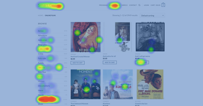
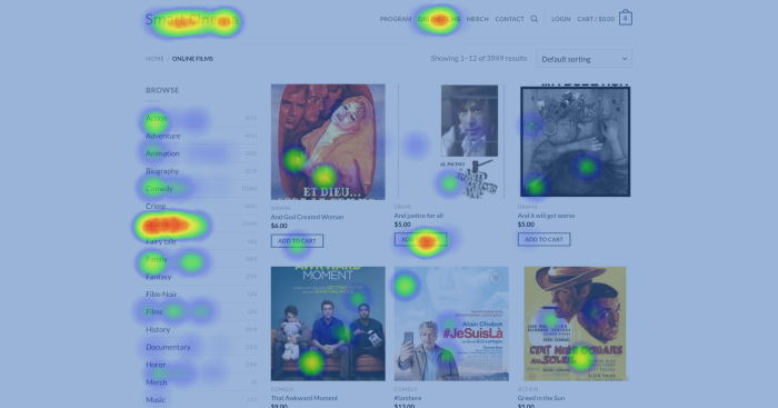
When looking over click data on a spreadsheet, it’s not always obvious how it translates to the user experience.
In this heatmap for an e-commerce website, it’s clearly visible that the Drama category is one of the most clicked items on the menu to the left. The category was moved up to a more prominent position and the number of clicks dramatically increased.
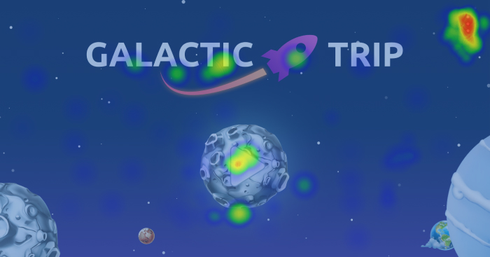
An opportunity in the move map
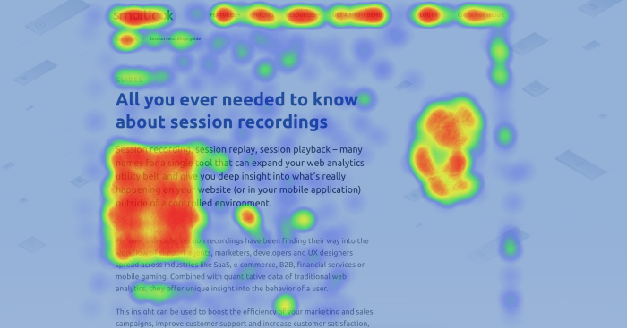
When looking at this move heatmap for Smartlook’s session recordings guide, it’s clear that users tend to keep their cursors on the right hand side of the screen as they scroll — but there is nothing for them to interact with.
The team decided to A/B test a design with a button and menu in a section of the page that saw a lot of movement.
The test showed that the button positively impacted the clickthrough rate.
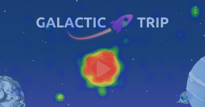
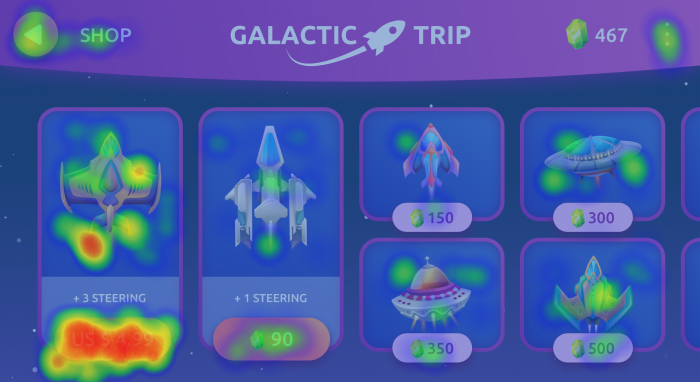
An inconspicuous button
This app screen looks great, but the Play button that developers really wanted people to click looks pretty cold in this heatmap. Even though it seems perfectly intuitive to the designers, most users didn’t notice it and opted to click on the three dots instead.
After taking the data into account, the UX team decided to implement a simple fix.
They recolored the button and made it more noticeable. The number of clicks immediately went up.
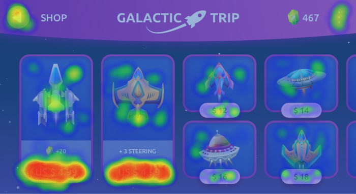
Taps is all the wrong places
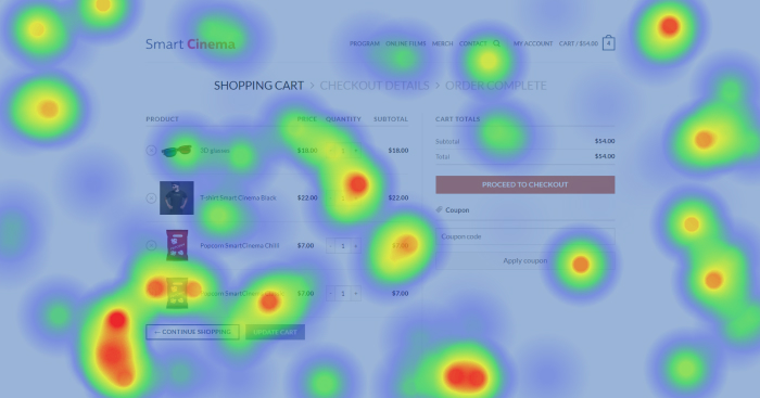
This app screen is as straightforward as it gets — a shopping cart and a checkout button.
Yet, the heatmap shows a lot of clicks all over the place.
There seems to be no particular pattern or logic to it: non-clickable elements receive as much attention as clickable buttons and menu items. This heatmap prompted a UX team and the product lead to pay special attention to this part of the app. It was discovered that due to a bug, the app experienced frequent freezes and crashes when users interacted with the screen. The touches highlighted by the heatmap were rage taps — users poked the screen in frustration before giving up.
Heatmaps for IAP (in-app purchases) optimization

To create a purchase flow free from barriers requires some fine tuning and testing.
Heatmaps can help you understand why certain product pages work better than others.
To optimize the in-game purchases of this mobile game app developers decided to compare interactions between Free and Premium users.
Heatmap indicated that when faced with a choice between items prices in an in-game currency and real money, Premium users gravitated towards the latter. A resulting decision to update the store to show mostly real-currency prices to Premium users led to an increase in overall sales.
Of course, there are as many heatmaps use cases as there are businesses. Digital marketers and growth hackers use heatmaps to test products and landing pages. E-commerce specialists use them to investigate shopping cart abandonment, and mobile game developers have countless possible use cases, including tracking user engagement with game features and in-app purchases.

Benefits of heatmaps
When your business begins growing lightning fast, what was perfectly manageable yesterday can quickly get out of hand. As more and more users flood your website or download your app, any inefficiency results in more potential revenue falling through the cracks — no time for analysis paralysis.
Under such circumstances, heatmaps are a great tool to help you make a quick decision.
In large organizations, processes are often slower, which is okay when the stakes are high and you need weighted, deliberate decisions. The key problem often lies in the realm of communication — stakeholders want to be involved in the process and be informed about arising issues without having to dive headfirst into complicated data analytics reports.
Visually intuitive heatmaps help achieve just that. They help product specialists and UX-teams turn user actions into a story, and help other teams to better understand the problems and proposed solutions.
Heatmaps work great as a supplemental tool for conversion rate optimization (CRO). They can key you in on the impact of recently implemented changes — an increase in useful interactions is sometimes immediately apparent.
For usability testing and UX optimization, heatmaps provide a user-centric angle: they allow you to put yourself into a user’s shoes and find ways to steer their attention toward important content.
Limitations of heatmaps
While heatmaps are easy to understand and are often visually appealing, you should have reasonable expectations when it comes to reviewing the results and insights gained from them.
A heatmap is simply one tool, albeit, an undoubtedly useful tool, in the arsenal of product managers and UX specialists.
Heatmaps are only as good as the data they are comprised of. If data is sampled, the results of the heatmap can be very misleading. Sampling is the practice of analyzing a subset of a data set, instead of the entire dataset. In simple terms, when the data is sampled it means you are not getting the complete picture, but rather a limited part with the assumption that the rest of the data set performs similarly.
In practice, when it comes to analyzing user behavior, this assumption can be pretty far from reality.
For example, heatmaps prepared with data from Google Analytics — a solution that utilizes data sampling for various reasons — won’t be as accurate as a heatmap created with a dedicated tool like Smartlook, that relies on accurate, unsampled data.
But even with accurate data gathering methodology, volume is another factor that can impact the accuracy of heatmaps. Visualizing the activity of 20 users simply won’t give you any actionable insights.
Aim for at least 1,000 sessions for a basic heatmap, and 10,000 or more for maximum accuracy.
Although heatmaps give you a decent view of what happens on your website or app, they don’t tell you why users behave the way they do. You’ll require further research to pinpoint problems.
The next steps
To reiterate what we covered previously, heatmaps usually serve as the first tool in the analysis of an app or a web platform.
The natural next step after studying a heatmap is to review individual session recordings. A session recording is functionally similar to a video: you see a recording of a user’s interaction with your web page or app. You can see where an individual visitor clicked or didn’t click.
Session recordings allow you to study individual use cases, helping you zero in on the experiences of individual users aggregated in your heatmap.
If users are not finishing the check out procedure in your e-shop, you can watch recordings of customer visits to get a better understanding of why certain actions were not taken.
If the users are not noticing a key button or ignoring a feature, session recordings can put you in their shoes to find a solution to the problem.
Events and funnels can help you optimize specific parts of the customer journey.
Events allow you to track specific user actions like clicking buttons or typing search queries.
With events, you can focus on data points that are important for your business model and perform more complex data analysis.
Funnels give you a detailed view of the customer journey from the moment they enter your website to the click that results in a conversion. With funnels, you can refine your marketing segmentation, analyze a typical customer’s path on your website, and address specific issues.
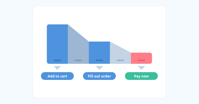
For example, say you notice that despite the large volume of new traffic to your e-shop, conversions are not growing as expected. A well-defined funnel can help you analyze the customer journey to determine that, although a big portion of potential buyers add goods to the shopping cart, they abandon it without payment.
In this way, the combined use of mobile analytics tools is not unlike detective work. You gather clues and analyze the evidence to understand how your customers experience your website or mobile application. All you need to do is remove the roadblocks from their way.
Starting with heatmaps
To start working with heatmaps, you will need to choose an analytics tool with heatmap functionality and incorporate it into your app or website.
This usually means adding a bit of code to your site’s html or mobile app.
Depending on the particular heat mapping software (and subscription plan), you will be able to create a number of heatmaps. Free plans often capture a limited number of user sessions. They are most suited for personal use, while various paid options record and process more data, allowing for increased accuracy and longer data retention periods. Pricing varies, but usually heatmaps are included with website tracking tools that are subscription-based or SaaS.
Smartlook is one such tool. It’s easy to implement and includes session recordings, heatmaps, events, and funnels with cross-platform functionality. It also utilizes your historical data, so you don’t have to wait for new sessions to accumulate before getting your first insights.
Whether you are starting to discover the amazing multitude of insights website and mobile analytics have to offer or already have experience, you can check out heatmap functionality with a free Smartlook demo account.
Heatmaps are used by digital marketers, product managers, and UX teams to make decisions that help optimize flow and improve conversions. QA testers also use them to better understand and reproduce issues.
1. A scroll map is vertical. The color illustrates what portion of users scroll down to the bottom of the page.
2. On a move map, hot areas depict where the majority of users move their cursor. Don’t confuse this with eye tracking — move heatmaps are not representative of where users are looking. Mouse movement can give you an idea of how users engage with your site or application.
3. Click maps display the most clicked areas as red-hot, median as yellow-green, and the least clicked areas as blue. They help understand which page elements attract attention and which don’t.
Heatmaps also need additional context to lead you to actionable conclusions.