Heatmaps provide a useful overview of the typical user’s behavior on a web page or mobile app screen. And since they’re easy to create and read, they’re a natural starting point when analyzing how users interact with a product, website, or mobile app.
However, even some of the best heatmap tools have some serious limitations. Specifically:
- They usually provide obvious, non-actionable information. The hotspots on a page or screen that indicate click density (or scroll depth) are usually clustered around buttons (or at the top of pages), which is exactly what you’d expect. Oftentimes, this information doesn’t give you any insights on how to improve your conversion rates, because it’s missing the context about what users did before or after clicking a button or what percentage of them converted to paying customers.
- They can’t track a single user’s journey across your site. Since heatmaps only show aggregate trends about a single page, you can’t use them to uncover trends about user interactions with elements that appear on multiple pages. This means you can’t put specific interactions, like button clicks or text inputs, in the context of the entire user journey.
- Some of them can’t handle dynamic content. Unless the heatmap tool also records user sessions, it can run into problems on JavaScript-heavy pages with frequently changing content (like social media sites), making the heatmap unreliable.
In short, heatmapping tools that don’t offer any other analytics features are limited when it comes to providing actionable insights that can help improve your users’ experience and conversion rates. Additionally, most heatmap solutions are available only for websites, so you can’t use them to track user behavior on mobile apps.
In this article, we’ll show you how our tool — Smartlook — was designed to overcome these common heatmap limitations.
Specifically, you’ll learn how to easily create three different types of heatmaps for your site or mobile app, while also using session recordings, events, and funnels to get the insights that heatmaps alone can’t provide.
Lastly, we’ll also compare eight other heatmap software tools. Here are the heatmap tools covered in this article:
Try out Smartlook today with our full-featured, 30-day trial: no credit card required. Our tool captures every user interaction on your website or mobile app and lets you create heatmaps, define events, build funnels, and watch session recordings.
1. Smartlook
- Web or mobile app heatmaps: Both. Smartlook can be used on websites as well as native iOS and Android mobile apps and games.
- Key features: Heatmaps, session recordings, event tracking, funnel analysis.
- Free plan: Records up to 3,000 user sessions/month (no credit card required). Paid plans start at $55/month (for our startup plan), with a 30-day free trial.
Smartlook is the only combined product analytics and visual user insights platform that won’t take your team forever to set up.
Our tool comes with four key features that help you see what your users do and uncover why they do it — heatmaps, session recordings, events, and funnels. This unique feature set lets you take full advantage of heatmaps’ benefits, while also overcoming their limitations.
In fact, in the next sections, we’ll look at:
- The three different types of heatmaps you can create with Smartlook and how to get the most value out of them.
- How session recordings, events, and funnels can give you even more insight into why visitors do what they do.
Create and analyze three different types of heatmaps for your website or mobile app
With Smartlook, you can create three different types of heatmaps: click maps(left in the screenshot below), move maps (middle), and scroll maps (right).
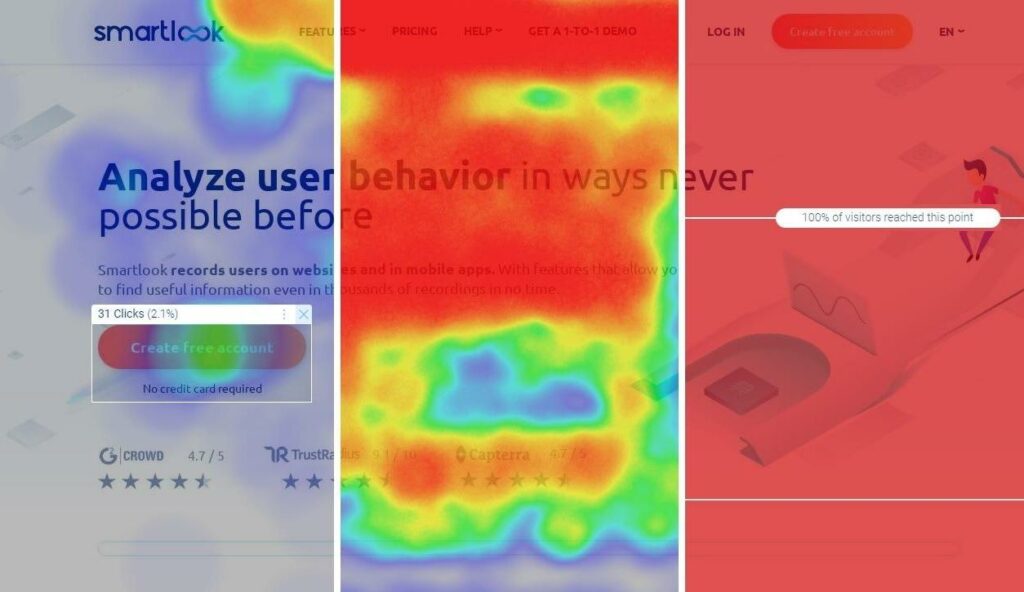
Each type of heatmap provides different information about your users’ behavior:
- Click maps show where users click and how often they interact with call to action (CTA) elements.
- Move maps show where users move their cursors while navigating a page.
- Scroll maps show what percentage of users reach each part of a page.
And since Smartlook automatically collects every user interaction (including clicks, scrolls, and mouse movements), newly created heatmaps instantly get populated with historical data, as far back as your data retention plan goes. This means you don’t have to wait for data collection every time you create a new heatmap.
Even with their inherent limitations, heatmaps are a great way to quickly get aggregate data on how users interact with certain pages or mobile app screens. We’ve discussed how to create and analyze heatmaps in other articles, so we won’t cover all of the details here. If you’re interested, check out our guide on how to read a heatmap.
For now, let’s look at two specific ways our customers use heatmaps to gather valuable information about their users.
See which buttons users click and which parts of your pages they ignore
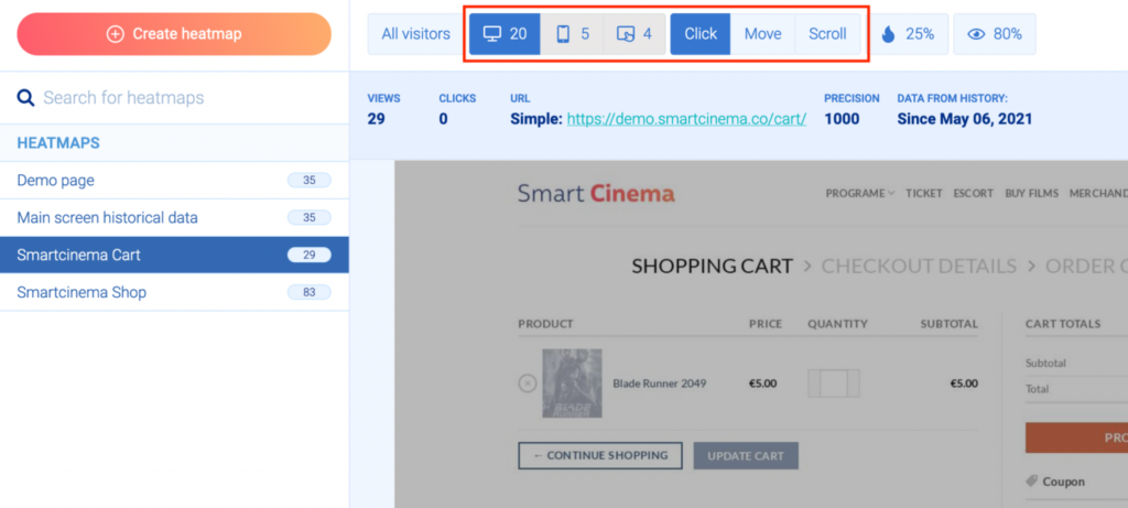
As we said, click maps show you where users click (on desktop) or tap (on mobile).
For example, the screenshot below shows a desktop click map with a few colored regions where users click. The red center marks the area where most clicks occurred.
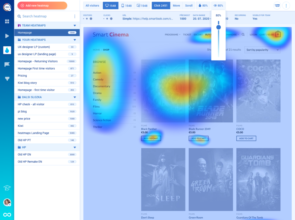
With Smartlook, you can select an area and see the actual number of clicks recorded and what percent of the total page clicks they represent.
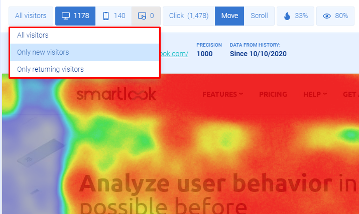
Next, scroll maps show you what percentage of visitors reach each part of a page. All scroll maps start with a bright red area at the top (since all users land there) and turn yellow, green, blue, and gray as users drop off down the page.
Scroll heatmaps are useful for:
- Finding the average fold on a page. The average fold is the part of your page that most users see without scrolling. Smartlook shows the average fold by default, so you can quickly find what users see when landing on a page. Knowing where the average fold falls helps you make informed decisions about element positioning. For example, if you have text, buttons, or any other page elements that you must show to everyone, it’s a good idea to place them above the average fold.
- Finding false bottoms. False bottoms are a design flaw that confuses people into thinking that a page ends before it does. In general, scroll maps should gradually fade from one color to the next, like from yellow to green. Sharp changes in color in a scroll map, like going from yellow to blue instead of a gradual fade to green and then blue, may indicate a false bottom.
Analyzing both click maps and scroll maps can reveal lots of useful information about your users’ behavior. For example, our customer Sewio used heatmaps on their homepage to discover that:
- Some buttons in the hero section were appearing below the fold where users might not see them.
- Almost no one was clicking on the client logos that lead to customer success stories.
- There was a 30% visitor drop-off between the logos and subheadline right after them, which indicated that some people perceived that point as a false bottom.
Armed with these insights, Sewio started making changes to the page design. Most importantly, they moved their main CTA buttons above the fold and reworked the section that had links to customer success stories. The result was a 276% click-through rate (CTR) increase for their “Go to store” button and a 3.1x increase in clicks on the success stories.
Use filters to analyze your heatmaps based on different criteria
Different categories of users interact with your site or app in radically different ways. If you’re only looking at aggregate data of all user actions on a page or screen, you can easily make incorrect conclusions about users’ behavior. That’s why Smartlook has lots of filtering options, which you can apply to your heatmaps.
First, two default filters:
- Desktop vs mobile vs tablet visitors. Desktop and mobile screens are vastly different, which affects what users see and click. For example, headlines and CTAs might catch the attention of desktop visitors, but be barely noticed by mobile ones, due to their positioning on a smaller screen. In Smartlook, you can use the buttons above the heatmap to switch between mobile, desktop, and tablet users.
- New vs returning visitors. Website visitors that already know your site and are looking for something specific behave differently than those arriving for the first time. Understanding these differences is important for improving the journey for each type of visitor.
Besides these defaults, Smartlook also has many other filtering options, like country, browser, referrer URL, UTM tags, and more.
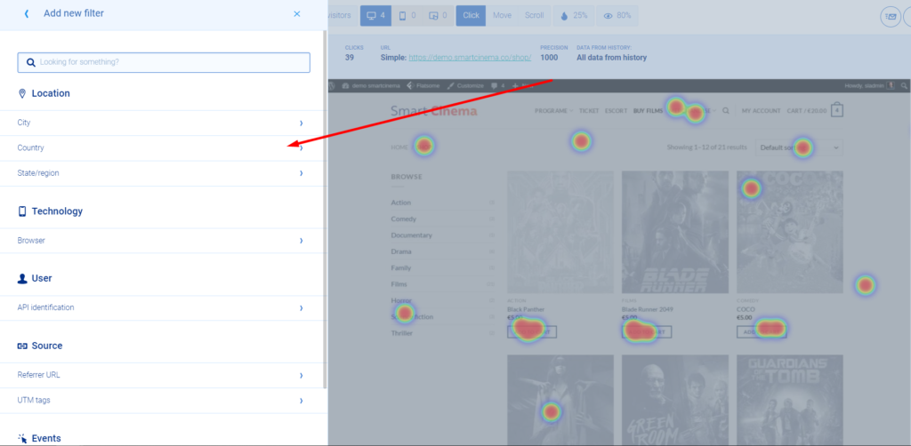
For example, say you want to see how visitors from the UK interact with your site’s homepage.
In that case, you can create a new heatmap and click on “Add filter” even before entering the page URL. Then, go to the country filter and select the UK. Lastly, enter the homepage URL, and click “Create heatmap”.
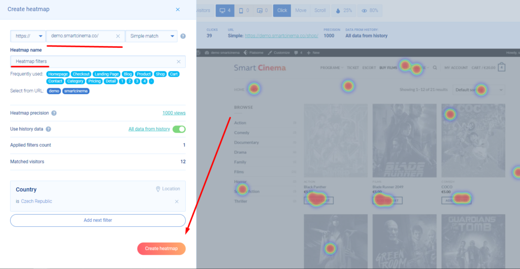
Note: These non-default filters have to be set up when creating the heatmap, not after it’s already been created.
As you can see, heatmaps are a quick and easy way to get some useful data about your users’ behavior.
But, as we mentioned, heatmaps come with certain limitations. Specifically, they can’t tell you why users do what they do. Since they don’t show you the why behind users’ actions, heatmaps typically can only give you a guess as to how you can improve the user experience.
In the next sections, you’ll learn how to overcome this problem by getting actionable insights with the help of session recordings, event tracking, and funnel analysis.
Session recordings: See the entire user journey with every interaction in it
Session recordings (sometimes called session replays) show you what individual users saw and did from the moment they opened your site or app to the moment they closed it. This means you get the full context behind their actions, which helps you determine why they didn’t convert or where they struggled.
Smartlook captures each user session on your site or mobile app automatically after our code snippet is added. You’ll know Smartlook is working as soon as your first user session recording comes in — which typically takes no more than a few minutes for websites and apps receiving a healthy volume of daily traffic.
You can find all session replays in the “Recordings” tab of your Smartlook dashboard.
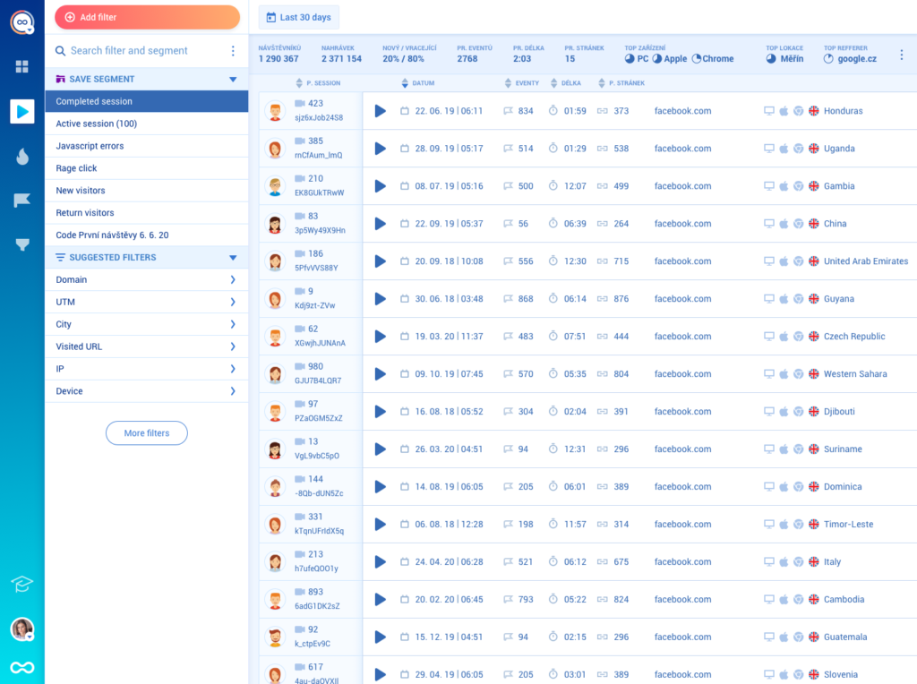
You can also use over 30 filters to quickly find the sessions you want to watch, including things like session duration, country, device, new or returning visitor, and more.
Event tracking: Uncover trends about user interactions with elements that appear on multiple website pages or app screens
Besides watching sessions, it’s important to track specific user interactions over time, like URL visits, button clicks, and text inputs.
In Smartlook, these interactions are called events. As we said, our tool automatically records all user interactions on your website or mobile app, so you only have to decide which ones you want to analyze as events.
And, unlike other analytics tools, with Smartlook, you don’t need any coding skills to track most website events. On that note, if you want a step-by-step explanation on setting up event tracking, check out our in-depth guide to tracking user activity on your website.
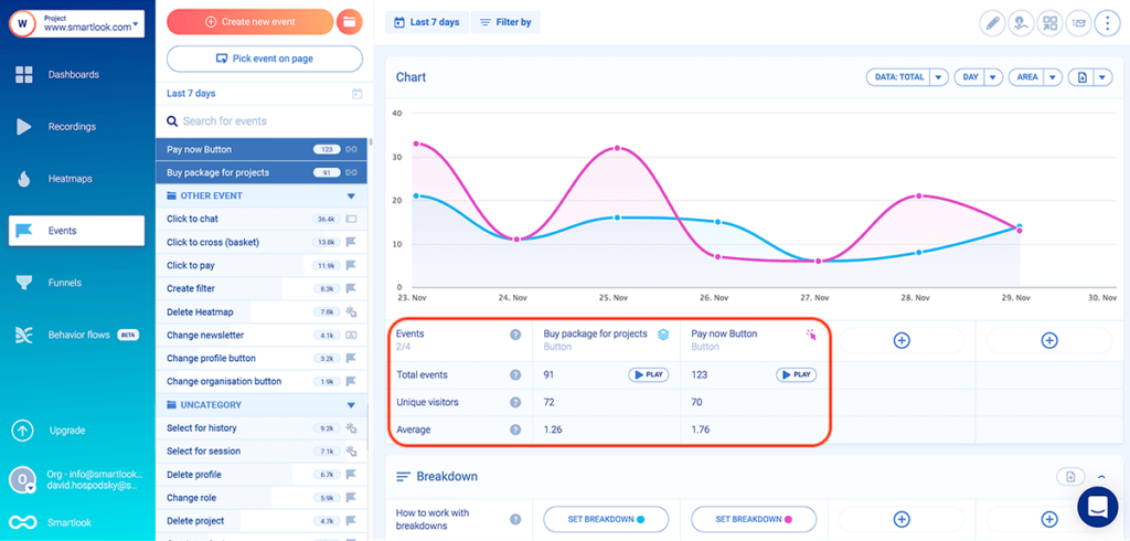
For now, it’s important to note that event tracking lets you uncover trends about user interactions with elements that appear on multiple pages or screens of your site or app. This is a huge advantage over heatmaps, which can only show data about a single page or screen.
Additionally, Smartlook lets you use events to filter session recordings, so you can quickly find sessions that include a specific interaction (event). For example, you can watch sessions of all users who clicked on the “Pay now” button — regardless of what page they were on or what they were purchasing.
You can see how easy it is to define and analyze events with Smartlook’s live public demo (no registration or credit card required).
Funnel analysis: Understand the user journey, measure conversion rates, and find out why users drop off
Funnels are sequences of steps (events) that users take to complete a goal, like buying a product or signing up for a newsletter.
Building and analyzing funnels in Smartlook shows you how many people move from one step to the next through key user flows, as well as the conversion rates between each step.
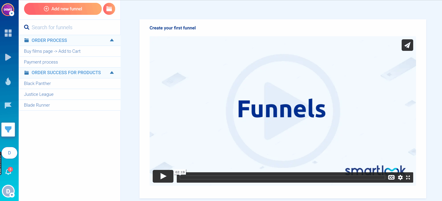
Creating a funnel in Smartlook is really simple — you just place two or more events in the order you believe your users follow and the funnel visualization will appear instantly, like in the GIF below.
For a deep dive on how to build and analyze funnels with Smartlook, check out our funnel analysis guide.
While analyzing funnels can show you where most users drop off, it’s not always clear why. That’s why Smartlook also lets you combine funnel analysis with session recordings.
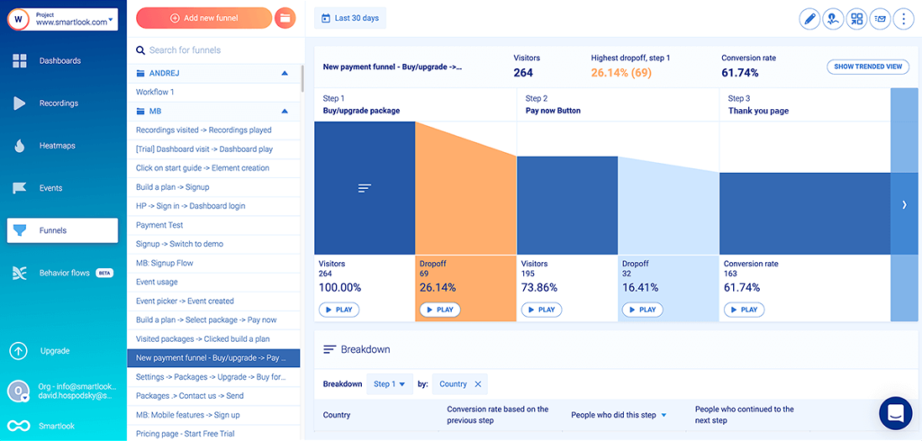
For example, the screenshot above shows a three-step checkout funnel that maps the purchase flow of a SaaS app. The funnel consists of three steps (events), which you can define in Smartlook without any programming:
- Step 1: Visitors click on the “Buy/upgrade package” button. Smartlook has a no-code event picker, which you can use to select the button and define the event.
- Step 2: Visitors click on the “Pay Now” button. Again, you can use the event picker and select the “Pay Now” button.
- Step 3: Visitors land on the “Thank You” page.Our tool has a “Visited URL” standard event, so you only have to enter the page URL to define this event.
As you can see in the screenshot above, Smartlook automatically shows the funnel’s conversion rate, as well as the drop-off rate between each step.
There’s also a “Play” button under each step of the funnel, including the drop-off steps. When you click it, you go directly to the recordings of all users who dropped off at that stage. This saves you tons of time and effort, as you don’t have to sift through all other recordings of users who went through the funnel successfully.
In fact, AstroPay (one of our fintech clients) used a similar process to improve the user experience and conversion rates for their cryptocurrency purchase flow.
First, they built a funnel that maps the steps users take to buy a cryptocurrency via their app. Then, they watched session recordings for the funnel stages with the highest drop-off rate. This helped them find big opportunities to reduce the friction during the process.
Specifically, AstroPay’s team learned that:
- Users who didn’t have their local currency in their e-wallet had to take extra steps to buy a cryptocurrency.
- Users spent minutes frantically searching for newly purchased cryptocurrencies in the wallet, not realizing their transactions were still pending.
After optimizing the process based on their findings, AstroPay increased conversions for the cryptocurrency purchase funnel by 56%.
Want to start analyzing and improving the experience of your website or mobile app’s users? Start our full-featured, 30-day trial today: no credit card required. Want more time to evaluate? Hang out on our forever-free plan as long as you need.
2. Crazy Egg
- Web or mobile app heatmaps: Web only.
- Key features: Heatmaps, session recordings, A/B testing, and surveys.
- Free plan: No free plan available, only a 30-day trial for all paid plans.
Crazy Egg is a conversion rate optimization (CRO) and web analytics tool. It offers heatmaps, overlay reports, user recordings, A/B testing, and features for tracking ad traffic on your website.
3. Hotjar
- Web or mobile app heatmaps: Web only.
- Key features: Heatmaps, session recordings, surveys, real-time feedback.
- Free plan: Records up to 35 user sessions/day.
Hotjar is a website heatmap tool that also offers session recordings, user feedback widgets, and survey features. It’s a beginner-friendly tool suited for marketers, product managers, and UX professionals.
Two downsides to this tool, which we’ve discussed in our Hotjar alternatives article, are its limited quantitative analytics functionalities and the lack of support for mobile apps.
4. Lucky Orange
- Web or mobile app heatmaps: Web only.
- Key features: Session recordings, heatmaps, conversion funnels, surveys.
- Free plan: Available for websites with up to 500 pageviews/month.
Lucky Orange has features for both visitor behavior analysis (heatmaps and session recordings) and CRO (funnels, form analytics, and live chat.)
5. Mouseflow
- Web or mobile app heatmaps: Web only.
- Key features: Session replay, heatmaps, funnels, user feedback.
- Free plan: Supports up to 500 user recordings/month.
Mouseflow is a session recording tool for websites that also offers heatmaps, conversion funnels, and more.
6. Inspectlet
- Web or mobile app heatmaps: Web only.
- Key features: Session recordings, heatmaps, A/B testing, feedback surveys.
- Free plan: Records up to 2,500 sessions/month.
Inspectlet is a website analytics tool that comes with additional CRO and debugging features (A/B testing and error logging).
7. FullStory
- Web or mobile app heatmaps: Both.
- Key features: Session replay, funnels and conversions, journey mapping.
- Free plan: No information about a free plan, only a 2-week free trial. Price for business and enterprise plans is available upon request.
FullStory is an analytics platform that has a session replay tool, funnel analysis, features for segmenting and filtering users based on their actions, and more.
Important note:FullStory is geared toward enterprise users, so it doesn’t have transparent pricing on its site. As a result, lots of online reviews mention its steep price tag, as we discussed in our FullStory alternatives article.
8. VWO
- Web or mobile app heatmaps: Some VWO features are available for mobile apps, but heatmaps are only for websites.
- Key features: Session recordings, heatmaps, A/B testing, product testing features.
- Free plan: No free plan, only a 30-day free trial.
VWO is a CRO platform, mainly used to boost conversions through A/B, multivariate, and split URL testing. Beyond that, VWO also has features for usability testing, sending push notifications, and more.
9. Clarity
- Web or mobile app heatmaps: Web only.
- Key features: Heatmaps, session recordings, insights, Google Analytics integration.
- Free plan: Clarity is free.
Clarity is a free behavior analytics tool from Microsoft that offers session recordings, heatmaps, automated insights, and an integration with Google Analytics — but it doesn’t have any quantitative analytics features. Clarity’s heatmaps are also relatively limited as compared to Smartlook: it can’t support capturing dynamic sections of a webpage, such as a menu that opens as you hover over it, and it doesn’t offer move maps.
Try Smartlook for free today
You can create a free Smartlook account today (no credit card required) and start analyzing your visitors’ behavior with the help of heatmaps, session recordings, events, and funnels.
Our tool can be used on various types of websites, including those built with popular CMSs like WordPress, Joomla, and Shopify. Implementing Smartlook on your site is as easy as pasting a code snippet (directly or via Google Tag Manager).
Smartlook also has SDKs for 10 native mobile app platforms, frameworks, and engines — including iOS, Android, React Native, Flutter, Unity, and Unreal Engine. We also have detailed documentation to guide you through mobile app implementation step-by-step — but if you get stuck or have any questions at all, our Support team is ready and waiting.
For an in-depth Smartlook presentation that’s tailored to your business, schedule a demo with our team.