UX analytics is the process of gathering quantitative and qualitative data about the user experience to inform the design process. Without reliable behavior data, there’s no way to be sure that any design changes you make will better serve your users.
Traditionally, UX analytics tools have made it easy to gather quantitative data, which can help researchers understand what users do. But to gather qualitative data — the subjective insights about what users really want or need or why they behave the way they do — researchers have had to go through an expensive and time-consuming process of conducting interviews, doing usability testing (or user testing), and gathering customer feedback through surveys.
But many companies don’t have the budget or resources to set up a testing space, recruit product testers, and spend time interviewing real users about what works. Because of this, a lot of teams end up relying on quantitative data alone, which can easily be misinterpreted. For example, quantitative data can tell you that a landing page has a high bounce rate, but there’s no way to know whether that’s because users found what they were looking for immediately or the page was so confusing they left.
Fortunately, there’s a new class of UX analytics tools that offer an efficient way to gather both quantitative and qualitative data: session recording tools.
Our tool, Smartlook, was designed to help UX researchers, product managers, and marketers gather accurate user behavior data quickly and cost-effectively by automatically capturing every interaction of every real user on your site, product, or mobile app.
In this article, we’ll show you how to use Smartlook to track and quantify specific user actions and trace them back to session recordings, so you can be confident your design decisions are based on accurate behavior data.
Then, we’ll compare six other UX tools for quantitative and qualitative analytics. Here are all the analytics tools we’ll compare in this article:
Lastly, we’re also going to cover two A/B testing tools: Google Optimize and Optimizely. While these aren’t analytics tools per se, they’re vital when researching user behavior and testing design hypotheses.
If you want to start analyzing the user experience on your website or mobile app today, sign up for a free Smartlook account (no credit card required).
1. Smartlook
- Quantitative or qualitative analytics: Both.
- Session recordings: Yes.
- Web or mobile analytics: Both. Smartlook can be used on websites as well as native iOS and Android mobile apps and games.
Smartlook helps over 2800 paying organizations analyze user behavior on their websites and mobile apps.
Once Smartlook is set up, it automatically starts recording all user sessions, so you can watch each users’ entire experience.
Smartlook also automatically tracks specific user interactions (like URL visits, rage clicks, or in-app purchases) and gives you the ability to trace them back to the session where they occurred. This capability lets you do two things:
- Verify that the quantitative data was gathered correctly. If the data shows that 15 users clicked on a call-to-action (CTA) button, you can replay the sessions of those 15 users to see them actually click on the button. You don’t have to trust that a developer set up the data collection correctly.
- See the interactions you’re tracking in the context of the users’ full session. In many cases, watching a user’s session will immediately show you why a user did what they did. Session replays can also quickly reveal bugs or problems with the user experience that would take weeks to figure out through cycles of A/B testing.
Here’s how this process works in detail.
Record all your users’ sessions automatically
Again, Smartlook’s session recordings are always-on by default from the moment our tool is set up. This mechanism ensures that:
- You don’t have to worry about turning session recordings on and off.
- You won’t be working with a limited sample or missing vital data when it comes time to research users’ behavior.
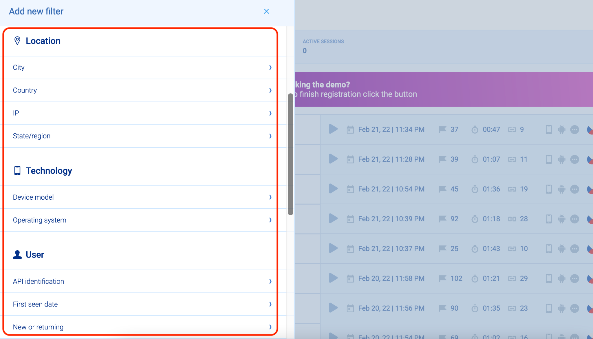
You just have to set up Smartlook (by selecting your platform or framework and following the instructions) and session replays will start appearing in the “Recordings” tab of your dashboard.
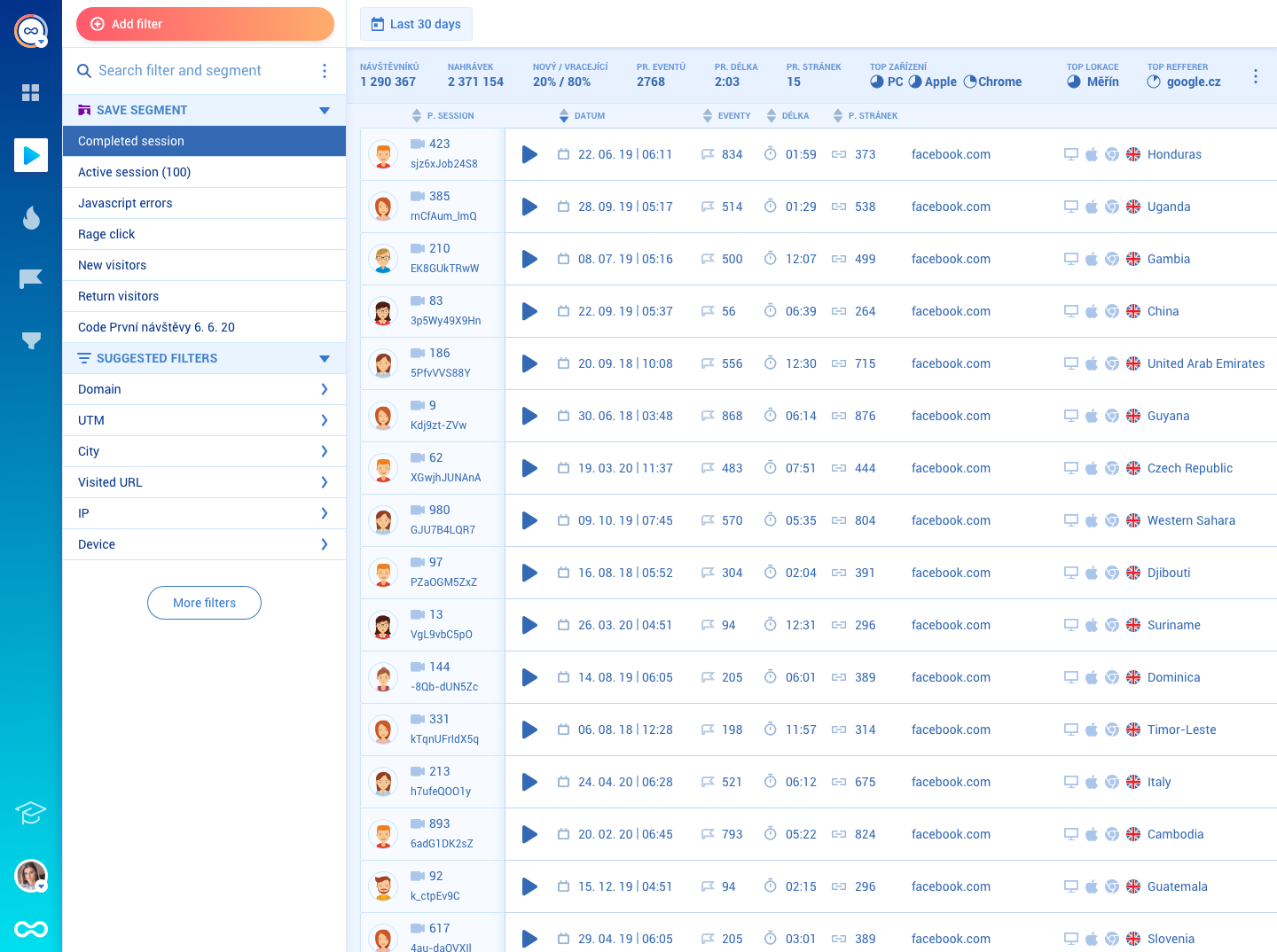
There are more than 30 filters available to help you find relevant session recordings fast, like device, operating system, new or returning users, and more.
A common scenario we see UX researchers and product teams explore with session recordings is the onboarding experience.
To find session recordings that show you real users’ onboarding experiences, you can add a filter for new users and another filter for sessions that include an event that happens during onboarding (like creating an account). You’ll then see a list of sessions of all new users of your product who completed that event during the specified date range — and you can watch each one, or add more filters to further narrow down the list. One of our clients (Vertigo Games) does this to understand what type of first impression their games make, as that’s crucial for retaining users.
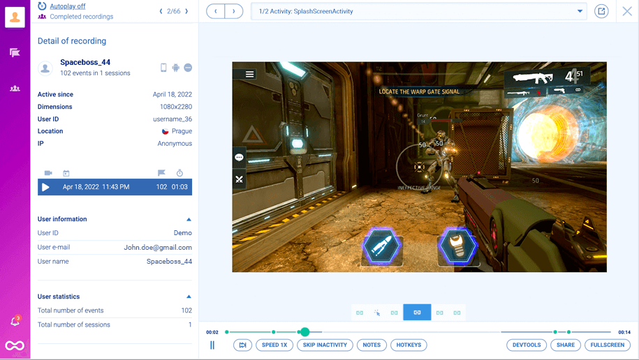
Smartlook also has an Identify API that you can set up, so that specific user details (e.g., username or email) get parsed into Smartlook. If you do that, these details will appear in users’ recordings, as you can see in the screenshot below.
Besides helping you find replays of an individual user’s sessions instantly, the Identify API can also be used to integrate Smartlook with A/B testing software like Google Optimize and Optimizely. Once you do that, you can jump straight into recordings of users who landed on a specific variant of a page or screen you’re testing.
In addition, Smartlook’s Session Vault lets you save specific session recordings for a longer period than your plans’ data retention period. That way, you can store important replays for a long time and refer back to them when you need to.
Lastly, Smartlook allows you to set up masks on any user input forms to exclude sensitive information so that it never gets sent to our servers.
While session recordings are a powerful tool, combining session replays with traditional quantitative tools (events and funnels) provides even more opportunities to quickly uncover vital insights about the user experience.
Track important user interactions and filter session recordings with events
Smartlook lets you track specific user actions over time, like button clicks, account logins, or form submissions. This capability lets you quantify how users interact with your site or app.
The interactions you track are called events. To choose which interactions you want to appear in your dashboard, you have to define an event.
With Smartlook, you can define events in four ways:
- Choose among pre-selected standard events: URL visits, button clicks, text input, or clicked-on CSS selector (allowing you to select any element on the page).
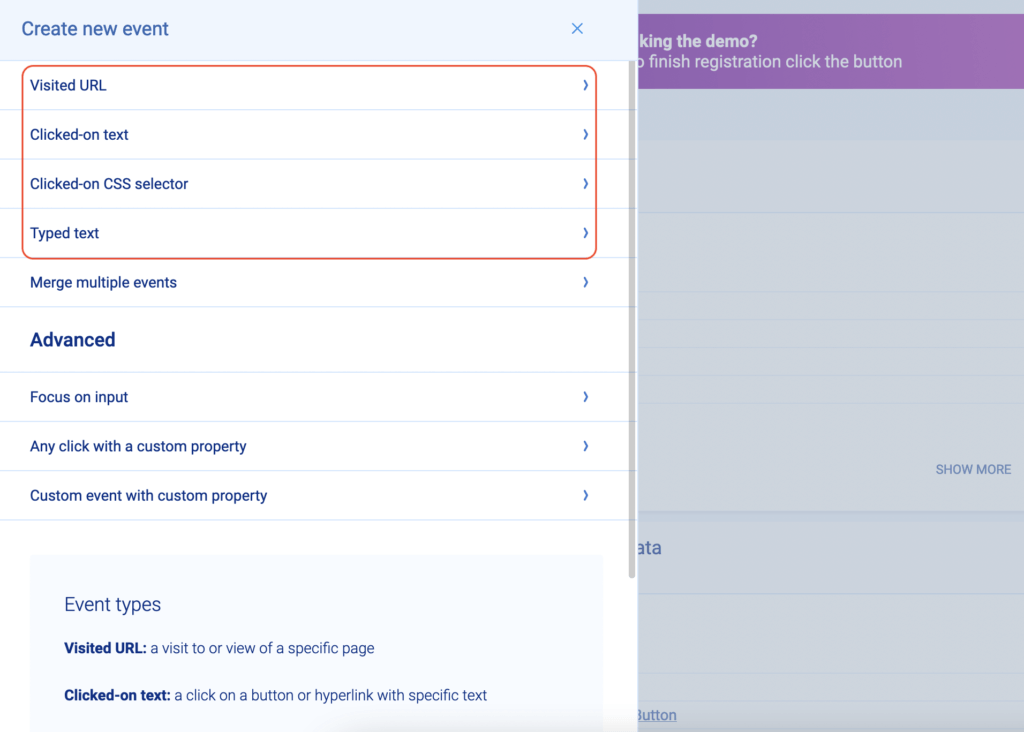
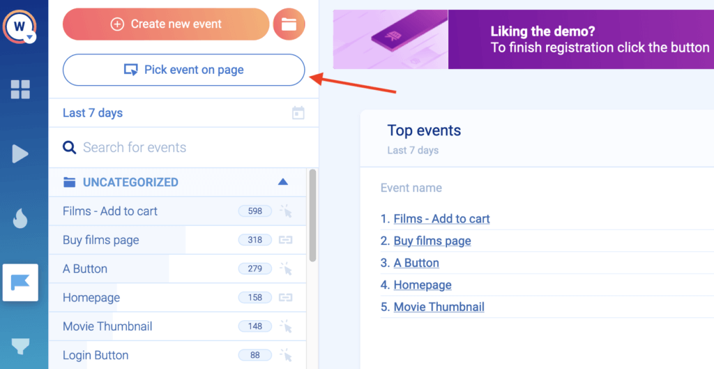
- Use the no-code event picker: This allows you to define an event by clicking on your website’s UI.
- Define events from user session recordings: While watching a recording, you can pause and turn an important user action into an event without leaving the recording.
- Create custom events via JavaScript: Custom events allow you to track pretty much anything else beyond the standard events.
For websites, you can define most events without coding by using one of the first three methods we showed. For mobile apps, most events are typically custom.
Once you’ve defined an event, you can track its occurrences in your Smartlook Dashboard.
With event tracking, you can answer important questions like, “How many times has the button for our new feature been clicked since we added it?” In addition, you can use Retention Tables to analyze how many of the users who performed an action for the first time (in this case — clicked on the new feature button) do so again over the following days.
But you can also combine these quantitative insights with session recordings to watch the session where each event occurred.
Here’s how:
There’s a play button under each event name.
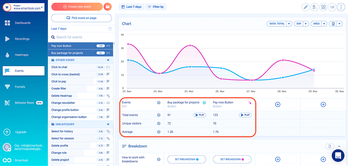
Clicking it takes you directly to all session recordings where that event took place. For example, if you have an event that tracks when users click on your new feature, you can jump into their session recordings to:
- Validate that they clicked on the new feature button intentionally.
- Get the full context behind their action by seeing what happened before and after they clicked the button.
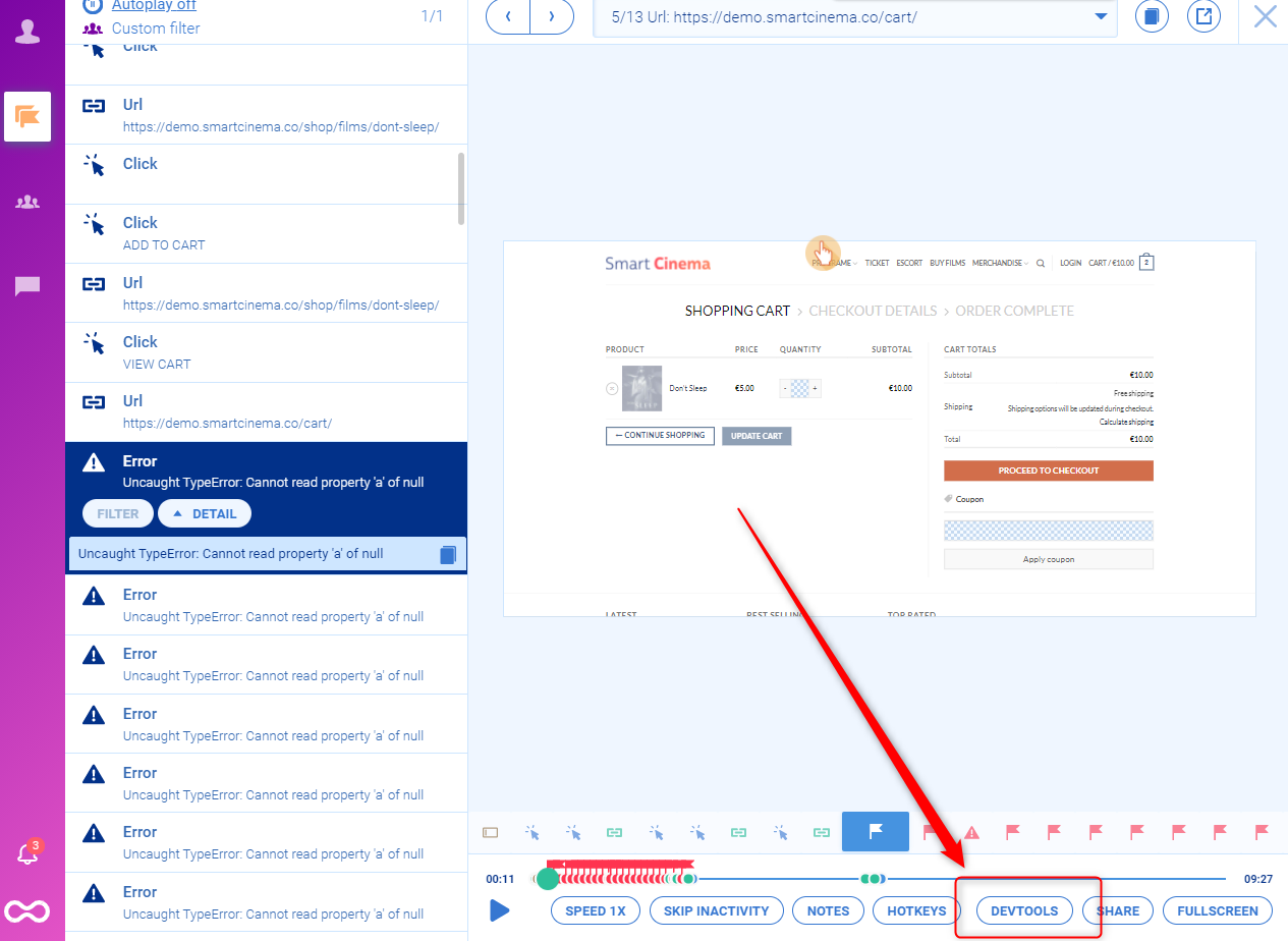
Smartlook also tracks rage clicks and JavaScript errors as events. This means you can instantly find recordings of users who were frustrated or experienced an error.
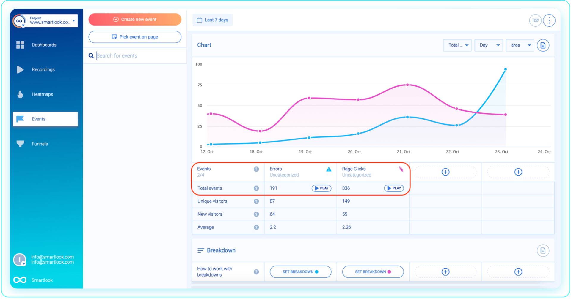
Watching users who rage-clicked is a great way to find frustrating or confusing moments in the product experience. For instance, you may find that users are excessively clicking on an element that’s not clickable. In these cases, the element might have to be redesigned, so it doesn’t look clickable to users.
As far as JavaScript errors go, you can send the relevant recordings to your developers, who can debug and fix the issue much faster, as they can see the exact circumstances that led to it.
One of our clients (StoragePug) used the combination of event tracking and session recordings to quickly find and resolve a critical issue.
After a recent release, they noticed their site had stopped receiving orders. In the past, when they only had access to quantitative analytics tools, they’d have to wait a few days to gather enough user data to confirm that something was wrong and start investigating.
But with Smartlook, they were able to watch a few relevant session replays within a few hours of the release, which showed that the UI wasn’t rendering properly. As a result, their engineers were able to debug and resolve the problem right away.
You can see how event tracking works with Smartlook’s live public demo — no registration or credit card required.
Analyze user paths through your site or app, find drop-offs, and calculate conversion rates with funnels
Funnels allow you to analyze paths users take through your site or app before completing a goal, like purchasing a product or trying out a new feature.
In Smartlook, funnels are sequences of events. All you have to do is take two or more events and place them in the order you believe your users follow. When you do that, Smartlook automatically creates a funnel visualization, like in the GIF below.
You can see how funnel analysis works with Smartlook’s live public demo — no registration or credit card required.
Going back to our example from the introduction, let’s say you’re unhappy with the completion rate of your app’s onboarding tutorial. You’re considering redesigning it, but you aren’t sure exactly what you need to fix.
With Smartlook, you can map each step of your tutorial to events and then create a funnel to track how many users go through each stage.
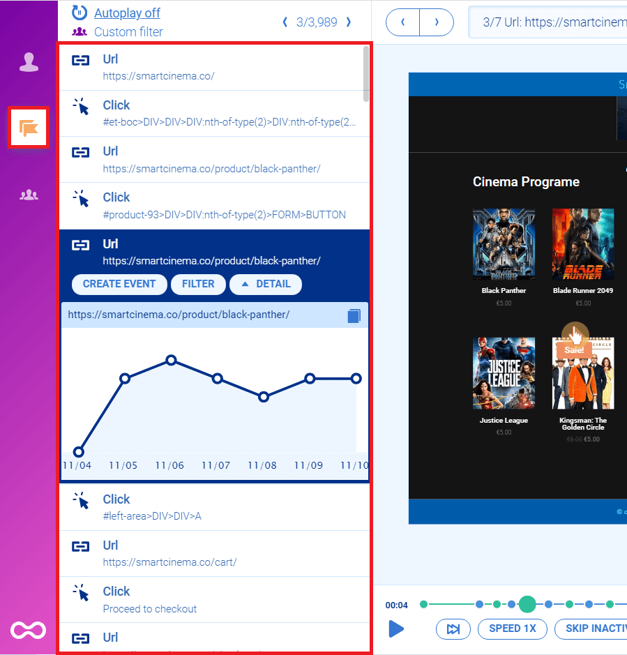
The image below shows a moment during a session replay of a mobile user’s journey while navigating an onboarding sequence.
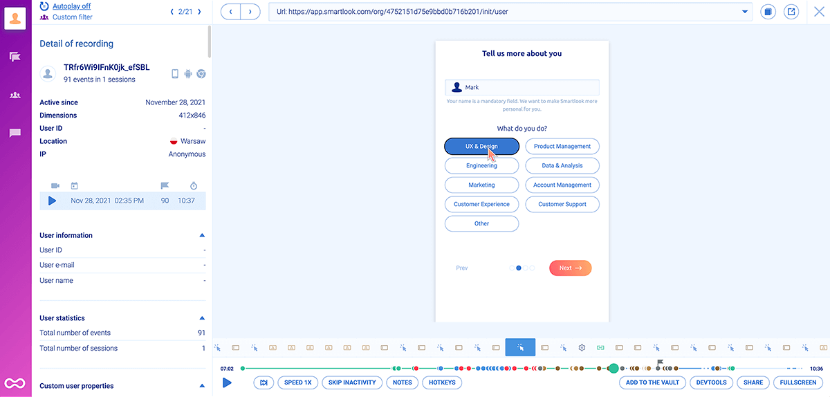
During the roughly 10-minute session, the user completed 91 events. Let’s say the overall drop-off rate for this funnel is 90%. That might make you think that redesigning it entirely is the right way to go. But if the average user completes almost 100 events before quitting, the tutorial is likely designed well in a lot of places.
The benefit of having a funnel that maps each step is that you can see where most drop-offs occur. In other words, you can pinpoint the moment where the majority of users abandon the tutorial.
Perhaps there’s a technical error happening between those steps, or the users simply think they’ve learned everything they need. Regardless of the reason, knowing where most users quit helps you make more informed decisions regarding your tutorial’s design. For example, if 80% of all drop-offs occur between two specific steps, it makes more sense to redesign only them, not the entire tutorial.
And, as with event tracking, you can also combine these quantitative insights with session recordings.
Find out why users abandon tasks by combining funnel analysis with session recordings
Since funnels only provide quantitative data, they also have the same blindspots as other quantitative tools. They can show you where users drop off, but not why or how to improve their experience.
Again, the solution is to combine quantitative analysis (funnels) with qualitative analysis (session recordings). Here’s how you can do that with Smartlook:
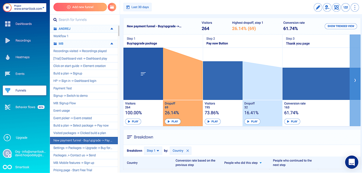
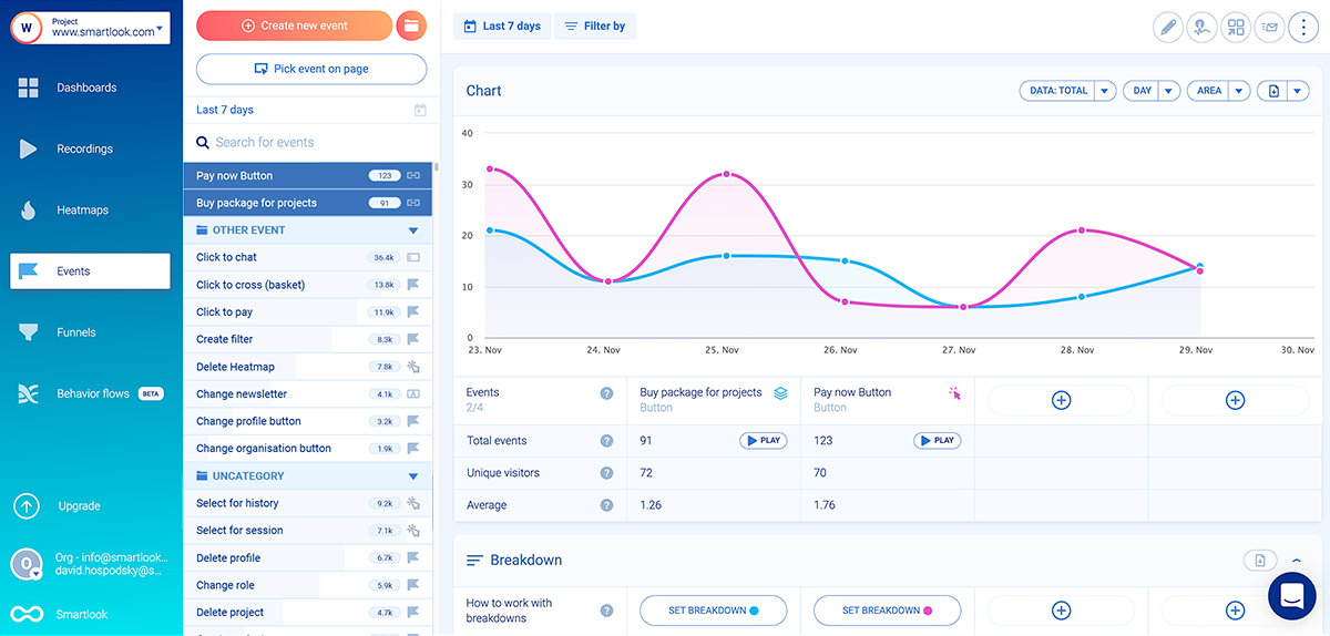
The example above shows a 3-step funnel where 32 users (16.41%) drop off between clicking “Pay now” and landing on the “Thank you” page. In theory, there shouldn’t be any drop-offs here — users who clicked “Pay now” clearly want to buy.
There’s clearly a problem, but the funnel alone can’t tell you what it is. It may be that the payment processing is taking too long. Or maybe users are getting distracted and clicking on something else before their payment goes through. Or maybe there’s a technical error. Again, without watching their sessions you can only guess.
Similar to the events section, there’s a “Play” button under each step of the funnel, including the drop-off stages. Clicking that button under the drop-off between steps two and three takes you to the session recordings of these 32 users, so you can find out why they dropped off. You save lots of time and effort since you don’t have to sift through all 195 sessions of users who clicked “Pay now.”
One of our fintech clients (AstroPay) used this process to research how users navigate their site and app and inform their product design process.
Their event tracking and funnel analysis showed that a lot of users didn’t complete their cryptocurrency process after starting it. Since Smartlook compiles these quantitative insights from session recordings, AstroPay’s team was able to watch the exact replays of users who dropped off, which led to the following insights.
- Some users dropped off because there were way too many steps in the purchase process.
- After purchasing, many users spent minutes anxiously looking for the cryptocurrency in their wallet, not realizing the transaction was still pending.
In short, Smartlook’s combination of quantitative and qualitative data allowed AstroPay to find two crucial user experience problems without conducting any user interviews.
Armed with these insights, AstroPay’s team was able to confidently redesign the cryptocurrency purchase flow, removing unnecessary steps and adding a “Purchase Pending” banner. This resulted in a much better user experience, as evidenced by a 56% lift in conversions.
Get an overview of the typical user experience and compare user behavior before and after design changes with heatmaps
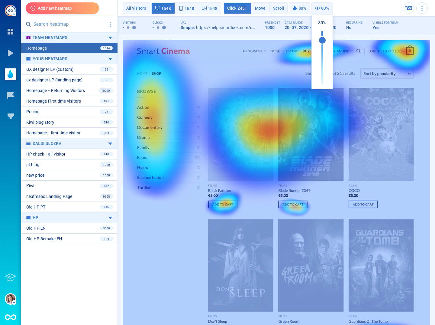
Besides session recordings, Smartlook also automatically captures clicks (or taps on mobile), scrolls, and mouse movements to create heatmaps.
Analyzing heatmaps can give a good overview of the typical user experience on a page or screen.
Each type of heatmap can provide different insights into users’ behavior:
- Scroll maps show what percentage of visitors reach each part of a page. This can help you determine where to place design elements, based on their importance, as well as inform your decisions regarding messaging and overall information architecture.
- Clicks maps show where users click the most. You can quickly see where most clicks are gathered on a specific user interface and how often users interact with important call-to-action buttons (CTAs).
- Move maps show where most users move their cursors. Hectic cursor activity around parts of a page or screen may indicate that users don’t know where to click or are getting distracted.
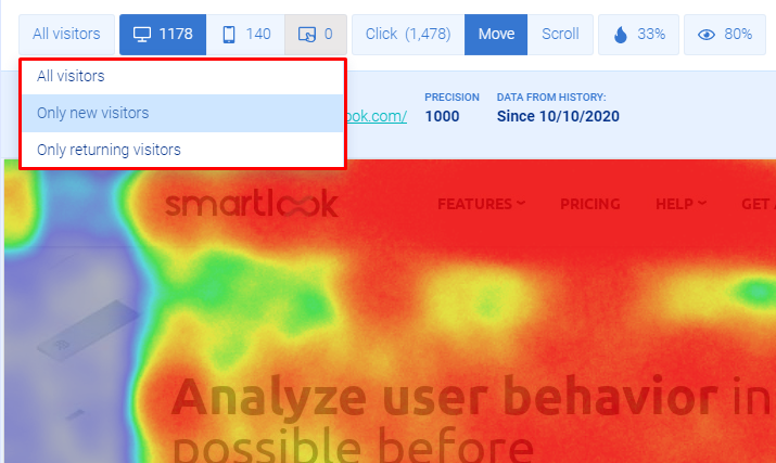
In addition, you can compare the behavior of new versus returning visitors and that of users on desktop, tablet, and mobile devices.
After updating a design, you can also create a new heatmap and contrast the user behavior with the old one, just by changing the date range. This is a great way to see how design changes affect user behavior at a glance.
In short, heatmaps are a good first step toward developing an understanding of your users’ behavior. However, you can’t use them to put the interactions on a single page in the context of the entire user journey. Making successful design changes requires a deeper understanding of the user experience, so it’s essential to also use event tracking, funnel analysis, and session replays, alongside heatmapping tools.
Smartlook Pricing
- Free Plan: Captures up to 3,000 sessions/month. No credit card required.
- Paid Plans: Start at $55/month, with a 30-day free trial. There are pre-made plans as well as an option for building custom plans.
If you want to start analyzing user behavior on your website or mobile app as soon as possible, sign up for a free Smartlook account (no credit card required).
2. Google Analytics
- Quantitative or qualitative analytics: Quantitative only.
- Session recordings: No.
- Web or mobile analytics: Both.
Google Analytics is the most popular analytics tool out there. It’s a traditional analytics solution, reporting on statistics and metrics like pageviews, sessions, time on page, and bounce rates, as well as users’ demographics.
While it has a steep learning curve, Google Analytics is highly customizable and can be used to track goals (similar to tracking events in Smartlook), build funnels, attribute conversions to marketing channels, track user flows, and more. But without a way to gather qualitative data, it’s not a complete UX analytics solution.
Google Analytics Pricing
- Google Analytics is free.
- The enterprise version (Analytics 360) is paid, but there’s no public pricing page. Reviews online suggest a starting price of $150,000/year.
3. Adobe Analytics
- Quantitative or qualitative analytics: Quantitative only.
- Session recordings: No.
- Web or mobile analytics: Both.
Adobe Analytics is an enterprise-level analytics platform with a focus on quantitative analytics. The platform brings together a suite of tools that can help you capture and analyze real-time data from the entire customer journey. They have a huge focus on attribution and predictive analytics, which analyzes users’ data and makes predictions about their future behavior.
Again, like Google Analytics, Adobe Analytics lacks any tools for gathering qualitative data to understand the subjective aspects of the user experience.
Adobe Analytics Pricing
- There’s no information about a free plan.
- Adobe Analytics’ price is available upon request to their team.
4. Mixpanel
- Quantitative or qualitative analytics: Primarily quantitative, but qualitative analytics features are available through third-party integrations.
- Session recordings: Only with third-party integrations.
- Web or mobile analytics: Both.
Mixpanel is a product analytics software tool, with features for analyzing conversions, app usage, and retention rate. The software lets you build reports, as well as custom dashboards to analyze product adoption, conversion rates across different segments, and other important metrics.
Like other traditional analytics tools, Mixpanel doesn’t offer session replays (but they do offer an integration for Fullstory).
Mixpanel Pricing
- Free Plan: Includes up to 100,000 tracked users (unique visitors that performed at least one event).
- Paid Plans: Start at $25/month, with the option to build custom plans.
5. Hotjar
- Quantitative or qualitative analytics: Qualitative, with limited quantitative capabilities.
- Session recordings: Yes.
- Web or mobile analytics: Web only.
Hotjar is one of the most popular qualitative analytics tools on the market. It’s best known for its session recordings and heatmaps, but it also has user feedback widgets as well as survey templates. It’s a beginner-friendly tool suited for marketers, product managers, and UX design and research professionals.
Two downsides to this tool, which we’ve discussed in our Hotjar alternatives article, are its limited quantitative analytics capabilities and the lack of support for mobile apps.
Hotjar Pricing
- Free Plan: Records up to 35 user sessions per day.
- Paid Plans: Start at $39/month, with the option to build custom plans, depending on how many sessions you want to record.
6. Crazy Egg
- Quantitative or qualitative analytics: Qualitative, with limited quantitative capabilities.
- Session recordings: Yes.
- Web or mobile analytics: Web only.
Crazy Egg is a CRO and web analytics tool, which has heatmaps, user recordings, A/B testing, and features for tracking ad traffic on your website. Although it has session recordings, Crazy Egg doesn’t capture every user session on your website. Instead, it samples your traffic, and you can choose the rate at which the sampling happens.
In our opinion, this feature set is better suited for conversion rate optimization than UX analytics.
Crazy Egg Pricing
- No Free Plan available.
- Paid Plans: Start at $24/month, with a 30-day free trial. All plans are billed annually.
7. UXCam
- Quantitative or qualitative analytics: Both.
- Session recordings: Yes.
- Web or mobile analytics: Mobile only.
UXCam is an analytics solution for mobile applications only, with a primary focus on session recordings. The solution also offers heatmaps, events, funnels, and other useful features for analyzing user behavior.
UXCam Pricing
- Free Plan: Records up to 10,000 total user sessions.
- Paid Plans: Customizable, based on how many sessions you want to record per month.
2 A/B testing tools for testing design hypotheses
A/B testing tools can help you test your hypotheses and see how design changes affect user behavior. That’s why they’re a vital part of the user research process, while also complementing the analytics tools we just went over.
Google Optimize
Google Optimize is one of the most popular A/B testing software solutions out there. It supports different types of tests, including A/B, A/B/n, multivariate, and split URL testing.
One of the biggest benefits of Google Optimize is that it’s designed to work with other analytics, advertising, and design tools that UX/UI designers, marketers, and product managers use, including Google Analytics, Google Ads, and Firebase.
Smartlook is also compatible with Google Optimize.
Google Optimize Pricing
- Google Optimize is free.
- There’s a paid enterprise version (Optimize 360), but no publicly available pricing for it.
Optimizely
Optimizely is a Digital Experience Platform, which offers products for scaling content, managing workflows, running e-commerce shops, and optimizing users’ experience. Their A/B testing is part of the Optimize product. As an enterprise platform, Optimizely has lots of advanced testing features such as exclusion groups, which let you safely run multiple A/B tests on the same page.
Optimizely also has an extensive suite of integrations with popular tools like HubSpot, Salesforce, and Google Analytics.
Smartlook also has an Optimizely integration.
Optimizely Pricing
- No information about a free plan.
- Pricing is available only after a request to their team.
Collect reliable user behavior data quickly and cost-effectively with Smartlook
You can start analyzing your users’ experience with Smartlook today by signing up for a free account (no credit card required). As soon as you set up our tool, it will start recording all your users’ sessions.
If you want to see a Smartlook presentation that’s tailored to your business, schedule a demo with our team.