Do you know what “Norman Doors” are? Although the term describes doors that are too confusing to open, you can apply this concept to anything that has a bad UX.
Badly designed headphones, ATMs, or a digital product such as a website or mobile app? Call it Norman doors. What’s common for those examples is the poor design that makes its users puzzled, frustrated, or angry.
If you’re working on a mobile application, you don’t want it to offer poor UX that results in application uninstall. That’s why it’s important to design your app in a way that ensures it’s usable, intuitive, and enjoyable to use.
This article will help you understand everything about mobile UX and how to improve app user experience on mobile devices.
You’ll dive into the following topics:
- What is mobile app user experience (UX) design?
- Why an excellent mobile UX is important for your business
- Mobile UX design process
- iOS and Android UX design principles
- UX vs. UI: What’s the difference?
- One limitation that makes it hard to optimize mobile app UX
- Why usability testing on mobile is tricky
- The good, the bad, and the ugly of mobile UX
- How to improve mobile app UX with quantitative and qualitative data
- Make your product design outstanding and ensure a good app user experience
Note: If you’re new to mobile app UX, read the whole article. If you’re a UX professional or already experienced in this field, skip to the most relevant section for you – “How to improve mobile app UX.”
What is mobile app user experience (UX) design?
Mobile app UX design is the stage of mobile app development that focuses on creating intuitive in-app experiences for end users.
The Interaction Design Foundation specifically defines mobile user experience design as:
“Mobile UX design is the design of user experiences for hand-held and wearable devices. Designers create solutions (typically applications) to meet mobile users’ unique requirements and restrictions. Designers focus on accessibility, discoverability, and efficiency to optimize on-the-go interactive experiences.”
The whole concept of mobile UX is broad as it encompasses various aspects, including user interface (UI) design, interaction design, information architecture, usability testing, and UX optimization. At the heart of every step in mobile UX design lies a deep understanding of the end-user — their needs, behaviors, and pain points.
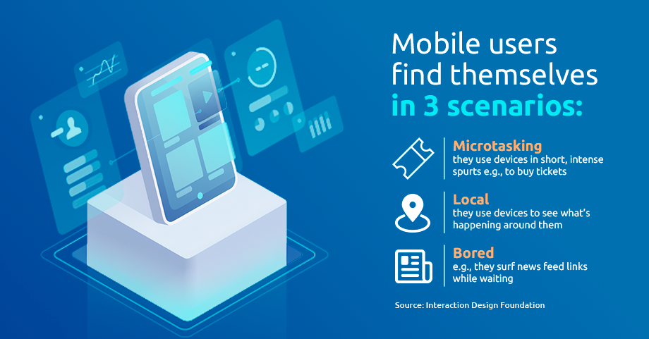
The context in which users interact with mobile apps is also important. Mobile app users have specific goals to achieve, but the attention span varies, as does the environment.
If you think mobile app UX optimization is hard work, you’re right. It’s tough to collect a lot of user data and deeply understand how they use your mobile app. But there’s good news – improving mobile app design and UX pays off.
If your users find your mobile app familiar, self-explanatory, and memorable, they’ll likely use it again. Also, if your app doesn’t require mental heavy lifting and lets them complete a task (buy a product, get information, read news), they’ll stick with it or even recommend it to others.And that should be your ultimate goal – a well-designed app with good UX that sparks strong positive emotions in its users. If your app is successful, your business will be too.
Why an excellent mobile UX is important for your business
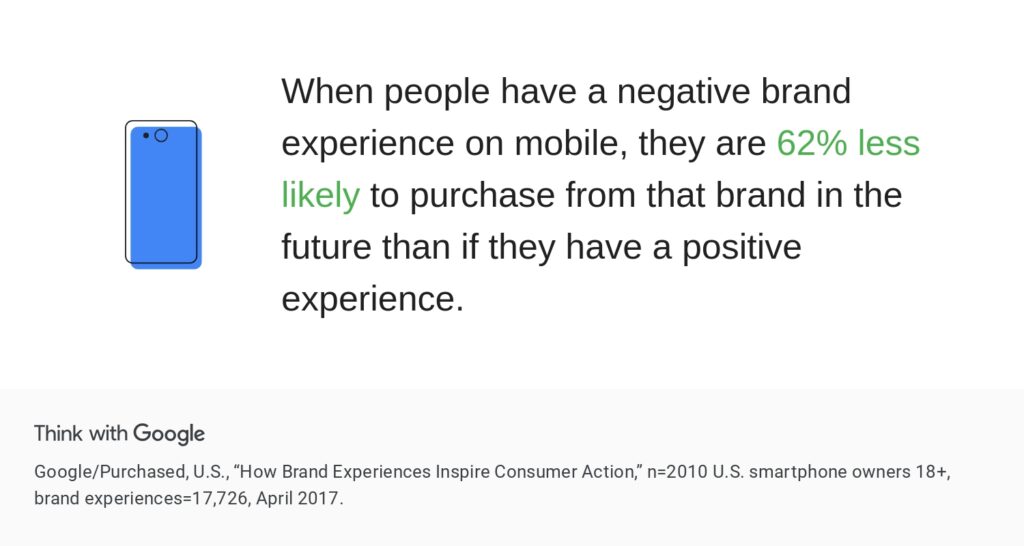
In addition to causing frustration, a poor user experience can lead to negative experiences, churn, bad reviews, or even a damaged brand image.
According to Think with Google, negative brand experiences affect purchasing decisions — even though the research dates back to 2017, it remains relevant as long as customers use smartphones.
If you want users to stick with your app, make it great. The business benefits you’ll reap in return will be well worth it, including:
(The following are the most important ones):
- Higher conversion rates — a user-friendly mobile experience can streamline the path to purchase
- Superior Net Promoter Score (NPS) — satisfied customers are more likely to recommend apps to friends and family, resulting in an improved NPS
- More loyal customers — when users find it easy and pleasant to interact with an app, they are more likely to remain loyal to the brand
- A higher app adoption rate — when navigating through an app smoothly, users realize its value faster
- Lower churn rate — users won’t need to look for an alternative solution when an app creates a seamless experience for them
By focusing on creating a positive mobile UX, you’ll experience more sales and higher customer lifetime value.
Mobile UX design process
Where does the design process of a great UX start? Of course, it all starts with research, including:
- User research and goal setting. Study your audience’s needs through market research, competitive analysis, or one-on-one interviews. Next, set clear goals and milestones for mobile UX development based on research insights
- Conceptualization. Generate ideas for app features, functionality, and user flows
- Information architecture and wireframing. Outline the app’s layout, navigation, and basic interactions
- Prototyping and user testing. Build interactive prototypes to visualize the app’s flow and functionality. Conduct user testing sessions to validate your ideas and gather feedback
- Visual design. Design high-fidelity user interfaces, incorporating visual elements like colors, typography, and imagery
- Development and iterative testing. Collaborate with developers to implement the design and test the resulting UX at each step
- Launch and continuous optimization. Release the app to users and gather feedback post-launch. Monitor user behavior to continue to optimize the app experience
That’s it? In reality, the process is more complicated and full of pitfalls. Understanding the differences between iOS and Android mobile app design is the first step in that direction — that’s where this guide comes in handy.
iOS and Android UX design principles
When an iOS user has an Android device in their hands (or vice versa), you can literally see the frustration on their face. More often than not, they don’t make it past the home screen as they’re not accustomed to the different UXs.
Such differences are also reflected in how iOS and Android apps are designed. Here are the key distinguishing elements between iOS and Android UX designs.
1. Design guidelines
- iOS: iOS design guidelines are strict and highly standardized. Apple provides detailed Human Interface Guidelines (HIG) that outline specific design principles, leading toward a clean and minimalistic design
- Android: Android follows Material Design guidelines which emphasize bold colors, depth, and meaningful motion. Android UI elements, following Material Design, have a more tactile and interactive feel. For instance, buttons often have shadows, providing a sense of depth and touch
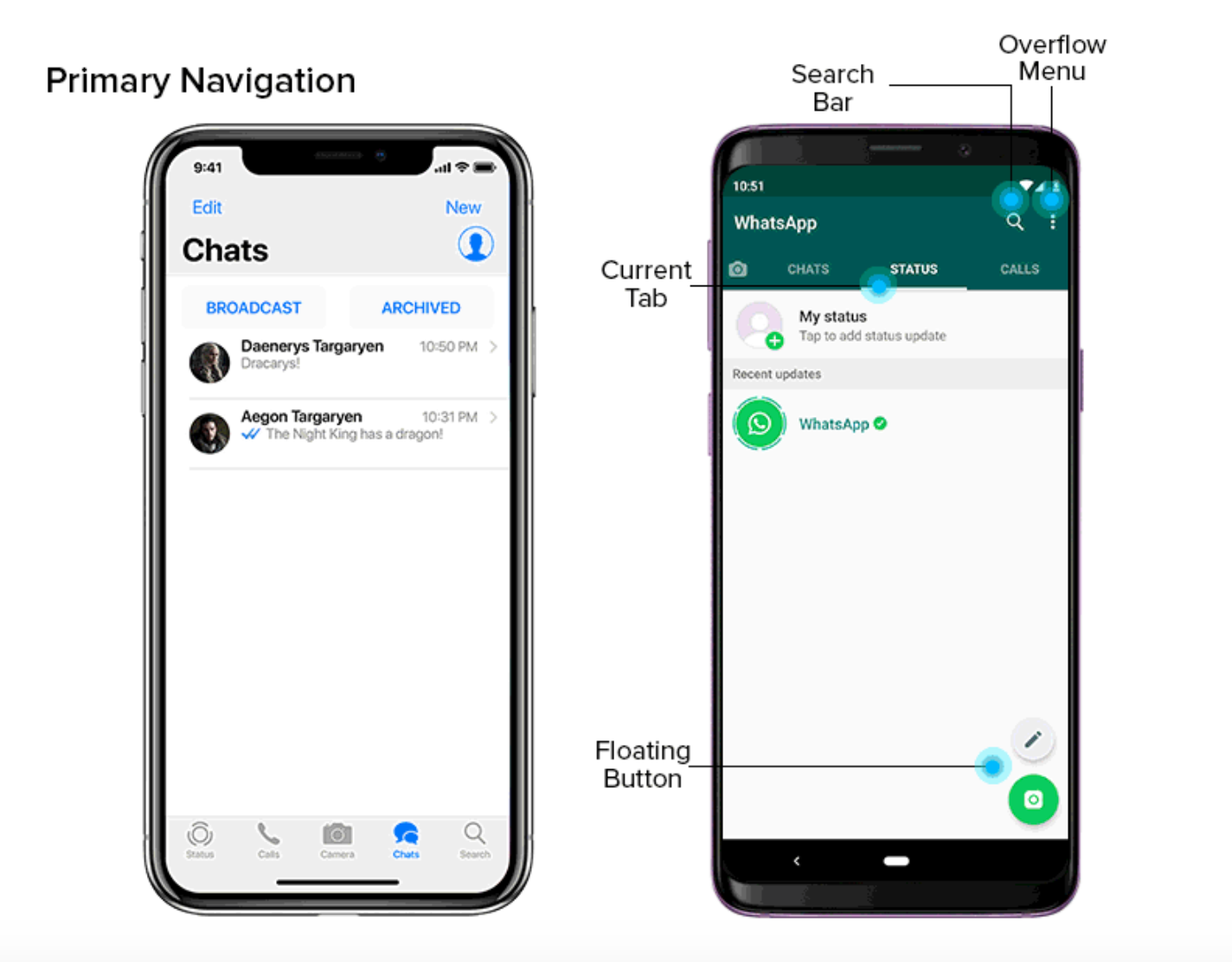
2. Navigation and interaction
- iOS: Apps often use a bottom tab bar for navigation, providing quick access to essential sections. Users can navigate using swipes, taps, and gestures like back swipes
- Android: Navigation destinations are often spread across the screen. Apps often utilize the back button for navigation, providing a consistent way for users to return to previous screens
3. Device fragmentation
- iOS: iOS has a limited range of devices, primarily iPhones and iPads, making it easy to maintain consistency in design across different devices and screen sizes
- Android: Android runs on a wide variety of devices from different manufacturers, leading to greater fragmentation in screen sizes, resolutions, and hardware capabilities. Designers must ensure their apps are responsive and adaptive to different screen sizes and orientations
Apple’s App Store enforces stricter design standards, while Google Play has more flexibility, making it easier for product teams to get their apps approved.”
You need to be mindful of these differences and tailor your app to provide users with a seamless, platform-specific experience on iOS and Android devices. Remember that half of your success comes down to creating a familiar UI. Speaking of which…
UX vs. UI: What’s the difference?
User experience (UX) and user interface (UI) are closely related in the field of design, but they refer to different concepts.
UI is easier to explain — it’s basically the design of your app. UX is a more abstract concept. It encompasses all user interactions within an app and their effect on the end user. In simple terms, if UI is what a user sees, UX is what they feel. To a certain degree, it’s safe to say that UI design is a part of UX design.
One limitation that makes it hard to improve mobile app UX
There is one major implication when working on mobile app UX optimization – usability testing on mobile.
Why usability testing on mobile is tricky
Mobile usability testing involves observing participants while they do an assigned task in an app. The main goal of usability testing is to get an idea of how people use the app, how easy or difficult it is for them, and what areas need improvement.
That said, mobile usability testing is tricky as it’s hard to observe participants and all their gestures due to the size of the screens.
According to Steve Krug’s book “Don’t Make Me Think” there are common issues of mobile usability testing:
- Do participants need to hold the device naturally, or can it be sitting on a table or propped up on a stand?
- What do the observers need to see (e.g., just the screen, or both the screen and the participant’s fingers, so they can see their gestures)? And how do you display it in the observation room?
- How do you create a recording of how they use the app?
Additionally, to get accurate results from mobile usability testing, you’d have to simulate scenarios in which people use smartphones.
In the testing environment, it’s almost impossible to replicate any of these scenarios. Thus, you won’t get accurate results of how people use your app, what experience they have, and what they think of its usability.
If mobile usability testing is that tricky, then maybe you should gather user feedback instead? This might be shocking, but according to the “guru of Web page usability,” Jakob Nielsen, you shouldn’t listen to your customers.
Jakob Nielsen says that the first rule of UX design is: Don’t listen to your customers. Your users aren’t designers, so they won’t know what the interface design should look like. What’s more, users are biased with what’s already familiar to them, so they will resist anything innovative.
Instead, improve your mobile UX by watching how users interact with your app. And you can achieve this with the right tool that combines both quantitative and qualitative data.
The good, the bad, and the ugly of mobile UX
Let’s go through real-life examples of mobile apps and see what makes them particularly good (or bad!).
PandaDoc: Mobile app optimized for users on the go
Let’s start with an example of a great mobile UX.
PandaDoc is a SaaS app for signing documents online. Alongside a desktop version, the company offers a mobile app so users can e-sign contracts on the go.
We talked to PandaDoc’s Product Manager to learn how they optimized their product’s UX for mobile users. Here’s what they said:
Additionally, we noticed that the contracts they needed to edit often contained small text, requiring frequent zooming. Pinching the screen to zoom in was an issue since it required two hands – one to hold the phone and the other to pinch. Considering that one hand was typically occupied holding documents, we decided to add separate “Zoom in” and “Zoom out” buttons to facilitate one-handed usage.”
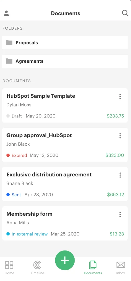
The PandaDoc app interface
IKEA: Big UI update
If you look at the IKEA app interface from just a few years ago, you wouldn’t recognize this minimalist brand.
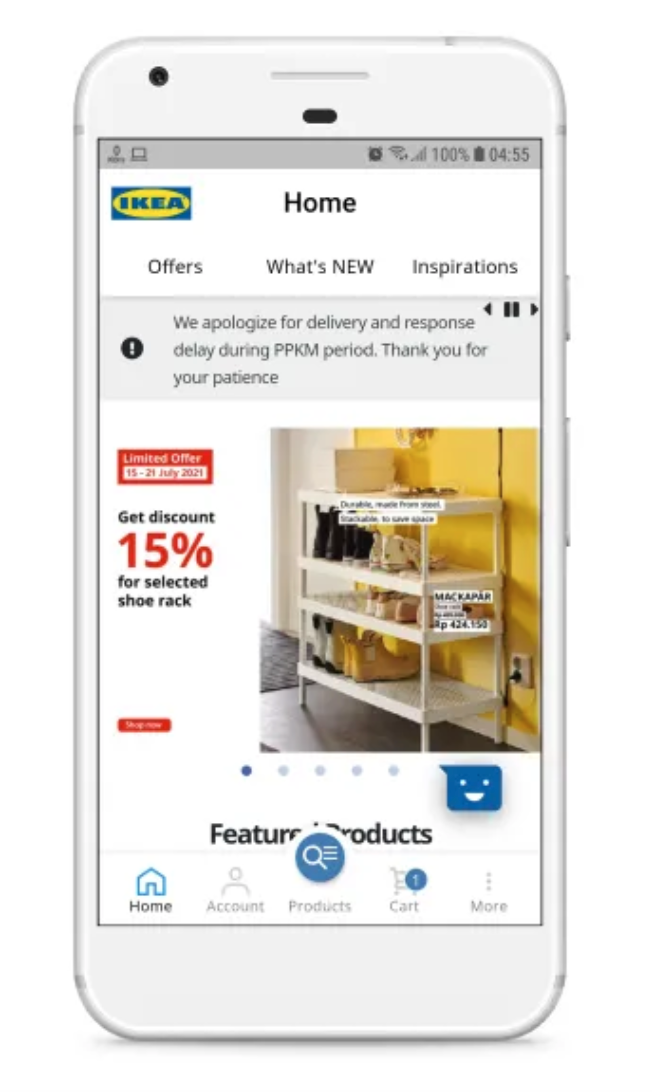
The IKEA app before the redesign
Indeed, the app UI felt somewhat cluttered, making users feel confused when they first logged in. Yet, the cluttered UI wasn’t the biggest problem of the app. It was the filtering functionality that was causing mobile users a lot of pain.
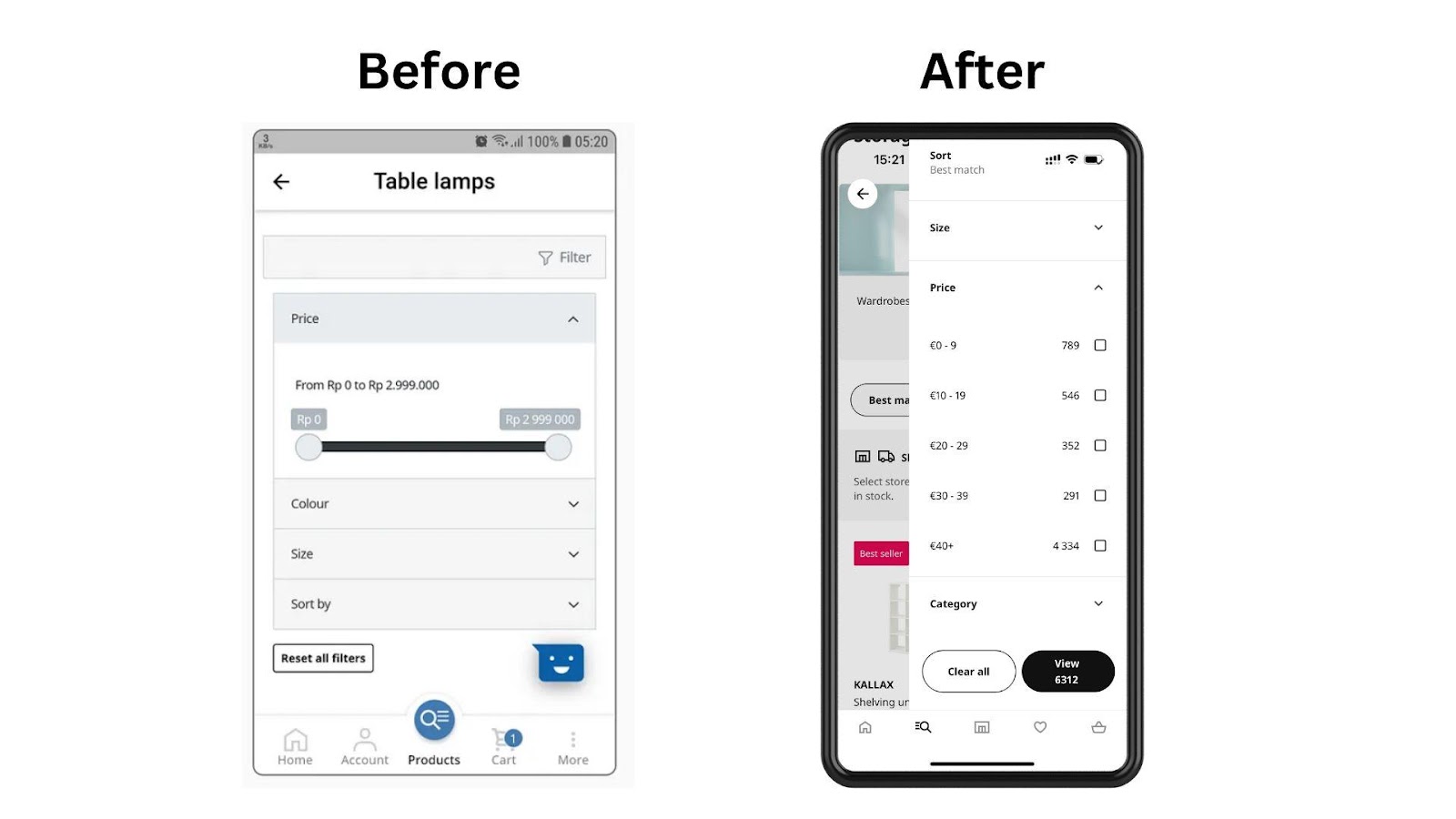
The IKEA app before and after the redesign
You can see that the old version (on the left) required users to use the slider to match the price range they were looking for — the UX was frustrating on a small screen. The new design provides users with checkboxes to select the right price range. The new UX feels more user-friendly and simple.
How to improve mobile app UX with quantitative and qualitative data
Now it’s your turn to improve your mobile app UX. We recommend that you start with a good UX analytics tool.
Smartlook is a website and mobile app analytics tool that combines the power of:
- Session recording
- Event tracking
- Heatmaps
- Funnel analysis
You’ll see authentic user behavior and based on this, you’ll have evidence to make mobile UX improvements. Smartlook records all mobile app users. It means you get a statistically significant sample size that would be impossible to obtain when doing usability testing with a small participant number.
Discover how to improve your mobile app UX with session recordings, heatmaps, events, and funnels.
Watch mobile app session recordings for first-hand evidence of mobile app UX performance
With session recordings, you’ll see how users interact with your mobile app “in the wild.” You’ll see granular behaviors of individual users including every tap, scroll, button interaction, or form submission.
With session replays, you’ll discover:
- If users navigate your mobile app in the intended way, or whether they get stuck somewhere
- If users rage click on a non-interactive button or element that seems to be interactive but isn’t
- If your app has UI design inefficiencies – e.g., a return button that hides under a drop-down menu, so your users struggle with navigation
- If functionality you chose for your app bring your users value
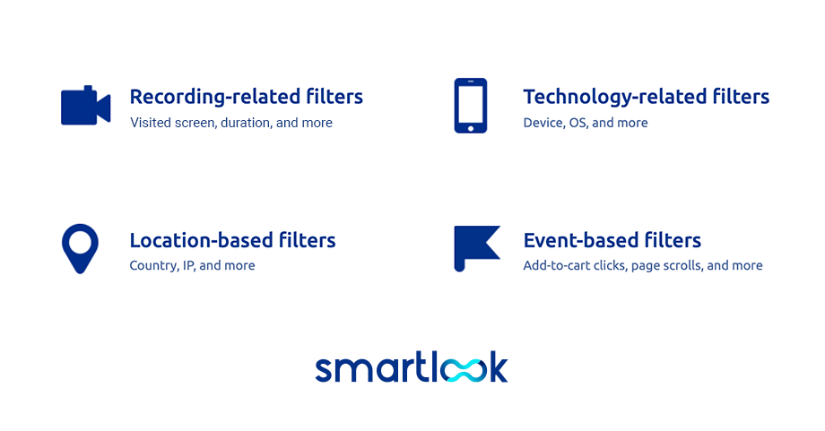
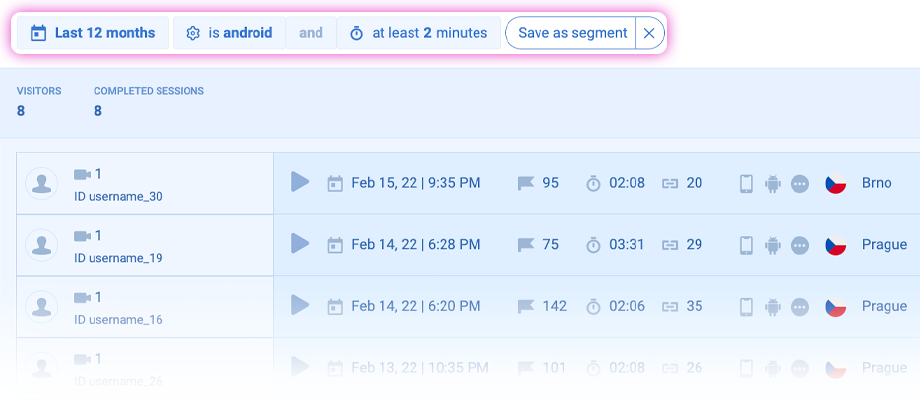
And if you want to focus on specific users or specific actions, session recording filters will help sort out what matters the most. For example, filter mobile session recordings by Android OS (or iOS) and session duration of at least 2 minutes.
Thanks to this setup, your development team will analyze a bug that Android users reported recently. Watching a filtered batch of recordings saves a ton of time for your team and helps solve problems fast. As a result, you’ll provide bug-free UX.
Analyze mobile app heatmaps to spot the most (and least) captivating elements of your mobile app UX
Mobile heatmaps will serve as a starting point for any UX improvement you’ll make.
Mobile heatmaps are a visual representation of user interactions. The most engaging elements are hot spots marked in red, while the least engaging elements are cold spots marked in blue. Those of average popularity are marked between the spectrum of red and blue.
With heatmaps for your mobile app, you’ll see:
- Which areas of your mobile app get more attention and which get less attention
- Which buttons are engaging for users and which are completely omitted (because they aren’t prominent enough)
- If there are any banners or images that users want to interact with but are non-interactive
For example, below, you’ll see that mobile app users engage with the “Thumb down” button and don’t engage at all with the “Thumb up” button. This could mean that the video in your app doesn’t display properly, or the content isn’t interesting for your users.
Verify what’s the problem by pressing the small “Play” icon at the bottom of a heatmap. You’ll see users who viewed this screen. With recordings, you’ll learn what makes users tap on the “Unlike” button and at which moment it happens. Thanks to this information, you’ll better understand your users and provide them with a better app user experience.
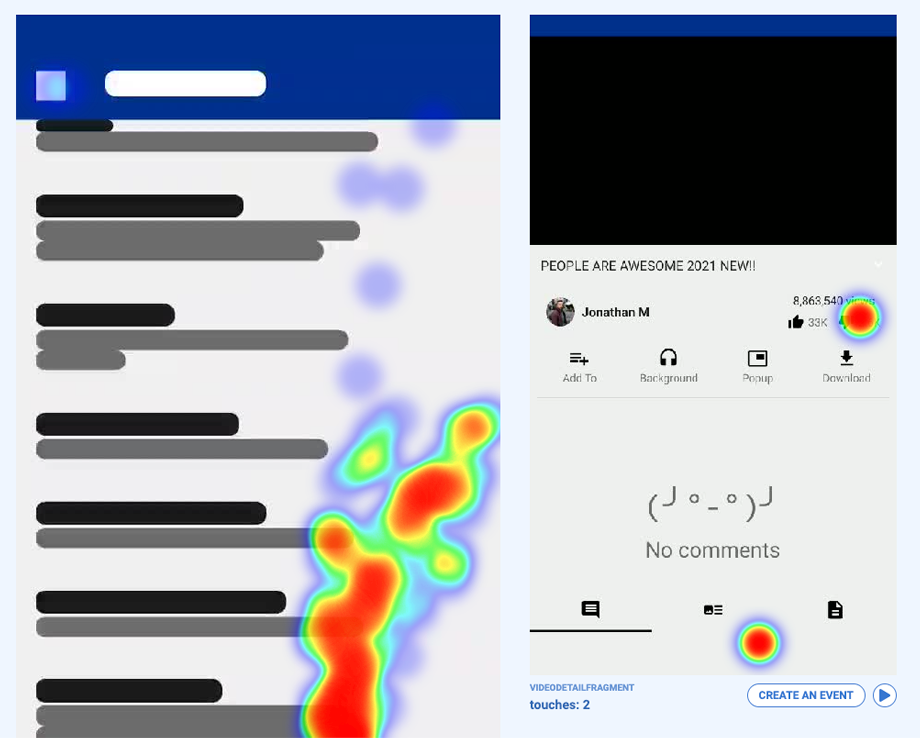
Also, you can check the aggregated number of clicks in a particular area by marking the area that interests you.
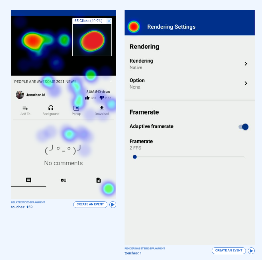
How to create a heatmap for a mobile project in Smartlook? You need to choose a date range, and Smartlook will create a gallery for all the fragments of your mobile app within that date range. By exploring heatmap galleries in Smartlook, you’ll see all screens of your app in one place.
You can also create an event from a mobile heatmap (that’s connected to a visit on a particular screen) or watch a session recording of those who interacted with this screen.
Track mobile app events to ensure users complete intended actions
In Smartlook, you can define a series of events that can be a button tap or a text-field input. You can also create custom events. Events are powerful because you focus your UX analysis on a single action and see the number of errors or clicks.
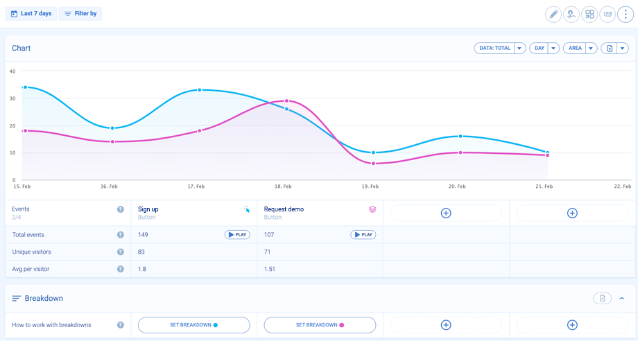
For example, you want to analyze how the most important “Sign up” button performs over time. You either analyze it separately or compare it with another key button like “Request a demo.”
Remember that mobile app space is limited, so this comparison will help you decide which button should be more prominent. This data evidence will also help declutter your mobile app user interface (UI). In addition, you can filter session replays by a specific event to see what happened before and after the event.
Monitor mobile app funnels to design user-friendly mobile workflows
To improve your mobile app UX, you’ll also use event-based funnels. Thanks to funnels, you’ll analyze the most important touchpoints of the mobile user journey.
It can be a purchase funnel, onboarding funnel, or any other path that’s key in your mobile app. You can create a funnel with an unlimited number of steps.
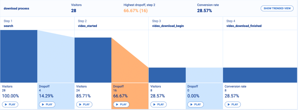
With funnels, you’ll improve your mobile app UX by:
- Optimizing a funnel to decrease drop-offs before a purchase
- Verifying where are the trouble spots and what stops app users from, e.g., completing the full onboarding guide
- Verifying the most intuitive paths, so you can implement similar paths in other parts of your app
By comparing user behavior and navigation patterns of those who completed a funnel with those who didn’t, you’ll see what exactly needs to be fixed in your app.
Make your product design outstanding and ensure a good app user experience
Now you’re armed with UX knowledge and a tool that will help you polish your mobile app UX.
What’s the key lesson from this article? Don’t let your mobile app fall into the category of Norman doors. Don’t let your application frustrate or confuse users. Don’t give them reasons to uninstall your app.
Instead, use analytics tools to make informed decisions. Always observe in-app user behavior and make improvements based on authentic user actions. Optimize mobile app UX continuously, so your users remain happy and loyal.