Heatmaps are among the most widely-used tools for analyzing user behavior on websites and mobile apps.
They’re easy to create and analyze, while also providing useful insights into where users click, scroll, and move their cursors. Their simplicity and versatility make them a popular choice for digital marketers, conversion rate optimization (CRO) experts, and product managers.
But despite their popularity, there are still several misconceptions about heatmaps. For example, many teams don’t consider the fact that large website changes shouldn’t be made based on heatmaps alone (due to their inherent limitations).
In this guide, you’ll learn how to create and use different types of heatmaps, while overcoming the most common pitfalls.
Here’s everything we’ll cover below:
- How heat mapping works
- The 3 main types of heatmaps and how to use each one (with real-life examples)
- Heatmaps’ biggest limitations and how to overcome them
Before we dive in, note that we’ll be using Smartlook — our behavioral analytics platform — to show examples of heat mapping in action.
You can try Smartlook today with our full-featured, 30-day trial — no credit card required. Our tool captures every user interaction on your website or mobile app and lets you create heatmaps, define events, build funnels, and watch session recordings.
How heat mapping works
Heat mapping is a data visualization technique for representing numerical data in different colors and hues. The resulting heatmaps are much more user-friendly than the raw, complex data sets because they make it easy to understand which values are high or low compared to each other.
The heat mapping process is very versatile, which is why it can be applied in various use cases — from regular data analysis to medical research, financial modeling, weather analysis, population density monitoring, website and mobile app analytics, and more.
In this article, we’re focusing on website and mobile app analytics, so let’s start with a website heatmap example.
This particular heatmap shows what percentage of visitors reach each part of the page. Or in other words, visitors’ scrolling activity is the numerical data behind this color-coded representation.
The top part is bright red because that’s the area all visitors see immediately after landing on the page. Since visitors gradually drop off further down the page, the heatmap’s colors change from warmer to colder ones — from red and yellow to green, blue, and finally gray (which is typically the footer of a web page).
This visual representation is what makes heatmaps really intuitive and easy to interpret, which is why they’re so popular for tracking user behavior.
For example, the heatmap below contains colored areas, with bright red spots in the middle. Even if you haven’t seen a heatmap below, you can probably guess that the red spots represent more activity compared to the colder colors.
There are plenty of heatmap software tools out there that can help you generate similar heatmaps for your website or mobile app.
While each tool has slight differences, the process of creating a heatmap typically follows these steps:
- You set up the tool on your site or app by installing a code snippet.
- The tool either starts collecting user behavior data automatically or asks you to manually pick which page or app screen you’d like it to track. For instance, we’ve designed Smartlook to collect all user interactions on your site or app by default. This ensures you aren’t missing important behavioral data or wasting time manually setting up data collection.
- You tell the tool which page or app screen you want to generate a heatmap for. If the behavior data has already been collected, your heatmap will be generated instantly. If not, you’ll have to wait for a few days or weeks to capture enough data. This is also why automatic data collection makes the heat mapping process much easier.
The 3 main types of heatmaps and how to use each one (with real-life examples)
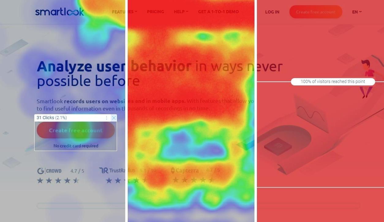
The term heatmap can actually refer to different types of heatmaps for analyzing user behavior. In fact, most heat mapping tools offer click maps (left in the screenshot below), move maps (middle), and scroll maps (right).
In this section, we’ll show you how to make the most out of each one. But before we dive in, there are three best practices you need to consider, regardless of the type of heatmap you’re working with:
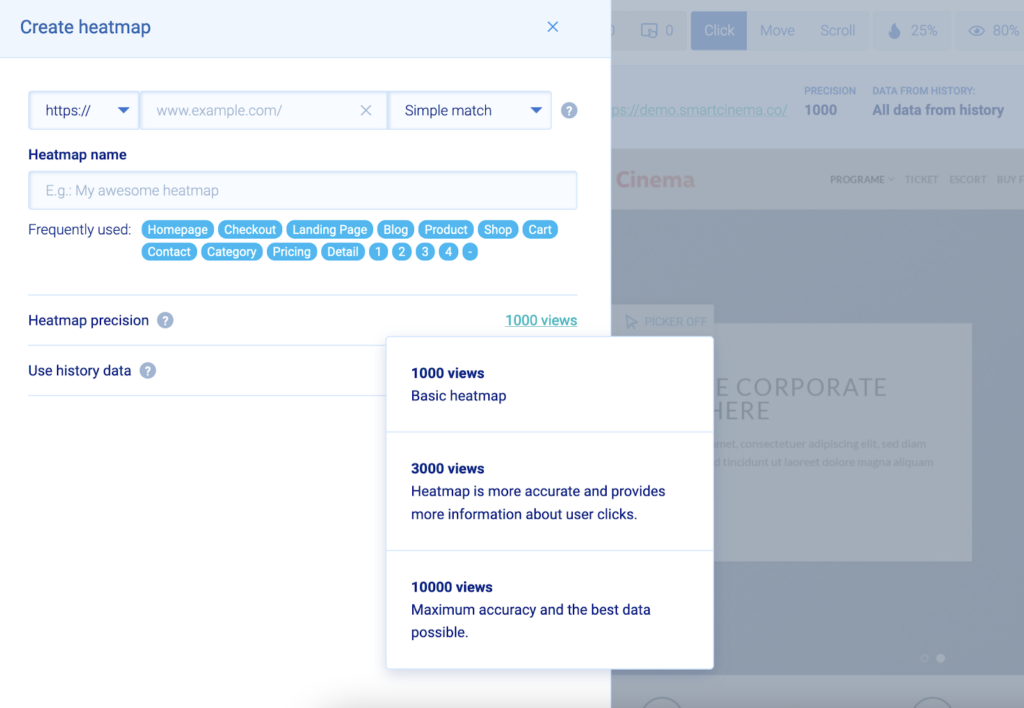
#1. Wait for at least 1000 views.
Heatmaps must gather 1,000 or more views before being reliable for behavior analysis. Below that level, it’s easy to make incorrect conclusions due to insufficient data. In general, the more information each heatmap collects, the more accurately it reflects the user experience.
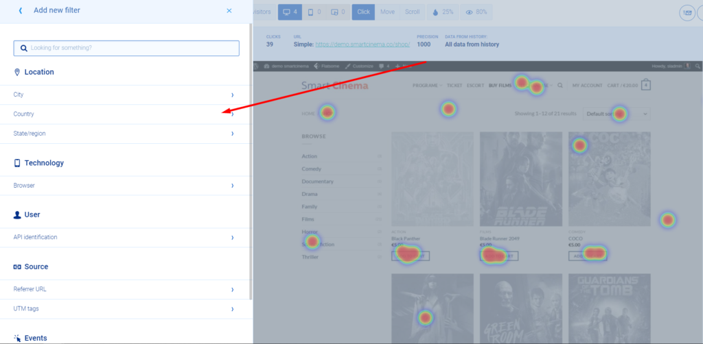
#2. Filter your heatmap data.
Different types of users interact with your site or app in different ways. If you don’t filter your heatmap data, you risk making changes based on false assumptions about your user base. For example, you may not consider that desktop and mobile visitors see totally different elements above the fold. With Smartlook, you can filter heatmaps by users’ devices, locations, referrers, UTM tags, and much more.
#3. Don’t make large changes based on heatmaps alone.
While heatmaps are a great starting point for analyzing user behavior, they can’t tell you why users do what they do or track behavior across different pages. That’s why you should make large website changes only after confirming your analysis with other analytics methods, as we’ll explore later.
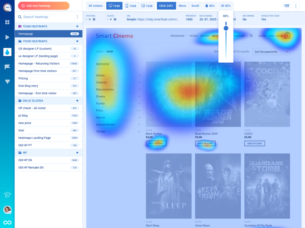
Click maps
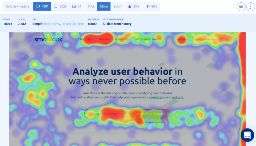
Click maps show you where users click (on desktop) or tap (on mobile devices). For example, the screenshot below shows a Smartlook click map for a web page.
The colored areas are where most clicks on the page occurred, with the red zones visualizing where most clicks were concentrated. You can also hover over any area and see the number of clicks in it.
Click maps are useful for:
- Understanding which call-to-action (CTA) elements users interact with. For instance, if you’re not sure whether visitors engage with your site’s “Free Trial” or “Book a demo” buttons, you can use a click map to quickly compare clicks on both buttons.
- Finding non-clickable elements that users are trying to click. These repeated clicks on non-interactive elements (called rage clicks) indicate confusion and frustration.
Move maps
Move maps show you where users move their cursors. Again, the bright red spots mark the areas with the most movement activity.
Tracking mouse movements with these heatmaps can help you:
- Understand which parts of a landing page attract visitors’ attention. Studies have shown a correlation between mouse movements and eye gaze. That’s why many companies use mouse tracking as a cost-effective substitute to the more expensive eye tracking.
- Find areas that distract or confuse visitors. If a move map shows frantic cursor activity in an area, it may be a sign that users are getting distracted or don’t know what they’re supposed to do.
Scroll maps
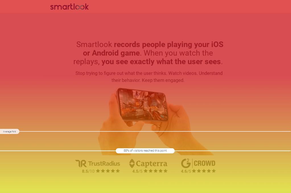
Scroll maps show what percentage of visitors reach each part of your page, as you can see below.
Scroll maps make it easier to determine if certain elements are placed correctly by:
- Showing you which part of a page most visitors see without scrolling (this is also called “above the fold”, borrowing a term from the newspaper industry). Since nearly all page visitors see the elements above the average fold, that’s the most valuable real estate on any given page. Make sure to put your essential value propositions, CTAs, and offers there.
- Showing you what percentage of visitors reach each part of a page. As you go further down a page, the number of visitors gradually decreases. Scroll maps show you exactly what percentage of visitors remains at each point, so you can decide where to place elements that don’t qualify for above the fold placement.
Now that you know how heatmaps work, let’s look at two examples of companies using them to solve real issues.
How Sewio improved their clickthrough rate by 276% with scroll maps and click maps
Sewio manufactures and sells real-time locating systems. The company’s marketing team wanted to learn more about how people interacted with their site’s homepage, so they set up Smartlook and started analyzing heatmaps.
Their scroll maps and clicks maps revealed two key issues:
- CTAs that were supposed to be above the fold actually appeared below the fold for many users.
- Almost no one clicked on the buttons that led to client success stories.
Armed with these insights, Sewio’s team was able to redesign the homepage in a way that aligned with the goals they had for their website.
They moved their primary CTAs above the fold. They also updated the customer success stories section to make it more interesting and enticing for visitors.
Thanks to these changes, Sewio’s new homepage saw:
- A 276% increase in the clickthrough rate of the “Go to store” button.
- Over 3x more clicks on the links to client success stories.
- An increase in average time on page from 4:01 to 4:29.
How Hookle saved 2 weeks of development time with heatmap analysis
Hookle is a social media management app for Android and iOS. They’ve used Smartlook to improve their onboarding, provide better customer support, and verify their hypothesis faster.
Specifically, Hookle’s team relied on Smartlook’s heatmaps to learn how users interacted with the main element of their app — an interactive statistics chart.
They wanted to understand how people interacted with the chart and find ways to add new elements to it. However, when they looked at the heatmap, they realized that people barely clicked on the chart.
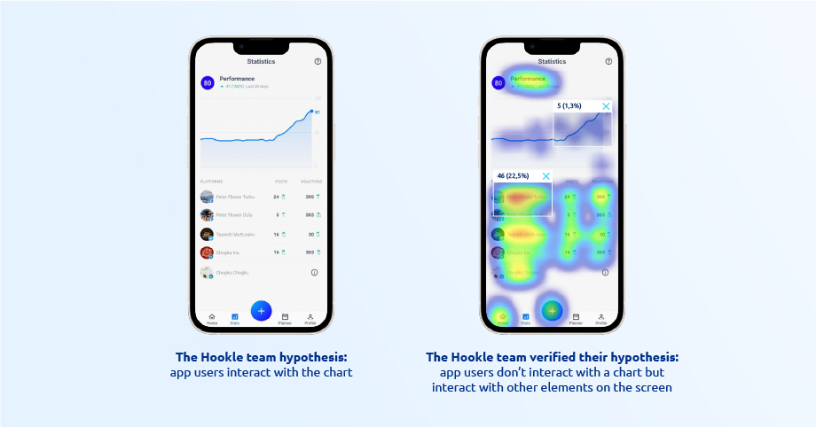
This helped Hookle’s team save two weeks of development time they would’ve spent making the chart more interactive. As a result, they were able to focus their efforts on improving elements that were much more important to the user experience.
Heatmaps’ biggest limitations and how to overcome them
Despite their ease of use and fast insights, heatmaps have two serious limitations:
- Their information is usually obvious and non-actionable. The heatmap hotspots are often where you’d expect, so you don’t get much novel or actionable information. This makes it difficult to come up with ways to improve clickthrough rates, conversions, and other key metrics.
- They can’t track a user’s journey across your site or app. Heatmaps only show aggregate trends about a page or app screen. You can’t use them to analyze how users interact with elements that appear on multiple pages and you can’t put specific interactions, like button clicks or text inputs, in the context of the entire user journey.
That’s why in most cases, conclusions based on heatmaps shouldn’t be the only basis for making website or app changes. Instead, they should be treated as a starting point for understanding behavior and used in combination with the analytics tools we’ll discuss below.
Session recordings: Watch how users navigate your site or app from start to finish
Session recordings capture everything your users do while navigating your site or app — where they click, which pages they visit, which features they use, and so on.
You can use them to watch the journeys of individual users, instead of just focusing on aggregated information for a single page or app screen.
For example, check out the Smartlook session recording below:
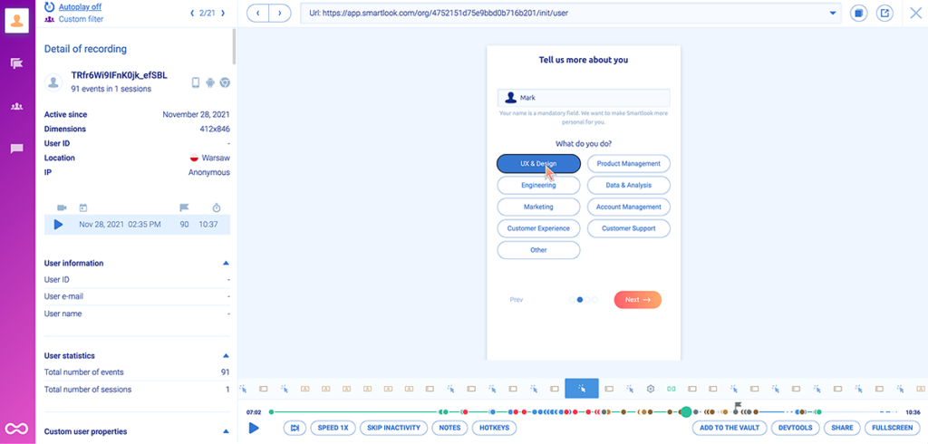
The session replay video that takes up most of the screen shows how a user navigates an onboarding tutorial. Besides this ability to observe user behavior in detail, session recordings also capture valuable data about:
- The user’s device, location, and session duration (to the left of the video).
- Each event that was triggered during the session (under the video).
This makes session recordings a very versatile tool that can be used by lots of teams in various use cases. For example:
- Product teams can use them to analyze how users interact with their app and communicate their findings with others.
- Marketing teams can see which features users like and highlight them in their marketing campaigns.
- Customer support teams can see exactly how problems occur, without having to bother users for explanations.
- And much more.
To learn more about session recordings and their benefits, check out:
- Our guide to recording website visitors
- The top 8 session replay & visitor recording tools for fixing UX issues
Events: Track business-critical user actions
Events are user actions that can be tracked over time, like button clicks, text inputs, or page visits.
Event tracking is a crucial part of any web and mobile app analytics toolkit because it lets you:
- Quantify user behavior.
- Monitor crucial interactions, like clicks on your “Add to Cart”, “Book a Demo”, or “Pricing” buttons, successful purchases, and more.
- Understand how copy and design changes affect the occurrence of these business-critical interactions.
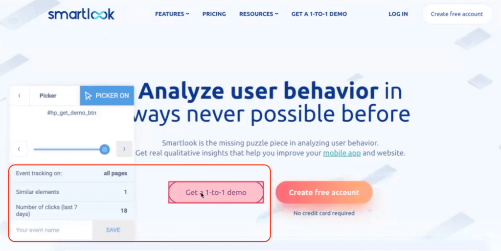
Smartlook offers different ways to track events, including selecting from a list or clicking directly on your site or app’s UI, as shown below.
Smartlook also supports two additional use cases for event tracking:
#1. Filtering session recordings.
In Smartlook, you can click the “Play” button next to each event to jump into all sessions where it was triggered. This functionality lets you see the full context behind certain events — what users did before and after performing them — to get a more nuanced view of the user journey.
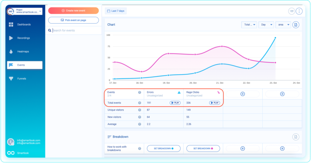
#2. Finding rage clicks and JavaScript errors.
Smartlook automatically tracks rage clicks and JavaScript errors as events, so you can zero in on the sessions of users who experienced these issues. This is especially useful for developers struggling to understand how certain errors occurred.
Funnels: Analyze key user flows
Funnels are sequences of events users go through during multi-step flows, like onboarding tutorials, newsletter signups, or checkouts.
Building and analyzing funnels shows you:
- How many users entered each flow.
- The flow’s overall conversion rate.
- The drop-offs between each step.
With Smartlook, you can build funnels by simply placing two or more events in the order your users follow. Since the user interaction data is already collected, the funnel visualization will appear instantly, like in the GIF below.
Smartlook also lets you combine funnel analysis with session recordings to see why users drop off.
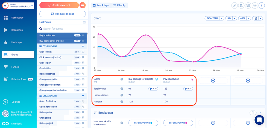
For example, the screenshot below shows an e-commerce checkout funnel with a 61.74% conversion rate:
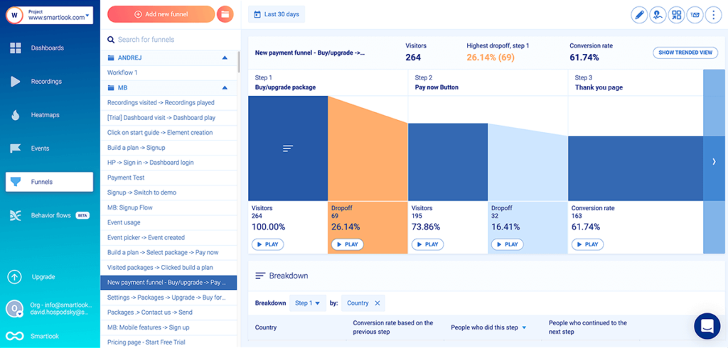
This funnel consists of three events, which you can define in Smartlook without any coding:
- Event 1: Visitors click on the “Buy/upgrade package” button (you can select the button with our no-code event picker).
- Event 2: Visitors click on the “Pay Now” button (again, just use the event picker and select the “Pay Now” button).
- Event 3: Visitors land on the “Thank You” page (use the “Visited URL” standard event and enter the page URL).
As you can see, there’s a “Play” button under each step of the funnel, including the drop-offs. This takes you directly to the recordings of users who dropped off at a certain stage. As a result, you can instantly find session recordings that are guaranteed to show you a point of friction in your flows (as opposed to wasting hours sifting through irrelevant sessions).
In fact, AstroPay (one of our fintech clients) used a similar process to boost the conversion rate of one of their most important flows by 56%.
Try Smartlook’s heatmaps, session recordings, events, and funnels for free
You can see how Smartlook can benefit your business by booking a free live demo with our team.
Our tool can be used on all kinds of websites, including those built with popular CMSs like WordPress, Joomla, and Shopify. Implementing Smartlook on a site is as easy as pasting a code snippet (directly or via Google Tag Manager).
Smartlook also has SDKs for many mobile app platforms, frameworks, and engines — including iOS, Android, React Native, and Flutter. We have detailed documentation to guide you through the implementation — but if you get stuck or have any questions, our Support team is ready and waiting.
Lastly, Smartlook integrates with A/B testing platforms (like Optimizely and Firebase A/B Testing), analytics tools (like Mixpanel and Google Analytics), and other popular SaaS solutions (like Jira and Slack).
Try Smartlook’s heatmaps, session recordings, events, and funnels today with a full-featured, 30-day trial (no credit card required).