The term product usage refers to the many different ways users interact with a product — where they click, which features they use, how often they log in, and so on.
Whenever users perform these in-product actions, they generate usage data. By collecting and analyzing this data (a process called product usage analytics), teams can make educated product decisions, instead of relying on guesses and hunches about what users want.
However, the traditional approach to product usage analytics has a significant drawback — it’s focused exclusively on quantitative data, i.e., numerical, objective stats about your user base.
And without qualitative usage data — the subjective insights into what users want or need or why they do what they do — product teams often lack the context necessary to improve their customers’ experience, boost conversions, and increase retention.
For example, most product teams keep track of many quantitative data points about their app usage, like:
- The length of user sessions.
- Users’ devices and locations.
- Where users click and which features they use.
These are all standard insights that every product team needs.
Butthey’re often insufficient to uncover the “why” behind users’ actions — why they suddenly drop off after trying a certain feature, why they don’t complete the checkout process, etc.
In most cases, the only way to understand that is through qualitative data gathered by watching users interact with the product or asking them about their experience.
That’s why it’s essential to use both quantitative and qualitative data together to guide your product decisions. In this guide, we’ll show you how to do that by covering the following:
- The two types of product usage data and why they should be used together
- Benefits and use cases for product usage data (with real-life examples)
- 5 essential product usage metrics to track
- How to set up product usage tracking quickly with Smartlook
Smartlook brings product analytics & visual user insights under one roof for fast-growing, fast-building product teams. Book a free demo with our team to see how Smartlook can benefit your business or give our tool a go yourself with a full-featured, 30-day trial (no credit card required).
The two types of product usage data and why they should be used together
At a high level, the usage data that product teams collect can be categorized as quantitative or qualitative. Understanding each data type’s benefits and limitations will help you make smarter product decisions.
Quantitative data
In analytics, quantitative data refers to the numerical measurements of what is happening in your app.
Product teams rely on quantitative data to answer questions like:
- How often do users log into the product?
- Which action do users perform most often immediately after logging in?
- Where are users located and what devices do they use to access the product?
- How many customers do we retain one month after they sign up?
- What’s the conversion rate for our checkout flow?
Event tracking, goal tracking, and funnel analysis tools are some of the most widely-used solutions for collecting and analyzing quantitative data.
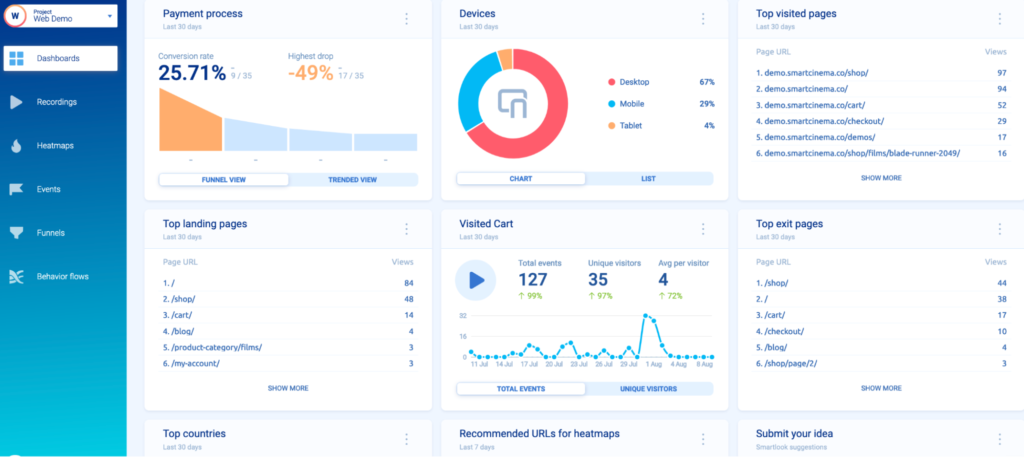
For example, the screenshot below shows a Smartlook dashboard with quantitative data about the top visited pages, the conversion rate on a checkout funnel, the number of times users triggered the “visited cart” event, and more.
These types of insights are a must for pretty much any product team. However, they’re often not enough to understand the “why” behind your users’ behavior, making it difficult to know exactly how to improve their experience.
Qualitative data
Qualitative data is non-numerical information that’s descriptive and rich in context and detail.
As such, qualitative data provides the subjective insights into what your users want or need or why they do what they do. This allows you to go beyond the raw numbers (i.e., quantitative data) and understand your users’ experience from their point of view.
For example, the screenshot below shows a Smartlook session recording of a user playing a mobile game.
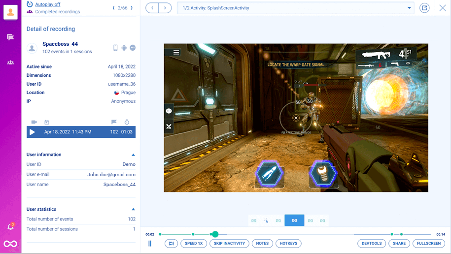
Session recording tools are great for gathering qualitative data because they show you everything a user does from the moment they open your product to the moment they close it (the entire context behind their actions.)
These qualitative product experience insights, alongside the quantitative data on the left, let you answer more nuanced questions like:
- How can we make the checkout flow easier to navigate?
- Why are Android users dropping off significantly more than iOS users during the onboarding tutorial?
- Why do so many users with the Safari browser add items to their cart but don’t complete their purchase?
Besides session recordings, heatmaps and surveys are other popular tools for collecting qualitative data.
But just like quantitative data, qualitative data by itself has its limitations.
For example, when you use a tool like Smartlook, each user session in your product gets captured automatically.
In theory, you can find useful product insights by watching all of these sessions. In practice, that’s often impossible since session recording tools can generate hundreds of hours of video.
That’s why it’s crucial to use quantitative data to guide you (and why we built both quantitative and qualitative analytics features for Smartlook.)
Let’s say you’re not happy with the completion rate of your onboarding tutorial.
First, quantitative analytics tools like events and funnels can show which steps lead to most drop-offs. With that information, you have a starting point for locating the problem’s root cause.
Then, you can start watching only the session recordings of users who dropped off after these steps. This lets you find out what’s causing the problem, without going through all sessions of users who started the tutorial.
Benefits and use cases for product usage data (with real-life examples)
As you can see, tons of different usage data can be generated during the customer lifecycle. In this section, we’ll discuss why working with this data is essential for product teams and give you examples of companies using it to improve their products.
Make data-driven product decisions
Collecting and analyzing usage data regularly helps you answer one of the toughest questions every SaaS company faces: “What should we build next?”
Answering this question becomes much easier once you know how end users interact with your product, where they struggle, and what they need.
For example, AstroPay — a fintech payment app that connects over 5 million users with 500+ merchants — relies on product usage data collected by Smartlook to inform their entire product development process.

This ensures each product decision is based on hard data, rather than hunches or guesses.
Analyze product adoption and feature usage
Before deciding what to focus on next, product teams must know how users interact with the product in its current state.
Again, having product usage data lets you find valuable insights into product adoption and feature usage, including:
- Which features of your product are used the most/least
- What users do before + after activating a new feature
- How exactly users utilize a certain feature
For instance, StoragePug — a website platform that helps self-storage businesses rent out facilities and attract clients — relies on both quantitative and qualitative usage data to analyze how users interact with each feature.
Initially, their product team had created small, non-interactive tiles with useful information for customers, such as the number of new contracts.
But when they started watching session recordings, they saw that customers actually tried clicking on the tiles. They expected that click to take them to another screen with more details and were frustrated when that didn’t happen.
Thanks to these insights, StoragePug’s product team redesigned the tiles to better fit their customers’ needs.

Now, the tiles are bigger and clickable, with fresh microcopy that’s easier to understand. Plus, they allow customers to find important details with just one click, which is a big improvement to the overall user experience.
Improve your onboarding process
A clunky onboarding process will reduce your chances of retaining users over the long run. That’s why it’s vital to collect usage data for the onboarding process and find ways to optimize it.
For example, Hookle — a SaaS app for social media management — uses session recordings to watch how users navigate their onboarding flow.
This showed them that users were getting confused about how to sync their accounts to Instagram and Facebook — a huge barrier to seeing the value of Hookle.
To solve this problem, Hookle’s team redesigned the onboarding flow to make it easier to connect those accounts, leading to a much smoother onboarding experience and a higher chance of users getting to experience Hookle’s most valuable features.
Boost conversion for key user flows by eliminating friction
Each product has many important user flows — sequences of steps that users take to complete a goal.
Understanding how users navigate these flows and why they drop off at certain points is crucial for improving your product’s user experience (UX), conversion rates, and revenue.
In fact, AstroPay (the fintech app we mentioned earlier) used product usage data to improve the conversion rate of their cryptocurrency purchase flow by 56%.
First, they mapped out this flow and found points of friction with Smartlook’s event tracking and funnel analysis features. Then, they jumped into session recordings of users navigating this flow, like the one below:

Thanks to this analysis, they found that users who didn’t have a local currency in their e-wallet were forced to go through more steps, which led to drop-offs.
Also, after completing a purchase, users often spent up to five minutes searching for their new cryptocurrency, not realizing the transaction was still pending.
To solve these problems, AstroPay’s product team:
- Added local currency as an option to finalize transactions, reducing the friction in the purchase flow
- Included a “Purchase pending” banner to reduce buyers’ anxiety post-purchase
The result of these changes was a 56% lift in conversions for AstroPay cryptocurrency’s purchase flow.
Make debugging much easier
Product teams aren’t the only ones that can benefit from product usage data. This data can be useful for customer success, development, and quality assurance teams (QA), as we discussed in our product analytics guide.
Let’s go back to Hookle for an example. Their support team faced a constant problem of not being able to understand bugs because bug reports from users often didn’t describe what happened accurately. This also made it slow and difficult for the dev team to reproduce bugs.
Thanks to Smartlook’s session recordings, the support team no longer needs to rely on users’ explanations. Instead, they simply jump into the session recordings of users who reported a problem (thanks to our Identify API) and see exactly how it occurred.
Plus, their dev team saves 10 hours a week on bug reproduction, because they don’t have to reproduce issues via trial and error.
Empower your marketing teams with product usage data
Product usage data is an invaluable resource for go-to-market teams, as it can help them understand customers’ needs and pain points better to ultimately sell more products.
Here’s an example from CDN77 — a global content delivery network product.
When CDN77’s team launches a new marketing campaign, they use Smartlook to track every customer that signed up.
Specifically, they focus on:
- What the customer did to lead them to sign up
- What they do after signing up
These usage insights help the marketing team get a good understanding of the customer journey and determine which campaigns attract the right type of customer.
Understand how different customer segments use your product
The browsers and devices your visitors use can affect their experience with your product. The experience of your product might be very different on an older laptop as compared to a new tablet. The way your app renders in Chrome might be very different from Mozilla, and so on.
Additionally, user behavior can vary greatly based on location — whether due to internet speeds or censorship in their country.
Understanding how these user segments interact with your product helps you improve their experience with more relevant messaging, suggestions, and features.
For example, with Smartlook, you can save any combination of user actions (events) and user properties as a segment, like:
- First-time US users on Android devices who completed your onboarding tutorial
- Returning UK users with MacBook devices who made an in-app purchase
- New website visitors from China with the Safari browser who visited your blog
Then, you can monitor how these segments perform right in your dashboard (quantitative usage analysis) and watch how users from them interact with your product (qualitative usage analysis) by clicking on the small “Play” button.

5 essential product usage metrics to track
While there are tons of product usage metrics you can track, the ones we’ve listed below are a must for the majority of product teams.
#1 Active users
At a high-level, most product teams use three time frames to analyze active users:
- Daily active users (DAU): The number of users who open your product in a day
- Weekly active users (WAU): The number of users who opened your product at least once during the week
- Monthly active users (MAU): The number of users who opened your product at least once during the month
Most product analytics tools will calculate these for you.
For example, with Smartlook, you can simply open the dashboard and click on “Add new tile”:

Then, click on “Active Users”, choose between daily, weekly, or monthly active users, and select the data range you want to analyze (seven, 30, or 60 days).

This new tile will be saved in your dashboard, where you can easily monitor it over time.
#2 Usage frequency
Usage frequency is another straightforward metric, as it simply measures how often customers use your product during a certain timeframe.
Here’s how you can calculate it:
Usage frequency = Number of unique user sessions per day, week, or month / Total number of users during that time frame
A high usage frequency indicates that your product has become entrenched in your users’ daily lives and routines, which is essential for some products (e.g., social media apps, mobile games, and lifestyle apps).
#3 Customer retention rate
The term retention rate often refers to two different things:
- The percentage of users who continue paying for a product over a given timeframe
- The percentage of users who continue to perform an action (e.g., log into their account, open a feature, or make an in-app purchase) for a certain amount of time after first doing so
In both cases, retention is about tracking how a group of users, called a cohort, acts over time. Smartlook has a feature called Retention Tables that helps you do exactly that.
To generate a retention table, you first need to select an action (i.e., an event) like:
- Account login
- In-app purchase
- Successful plan renewal (and so on)
In the example below, we’re using the account login event, but note that Smartlook can calculate retention for any event you want.
Here’s how the retention table for this event looks:

On Monday, 10.19 (Day 0), 376 users triggered this event for the first time.
Over the next few days, the table automatically tracks this user cohort (users who first performed the “Account Login” action on 10.19).
Here’s the retention data for the next 5 days:

There are two crucial insights here:
- 300 of the users who logged in on Day 0 didn’t do so on Day 1, which may indicate that the product doesn’t leave a great first impression. You can try to see why that’s the case by watching session recordings of new users.
- There’s a big drop in retention between Day 4 and Day 5, which shows that many users lose their interest and stop interacting with the product on a daily basis. You can try to fix that with various re-activation tactics on Day 5, like emails or live chat messages.
#4 Churn rate
Churn rate is the percentage of customers that stop using or paying for a product over a given period. Similar to retention, reducing churn is usually a big priority for product managers, since it directly impacts the company’s revenue.
Here’s how you can calculate your monthly churn.
Customer churn rate = (Lost Customers / Total Customers at the Start of Time Period) x 100.
For example, if you have 1000 customers at the start of the month and 63 unsubscribe or cancel throughout the month, you’d have a churn rate of 6.3% [(63/1000) x 100].
Again, you can perform churn calculations for any period you want — a week, a quarter, a year, and so on.
#5 Conversion rates
Conversion rate is the percentage of users who take a desired action in your product, such as:
- Making an in-app purchase
- Completing an onboarding tutorial
- Configuring a certain setting in their dashboard
Most product teams track several of these important flows, each one with its own conversion and drop-off rate.
You can analyze these flows with Smartlook’s funnels.
Funnels are sequences of steps (i.e., events) users go through to complete a goal. Building funnels lets you analyze user behavior through these flows, find out where users drop off, and calculate conversion rates, as shown in the screenshot below.

And because Smartlook also has session recordings, you can also watch the sessions of users who dropped off by clicking on the small “Play” button.
In the example above, you can watch drop-offs between Steps 1 and Step 2 (26.14% of all users), as well as between Step 2 and Step 3 (16.41% of all users) to try and find out why drop-offs occur and improve your conversion rates.
For more detail and examples on this topic, check out our detailed funnel analysis guide.
How to set up product usage tracking quickly with Smartlook
You now know how to take advantage of product usage data to build better products, so here’s how you can start gathering this data with Smartlook.
Smartlook is built to collect as much valuable product usage data with as little intervention on your end as possible. That’s why you only need to install one code snippet and our tool will automatically start recording all user sessions in your product.
This removes the need for extensive planning or months-long setups that traditional analytics platforms often require. Instead, you can have your dev team install one snippet and start getting valuable product usage data in minutes.
Then, you can use our quantitative and qualitative analytics features — such as session recordings, heatmaps, events, and funnels — to analyze exactly how users interact with your product.
Further reading on this topic:
Start capturing product usage data automatically with Smartlook
Smartlook empowers fast-growing, fast-building product teams with the usage data they need to make better product decisions.
Our tool combines the power of quantitative and qualitative analytics, so you can capture everything your users do, uncover why they do it, and improve their experience.
To get a detailed presentation of how Smartlook can help you (without having your dev team set it up), book a free demo with our team. We’ve found that customers who go through the demo have a 70% faster onboarding time and leave positive reviews 99% of the time.
If you want to give Smartlook a go yourself, start a full-featured, 30-day trial (no credit card required).